Adidas Jersey Thread

Status
Not open for further replies.

SladeWilson23

I keep my promises.
Sponsor
Nov 3, 2014
26,735
3,220
New Jersey
My thoughts:

Starting with Vegas as a warm welcome to the NHL:

Vegas: I would like to have seen more gold in the jersey and more black and less grey, But still a pretty sick jersey.

Calgary: Meh
Carolina: Look much better.
Colorado: Love that unique and new design.
Edmonton: The Jersey looks weird, nice, but would rather the numbers on the shoulders.
Minnesota: I can live with it.
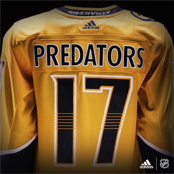
Nashville: Losing the dark blue at the top looks so wrong.
NJ: Change was needed, looks weird but it'll grow on me eventually.
Ottawa: Upset they didn't go with the O.

Change was not needed.
 

Oilers Propagandist

Relax junior, it’s just a post.
Aug 27, 2016
8,064
5,995
Edmonton, AB
It only took a couple of hours but ours have grown on me:

DCyXy66UwAAoZqI.jpg

it is honestly really nice. will probably grab a subban one.
 

KCC

Registered User
Aug 15, 2007
18,353
9,278
My thoughts:

Starting with Vegas as a warm welcome to the NHL:

Vegas: I would like to have seen more gold in the jersey and more black and less grey, But still a pretty sick jersey.

Calgary: Meh
Carolina: Look much better.
Colorado: Love that unique and new design.
Edmonton: The Jersey looks weird, nice, but would rather the numbers on the shoulders.
Minnesota: I can live with it.
Nashville: Losing the dark blue at the top looks so wrong.
NJ: Change was needed, looks weird but it'll grow on me eventually.
Ottawa: Upset they didn't go with the O.

I def do not agree with that. They were amazing before. :popcorn:

it is honestly really nice. will probably grab a subban one.

Until you flip it over to the front and stare into the golden sun of hell.
 

SI90

Registered User
Jul 25, 2011
85,601
63,142
StrongIsland
My thoughts:

Starting with Vegas as a warm welcome to the NHL:

Vegas: I would like to have seen more gold in the jersey and more black and less grey, But still a pretty sick jersey.

Calgary: Meh
Carolina: Look much better.
Colorado: Love that unique and new design.
Edmonton: The Jersey looks weird, nice, but would rather the numbers on the shoulders.
Minnesota: I can live with it.
Nashville: Losing the dark blue at the top looks so wrong.
NJ: Change was needed, looks weird but it'll grow on me eventually.
Ottawa: Upset they didn't go with the O.

Agreed about the golden knights need more gold. Maybe after next year when thirds come back Vegas will have a gold dominant third jersey?
 

Hisch13r

Registered User
May 16, 2012
32,897
32,072
NJ
There was no need to change the Devils uniforms. If Adidas wanted to spike NJ sales they could of waited a yr and added a 3rd.

I think if we used the old design with black instead of green that would've looked great but these are ****
 

Cult of Hynes

Hynes is never wrong.
Nov 9, 2010
13,369
2,979
The Devils one looks like someone discovered indesign, illustrator and photoshop for the first time and just stopped designing half way through.
 
Status
Not open for further replies.

Ad

Upcoming events

Ad

Ad