
LakeLivin
Armchair Quarterback
This concept has been out there a while, and it would benefit from a logo change, but I've always been a big fan of something along these lines:

I completely get what you're saying, but I struggle to figure out how we can execute a more stylized C without it looking too much like a table saw or being way too busy like the Frankfurt Galaxy of NFL EuropeMuch of what I was going to say. I like the concept but the "C" would need to be much more stylized and "free flowing" in order to capture the "feel" of a hurricane.
I have to admit that I'm not at all a fan of our primary logo. I like the current "CANES" away logo much better than the swirl.
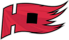
I posted this before, and I figured I might as well add it to this thread just to consolidate. I whipped this up last year, and my thinking is maybe we can replace the NC flag on the shoulder of the alternate with it, if not use it as a shoulder patch on all the jerseysView attachment 527936
I tried it on the right side to balance it, and I didn't think it workedI like it, but they would be much better if the left side of the "H" also had flags on it. The H looks kind of naked next to the C as is.
I completely get what you're saying, but I struggle to figure out how we can execute a more stylized C without it looking too much like a table saw or being way too busy like the Frankfurt Galaxy of NFL Europe

How about both on the left?
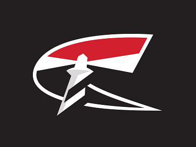
Didn't want to post this in the News thread, because its not news, and I don't think we have anything like this currently going, so I decided to start my own thread because I've had some concepts periodically that come into my head that I put to design. And sure, enough, this morning I had an idea to tweak the logo I've been using as my avatar for a while.... What do you think?
View attachment 527857
None of these are mine. Just ones I've seen around the net that are different, if nothing else.
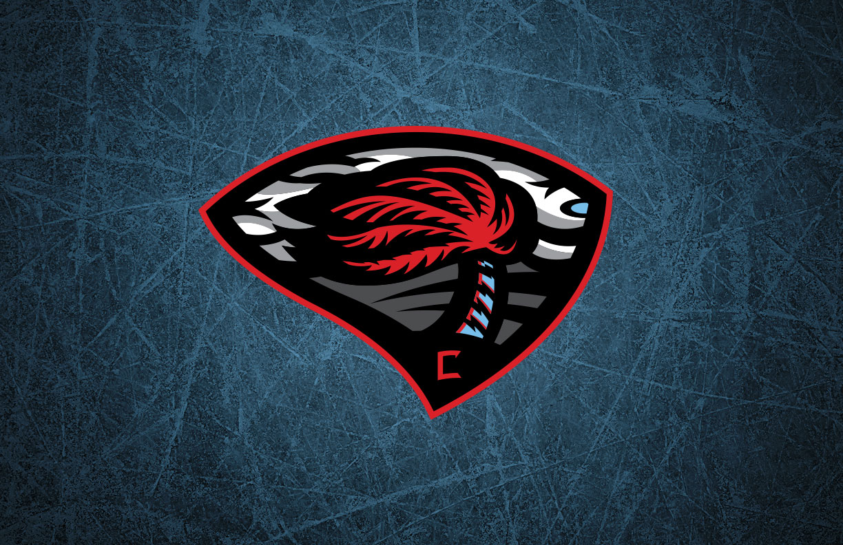
Does the shape of that middle one give anyone else a real Thrashers vibe?
I like the overall concept, especially as a subtle nod to the Whalers. I think people are hitting on the right set of tweaks… it needs to be tilted (perhaps straight-up the same shape as the current logo) and more of a “swirl” to capture the right effect.
I don’t like the overwhelming gray of the C. Maybe try making it a multi-tone swirl like the current logo? I dunno, it might be too much of a mess that way.
Those of you from the old nhl forum, anyone got a copy of that pirate logo that floated around on there?
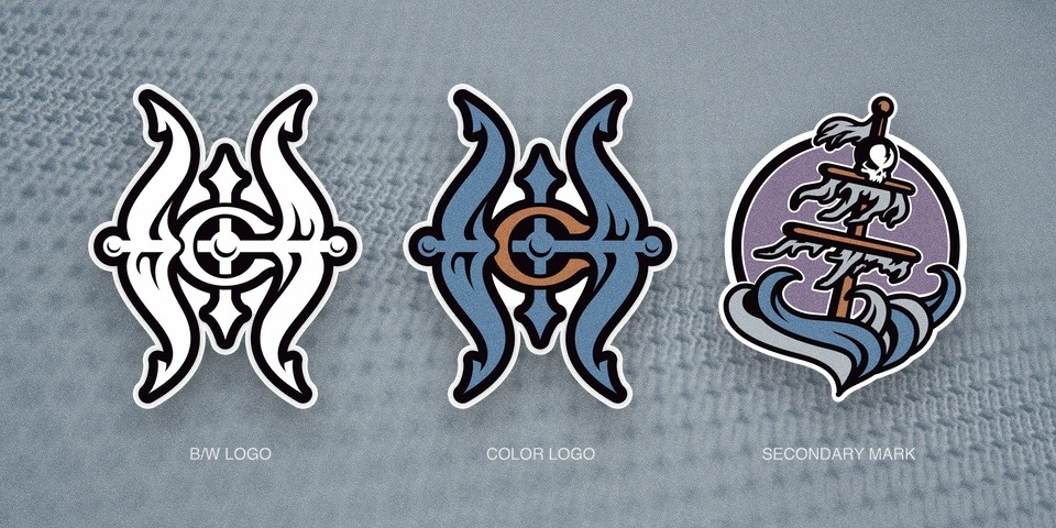
No it was red and black looked like it would go on a black sweater. Was a skeleton pirate with cross bones (I think) a the hurricane flags on his sword, maybe?
This one?
It almost looks like South CarolinaDoes the shape of that middle one give anyone else a real Thrashers vibe?
View attachment 527978
On the last one, seems like the creator could have altered colors some and slid the lighthouse to the right to create a negative space H.
Does the above picture show up in a spoiler dropdown for y'all? It's supposed to, but in my browser the pic is there, just blurry until you click on it. But I'm using an obscure browser since it's a really old XP laptop.
It was just blurry until I clicked it
Same
