I don't understand people saying "they are so similar!"
Blows my mind.
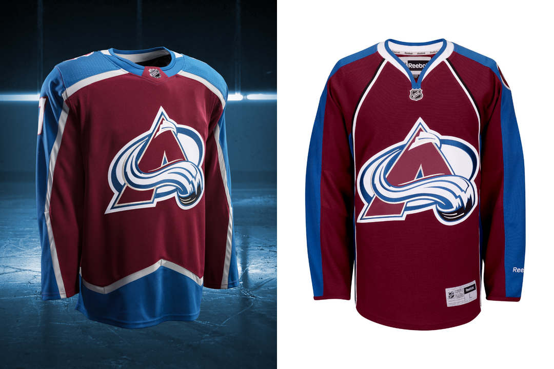
The Edge jerseys were an embarrassment. We have our identity back.
The collar could be tweaked and the C is still awkwardly placed, but come on.
My first thought when I saw one of those comments was that it was sarcastic, but since more than one person has done it I assume they're serious. The explanation for sticking with the uniprons for nine years with no changes starts to form.
We'd all like the original jerseys back. I have no doubt if the Avalanche could have they would have kept them forever, but for various reasons that's not possible. The more I look at our new jerseys the more I'm underwhelmed for various reasons I'll go into but I'm glad they took this opportunity to return to a design style which is both distinctive and persistent in a way many new design elements introduced to hockey in the 90s aren't. The classic Mighty Ducks look is the only other one that manages this and they still don't want it, god knows why.
In the present day however trying to keep the classic Avalanche jersey probably isn't possible so to keep the same basic design with some tweaks is the best we could hope for and it seems we've managed it. I don't like the collar. Round collars on hockey jerseys don't work unless it's one whole colour and doesn't have a shoulder yoke or something like we do. The problem with this is one you can see on our new jersey, the way the collar meets the arm panels makes the chest look too large and this wouldn't happen with a V-neck. That's even before you get into the upside down pentagon adidas' major motif seems to be. Fortunately ours looks less out of place than the Rangers or the (titter) Wild.
When you compare our new jersey to some of the other teams who had classic designs redone or put out new looks altogether you really realise how lucky our escape was. Look at how big the arm and waist stripes of St. Louis and the Islanders are for instance. It looks cheap, it looks like a knock-off. That's something we seem to have avoided. As much as it was surely impossible to end up with a jersey worse than the one we had I wouldn't put anything past the Avalanche people involved with these decisions or the rubes the NHL has from manufacturers who dictate these things, so I'm still glad.
I know we haven't had real pictures of the jerseys yet but they've all made the colours look a bit brighter than usual. I can't tell if this is because the stripe separating them now exists and is grey, but it seems less vibrant than the original. We won't know if this is necessarily a bad thing until we see them on-ice, but I think we'll manage. And on that note I still don't see what the problem with black accessories is. If we have burgundy or blue helmets/shorts/gloves/numbers (especially numbers on the whites) we get the same problem the Illuminati thirds suffered from, it's too much. Of the other changes I'm sad the classic Avalanche font is gone. Even the one we had on the old thirds would have been worth keeping, but I'd wonder if it wasn't changed to make reading the numbers easier. I know I'm setting the bar low but multiple times this season Haynes was mixing up 18 and 28 (all the funnier since one was left handed and the other right) and 32 and 92, so making the numbers a bit straighter should change this. I'm not sure about the burgundy trim on the numbers and the arm numbers seem a bit high but I think this might look better on-ice. The apparent loss of the classic C and A font on the front though is a travesty. Get them back immediately.
The redesign is a good choice and I'm glad we have something that looks like it was supposed to be an Avalanche jersey again. I'm glad we did better than a lot of other teams, particularly Minnesota who just get worse the longer you look. This season was almost worth suffering through for this end result.