Tribute Which version do you want to see?

Which version would you prefer?


  • Total voters
    69

dumbdick

Galactic Defender
May 31, 2008
11,391
3,807
I like it in essence, do not get me wrong, but it looks much too similar to the style and colors that the New Jersey Devils have. So I would definitely say no on that front alone.
I want to see it, but I just don't see it.
 

GrantLemons

Church of FYOUS
Feb 3, 2013
1,997
1,584
Ottawa, ON
Please Christ be this.

Seven.jpeg

That's slick no doubt, but we have to black as our main colour. It just looks too good.
 

Emerica

Registered User
May 29, 2010
10,980
6,310
Yea those black shoulder pads don’t do it for me. Jersey looks way too busy imo.
 

BoardsofCanada

Registered User
Aug 26, 2009
1,089
1,230
G.T.A.
b469_1_sbol.jpg


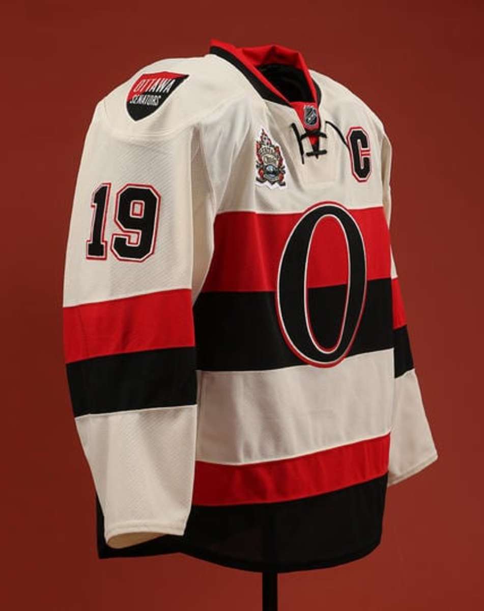
I've always thought these were nice looking jerseys. Put a two-D logo on it and there you go.

Senators-heritage-Classic-Jersey-1_slide.jpg


Put a 2-D logo on this jersey.

I am thrilled we are going back to the 2-D logo but I find those two original jerseys in the OP to be dated. They need an injection of some modern style.
 

DrunkUncleDenis

Condra Fan
Mar 27, 2012
11,820
1,682
[snip]

I am thrilled we are going back to the 2-D logo but I find those two original jerseys in the OP to be dated. They need an injection of some modern style.

I agree that the black jersey with two thin stripes looks a little dated. I am a fan of the added white stripe, but I think if they modernize the black and-red-only jersey arm and waist bands to this, it'd be real sharp.

full


I'm also really excited about the prospect of the S shoulder crests. They were always kinda asymmetrical like the 2D main logo, but awesome at the same time. Adds such a punch to the jersey with an extra bit of gold.
 
Last edited:

Ad

Upcoming events

Ad

Ad