Washington Capitals release their 3rd jersey

ThePsychicSaw

Registered User
Jul 24, 2009
1,843
296
0914-anthonycinerari-wsh.png
 

Skrudland2Lomakin

Registered User
Jan 1, 2011
7,684
5,682
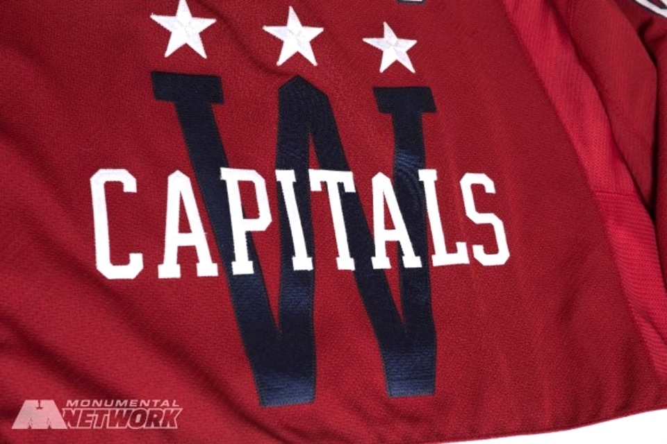
Idk if the number of stars means anything, tbh.

The Flying Eagle had 5, the White house had 2, the original and the retro have 6, and the current logo has 3
And then shoulders and pants have been inconsistent as well - the third has 4 on the sleeve and 5 on the pants, to (not) match the 6 on the logo
You guys are just over thinking it. It's all a play on three stars, and from there I think they just added stars to sleeves and pants to make it work. They added and subtracted stars from the arms arbitrarily in the 80's, again I think it was purely aesthetic. It all circles back to the use of three stars. Hence three blue, three white. Currently three white on the logo, three white on the Winter Classic from 2015, and three on the Stadium Series.

The three star motif is a reference to the DC flag which is lifted directly off of the Washington coat of arms. Don't believe anyone who tells you mumbo jumbo about it being for DC, Maryland, or VA is wrong. It's lifted from the flag, that's it, there isn't much more to the story. They even took the same star design.


255px-Flag_of_the_District_of_Columbia.svg.png


washington_large.gif

0923-wsh15wc-crest.jpg


WashingtonCapitals.png

hwasadiss18_f.jpg
 
  • Like
Reactions: Babe Ruth

jetsforever

Registered User
Dec 14, 2013
27,380
23,447
Most of these teams are just bringing back their old 3rd jerseys
Now I do quite like this one, but it's still unoriginal
 
  • Like
Reactions: uncleben

DowntownBooster

Registered User
Jun 21, 2011
3,202
2,414
Winnipeg
It's alright but not quite as nice as their original jerseys. The colors are the same and the basic design is similar to the originals but just doesn't quite look as good. Maybe it's because the shoulder yokes are too big and the placement of the stars looks off. It just seems that since the league went with Reebok Edge and now Adidas, the jerseys don't look as good as they used to.

washington-capitals-oral-history-yvon-labre.jpg


:jets
 
Last edited:

Skrudland2Lomakin

Registered User
Jan 1, 2011
7,684
5,682
Half ass attempt by the Caps.
Are the Penguins current sweaters not literally copies of the version you have in your avatar?


Vintage plays. It's also pretty clear the Caps are shifting towards going back to having this as their full time kit, they've been setting it up for years. I would bet that ADIDAS has it in their contract that teams can't change their full uniform within X amount of years of switching over to their brand after the first year. ADIDAS wants to squeeze the market on the current iteration of sweaters before actually letting teams rebrand.
 

Oak

Registered User
Apr 22, 2012
3,936
703
MA
This is one of my favorite jerseys in the league. Looks very similar to their old 3rd though.
 

KCC

Registered User
Aug 15, 2007
18,352
9,278
A third should be new and different, not old school and a look we’ve all seen a thousand times. I think so ways. Allows you to try something off the wall.
 

Sam Spade

Registered User
May 4, 2009
27,484
16,207
Maryland
I can't see if there if lettering inside the back color? I really like that in some of the other jerseys I've seen.

Screen Shot 2018-09-25 at 12.36.29 PM.png

Screen Shot 2018-09-25 at 12.38.12 PM.png

Screen Shot 2018-09-25 at 12.40.18 PM.png
 

Matty Sundin

Registered User
Jul 18, 2006
3,320
3,402
A third should be new and different, not old school and a look we’ve all seen a thousand times. I think so ways. Allows you to try something off the wall.

Anything new most fans ridicule it. I dont get the love for retro jerseys like some fans seem to have.
 

Ad

Upcoming events

Ad

Ad