Sticking with NHL only.
1. Cleveland Barons 1976-78
This is a seriously underrated uniform set. In fact, sadly I can't even find a color, full-body photo of a player wearing it. Not only is it well-balanced in a traditional hockey style, but it has a couple of innovations which give it a unique look. For one, there are the signature Ohio number plates. Also, and it's hard to see in this photo, the sleeve stripes are diagonal -- a true rarity in the pre-1990s NHL. Finally, the multi-layered logo looks great as a crest from a distance, where it looks like a Bruins-esque circle, and gives you more and more as you get closer and see the details come out. This actually isn't the prettiest look on the list, but it was very innovative for its time and pulled off nicely, so I want to draw some attention to it here.
2. Philadelphia Flyers 1982-2001
The Flyers haven't looked "right" to me since they abandoned this darker shade of orange. In my opinion, the brighter shade doesn't suit them nearly as well. This jersey is by far the best of the long-yoke category, largely because the yoke is thick enough to provide real weight to the upper torso. The curves around the shoulder and wrist mimic the stylistic curves of the Flyers logo, and the black at the wrists blends beautifully with black gloves. AFAIC, this is the jersey a Flyers player ought to be wearing, period.
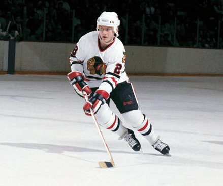
3. Chicago Blackhawks 1981-96
I don't have much to add which hasn't already been said about these. There are a lot of little variations over time, but the Hawks got it
just right during this time period with the width of stripes, size of logo, outline on the numbers, and outline on the logo.
4. St. Louis Blues 2014-present
For a while there, it felt like St. Louis was monkeying around too much with a good concept. Finally they landed on a design which is just beautiful. The shoulders and hem stripes are tastefully balanced, the hems blend into the gloves and pants, and the crest looks gorgeous against a white background. This is pretty close to perfection, and I'm not sure it isn't nostalgia that keeps it behind Chicago on this list.
5. Buffalo Sabres 1983-96
This is basically the 80s/90s answer to the current St. Louis look. The gold and blue are distinctive and perfectly balanced, and the circular crest looks fantastic. My only critique is that they duplicated the logo on the shoulders, when it might have looked better to use an alternate logo a la Chicago. It was tragic when Buffalo switched from this to the awful goat-head look.
6. Colorado Avalanche 1997-99
Not everyone loves this look and I understand why, but I think it's got two very strong selling points going for it. First, it has a completely unique color scheme that actually works. That's an extreme rarity in the NHL, where inevitably things get recycled by different teams. Colorado owns burgundy-and-blue. Second, the striping scheme is truly unique AND has a meaning that makes sense with the team name and location. Contributing factors -- a unique if slightly dated number scheme, and a nice interplay in the shapes of the primary and secondary logos. It all just goes together nicely and gave the Avs a very recognizable look.
7. San Jose Sharks 1991-98
Much like the Avs, the Sharks pulled something new out of the closet and absolutely owned it. Teal is a risky color, but it looked great on them. It's dated but in a good way, much like the Flyers orange. Beyond the color scheme, these jerseys featured an instant-classic logo, a great shoulder patch, and an overall balance that avoided feeling too gimmicky and paid respect to hockey tradition. My only complaint is that I'm not crazy about the teal-on-white stripes on the waist and wrists.
8. Boston Bruins 2007-present
Most of the positives from the current St. Louis uniforms also apply here. A well designed yoke, good-looking crest, and overall balance. This one doesn't have quite as pretty of a color scheme to work with, but it makes up some ground with a nice shoulder patch. There is literally nothing wrong with this jersey unless you just don't like yellow.
9. Atlanta Flames 1977-80
How perfect is this look for a team called the Flames? Everything about it says "warm" in an ice sport, and the red-and-yellow looks great against white ice. Naturally I could just as easily picked Calgary here, but I lean slightly toward the Atlanta logo and its creative use of flames in the middle. But really, any jersey in the Flames family up to 1994 looked great.
10. Florida Panthers 1998-2003
This is another warm-feeling uniform that probably doesn't get enough love. There's an absolutely perfect relationship between traditional hockey elements -- the shoulders, stripes, crest all look great -- while also spinning off some modern elements like diagonal striping, a pointed yoke, and a color scheme that generally just feels "Miami". It features a fantastic alternate patch on the shoulders, and the dark blue elements seem to ground the red with some weight and balance.