SENS TOURNAMENT OF LOGOS: ***FINALS*** - "OLD 2D" vs. "Heritage =0="

BonkTastic

ಠ_ಠ
Nov 9, 2010
30,901
10,092
Parts Unknown
SENS TOURNAMENT OF LOGOS

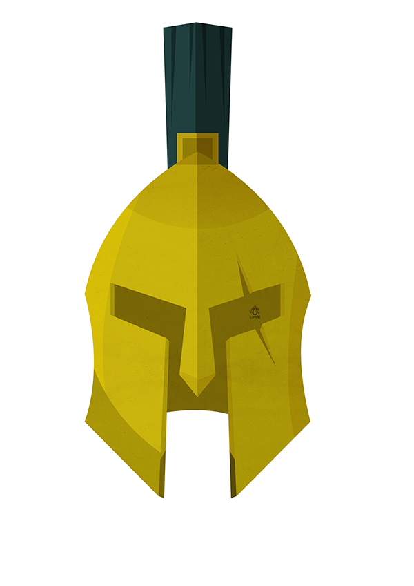
FINALS: "Old 2D Logo" vs "Heritage =0="

150px-Ottawa_sens_logo_old.svg.png


4609625-9371376870-latest


q5hvGb7.gif


Sorry for not posting until today, I've been in and out of the house all week.

Poll will close Monday at Midnight.


SEMIFINAL RESULTS:
Semifinal #1 - "Old 2D" vs "Peace Tower" "Old 2D" wins 40-7
Semifinal #2 - "Heritage =0=" vs "New 3D" "Heritage =0=" wins 34-4

QUARTERFINAL RESULTS:
Quarterfinal #1 - Old 2D vs New 2D - "Old 2D" wins 100-18
Quarterfinal #2 - Old 3D vs New 3D - "New 3D" wins 85-7
Quarterfinal #3 - "SNES" vs Heritage =0= "Heritage =0=" wins 89-6
Quarterfinal #4 - Inaugural Shoulder vs Peace Tower Shoulder vs Shield Shoulder - "Peace Tower" wins 38-29-26
 

DrunkUncleDenis

Condra Fan
Mar 27, 2012
11,820
1,682
==O== all the way.

Centurion has no ties to Canada let alone Ottawa

Sometimes things don't need patriotic significance. That's how terrible logos are created (see: new Jets logo). Too much "significance" packed into something.

I now enjoy the irony of a centurion not having anything to do with a 'senator', it has become one of those strange sports quirks. The 2D centurion was modern Ottawa Senators, it was there through our late 90's-2000's glory years. To me it represents a time of success after the early dark days. That's why it is special. It doesn't need to "represent Canada" IMO. The Jets tried that and it failed.
 

Big Papi

Who's Mel Bridgeman?
Jul 10, 2009
2,009
164
Quebec
www.instagram.com
Sometimes things don't need patriotic significance. That's how terrible logos are created (see: new Jets logo). Too much "significance" packed into something.

I now enjoy the irony of a centurion not having anything to do with a 'senator', it has become one of those strange sports quirks. The 2D centurion was modern Ottawa Senators, it was there through our late 90's-2000's glory years. To me it represents a time of success after the early dark days. That's why it is special. It doesn't need to "represent Canada" IMO. The Jets tried that and it failed.

I agree the jets logo is God awful, and I'm not saying the logo has to be patriotic, the ==O== is not patriotic in the traditional sense. More like civic pride and as you allude to the glory years of winning for the modern Sens, the heritage links us back to the true first dynasty of the NHL in the 1920s.

Taste is subjective, and its fun to debate which of these two logos (both of which I love) should be our number 1.

A compromise?
Hertiage jersey as our home
White 90s jersey as our away.
 

DrunkUncleDenis

Condra Fan
Mar 27, 2012
11,820
1,682
I agree the jets logo is God awful, and I'm not saying the logo has to be patriotic, the ==O== is not patriotic in the traditional sense. More like civic pride and as you allude to the glory years of winning for the modern Sens, the heritage links us back to the true first dynasty of the NHL in the 1920s.

Taste is subjective, and its fun to debate which of these two logos (both of which I love) should be our number 1.

A compromise?
Hertiage jersey as our home
White 90s jersey as our away.

Ya, I could settle for this, although I'm not the biggest fan of having such dramatically different jersey sets for home/away (which we did in 2006/07 era with the 2D white and red 3D swoosh).

Realistically, any jersey combination set using both the 2D and =O= is fine with me. I do really like the mock-ups of a bright white =O=.

My dream is home/away 2D and black =O= for alternate.
 

Icelevel

During these difficult times...
Sep 9, 2009
24,819
5,022
Nice to see them using my logo idea for the Spartan race. Hope they keep up the warrior themed training.
We could do s much more with our logo/theme. Looks like a good start to creating a tougher image. And fun for the players.
 

Tap on the Ankle

Registered User
Jun 9, 2004
3,558
1,247
Ottawa
heritage Os as main but with true white/black not "vintage" offwhite/offblack, old black or red jersey 2d logo as thirds

but I would be fine with a switch to either, both are massive upgrades over "angry centurion man looking angry right in your direction" featuring default Reebok Edge layout
 

DrunkUncleDenis

Condra Fan
Mar 27, 2012
11,820
1,682
heritage Os as main but with true white/black not "vintage" offwhite/offblack, old black or red jersey 2d logo as thirds

but I would be fine with a switch to either, both are massive upgrades over "angry centurion man looking angry right in your direction" featuring default Reebok Edge layout

Agree. Except I think the 2D on a red jersey wouldn't look right (at least any of the mocks I've seen look bad) because the 2D's red plume is so large. Doesn't look right.
 

Neiler

Registered Loser
Jul 16, 2006
2,195
786
I prefer the classic logo look. The =O= fits in the style of timeless logos like the Bruins, Habs, Blues, Flames, Flyers, etc. This is my choice for main home/away. The =O= looks like a brand to me, a very recognizable and marketable logo.

I'd like to see the old 2D as the alternate. Most of all I'd like to see all of the cartoon logos perish. They look like junior team logos.
 

Icelevel

During these difficult times...
Sep 9, 2009
24,819
5,022
The Sens? Pic?

actually someone posted something similar before mine i think. was just an idea to use the front facing simple helmet design for something more badass. The spartan race logo definitely looks more badass. Great job i say.

Here was danielpalfredsson's logo. pretty cool. not so cool on jerseys maybe....
I'm all for going back to the 2D logo. With that said......here's my concept. The jersey designs themselves aren't anything concrete.

Logo concept, three slightly different designs.
BRpdXesCUAAENOb.png

BRpaWIOCIAA-a6q.png

i liked this image as something to work around for something in the organization, (not like they actually used my idea ;)

9cbcb20b651904abd56b30a12a642de3.jpg


Spartan Race,
[NHL]832121&catid=1196[/NHL]
 

HispanicAtTheDisco

Registered User
Oct 17, 2014
2,222
0
Ottawa, Ont.
actually someone posted something similar before mine i think. was just an idea to use the front facing simple helmet design for something more badass. The spartan race logo definitely looks more badass. Great job i say.

Here was danielpalfredsson's logo. pretty cool. not so cool on jerseys maybe....


i liked this image as something to work around for something in the organization, (not like they actually used my idea ;)

9cbcb20b651904abd56b30a12a642de3.jpg


Spartan Race,
[NHL]832121&catid=1196[/NHL]

First thing I thought of when I saw that logo was runescape.
 

Back in Black

All Sports would be great if they were Hockey
Jan 30, 2012
9,929
2,118
In the Penalty Box
I prefer the classic logo look. The =O= fits in the style of timeless logos like the Bruins, Habs, Blues, Flames, Flyers, etc. This is my choice for main home/away. The =O= looks like a brand to me, a very recognizable and marketable logo.

I'd like to see the old 2D as the alternate. Most of all I'd like to see all of the cartoon logos perish. They look like junior team logos.

YEEESSSSSSSS! It was tough, but I went with the "O".


I think the old 2d logo would make for a better shoulder patch while the Heritage O the better main logo
Maybe, but necessary

Happily either winning vote is good for me!:popcorn:
 

18Hossa

And Grace, Too
Oct 12, 2012
6,625
252
It's funny, Jerk Store did a poll on twitter between the heritage and his take on tbe 90s jerseys and the =O= was winning 180-90(2-1) last I checked. Shows how on here there are an older generation and twitter is full of a new generation I guess.

Personally I would like to go with the 90s home/away with the black Heritage as an alternate and maybe try to get a pure white version for special occasions.
 

Sun God Nika

Palestine <3.
Apr 22, 2013
19,922
8,283
Im a newish fan (Post 2007) and I love the 2D logo more than anything it represents an era of success and domination, and looks amazing on jerseys.
 

Tap on the Ankle

Registered User
Jun 9, 2004
3,558
1,247
Ottawa
Looks like another twitter account has been started to promote the idea of a jersey/logo change

https://twitter.com/SensGoWithTheO

"Go With The O" is a pretty good slogan. I'm a big fan of heritage O for the same reasons as everyone else - while the old centurion logo is nice, it just isn't Ottawa. The O is an historic Ottawa hockey logo has a nice simplicity reminiscent of the other good logos in the NHL. The jersey itself is very unique as well, the Habs are the only team I can think of that does the "horizontal stripe across the logo" and even then it's a single stripe and only used on their alt jerseys these days. Sens can own that look.

Full-time Os would be the best branding decision this team could ever make.
 

Ad

Upcoming events

Ad

Ad