
Sens 25th anniversary "new look" | Future Jersey Poll
- Thread starter muffin with tentacle
- Start date
You are using an out of date browser. It may not display this or other websites correctly.
You should upgrade or use an alternative browser.
You should upgrade or use an alternative browser.
18Hossa
And Grace, Too
- Oct 12, 2012
- 6,625
- 252
I don't know who's running it but there's a twitter account up. http://twitter.com/SensChanges
Bump for new page
Slack
everything's fine?
- Apr 27, 2012
- 3,692
- 466
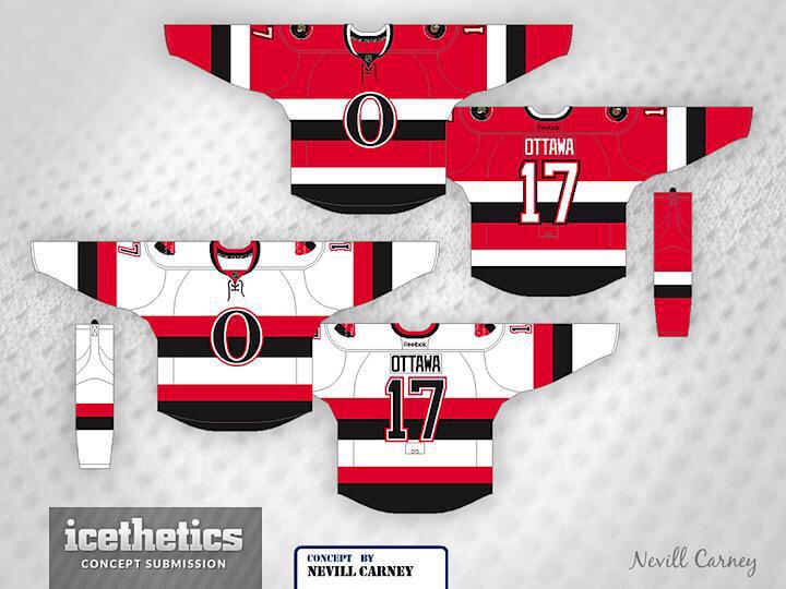
A lot of the most classic logos are letters
Look at:
Boston Red Sox, Bruins
New York Yankees
Chicago Bears
Green Bay Packers
Cincinnati Reds
Philadelphia Phillies
Atlanta Braves
SF Giants
LA Dodgers
Countless NCAA teams
Im not a fan of the habs logo honestly
If you keep going with the centurion as the main there will be a conintual need to update it, as we have seen.
I can't really agree here. Even the most classic logos have a strong design, or logo element to them. The =O= is just simply that, a big black letter. It works as paying tribute to that particular era, but a main crest needs more IMO.
The Bruins have the spoke, Habs have the letter-within-a-letter thing, the Flames have... flames, etc. I'm not saying we have to stick with the Centurion theme (although I do quite like it), but the =O= is just too simple to even be recognizable if you were to put it anywhere other than the heritage jersey itself.
As for continual updates, that's more of bad organizational branding decisions rather than the product of any particual theme IMO.
FlapjackSilver
Registered User
I can't really agree here. Even the most classic logos have a strong design, or logo element to them. The =O= is just simply that, a big black letter. It works as paying tribute to that particular era, but a main crest needs more IMO.
The Bruins have the spoke, Habs have the letter-within-a-letter thing, the Flames have... flames, etc. I'm not saying we have to stick with the Centurion theme (although I do quite like it), but the =O= is just too simple to even be recognizable if you were to put it anywhere other than the heritage jersey itself.
As for continual updates, that's more of bad organizational branding decisions rather than the product of any particual theme IMO.
I kind of agree. The O is definitely the way to gO.
However, I know what you mean about the lack of detail.
What about the O with some sort of peacetower mockup inside? Similar to the shoulder patch.
Sun God Nika
Palestine <3.
- Apr 22, 2013
- 19,923
- 8,283
Do you guys think the Sens gonna respond to the outrage or just hope time lets it slide and make people forget about it/give up?
QuietOnTheFront
@QuietOnTheFront

Alternatively, something like this?
I'm late to this party. But yes to all of this. Someone contact Sens marketing, this should be our anniversary patch!!

Filatov2Kovalev2Bonk
Effortless sexy.
Alternatively, something like this?
This is incredible and should be the official logo.
And a return to the 2D logo as well would be great.
Back in Black
All Sports would be great if they were Hockey
Alternatively, something like this?
Not sure about the red one, but.......

DrunkUncleDenis
Condra Fan
- Mar 27, 2012
- 11,820
- 1,682
These Are The Days
Oh no! We suck again!!
Yo expansion bros! Just shouting out and giving some love towards next season. Good luck to you guys.
Ttracer*
Guest
Yo expansion bros! Just shouting out and giving some love towards next season. Good luck to you guys.
You need it more than us
Last edited by a moderator:
DrunkUncleDenis
Condra Fan
- Mar 27, 2012
- 11,820
- 1,682
Yo expansion bros! Just shouting out and giving some love towards next season. Good luck to you guys.
Thanks brah!
Hey, since you're here.. you guys re-branded a few years ago, got any tips on how to force management's hand on this issue?

Sun God Nika
Palestine <3.
- Apr 22, 2013
- 19,923
- 8,283
That red jersey is horrid. Nice patch, though.
I dunno bro.
Obviously in the pik it looks bad, beige and red don't go together but I am curious to see how that would look like in actual material.
DrunkUncleDenis
Condra Fan
- Mar 27, 2012
- 11,820
- 1,682
I dunno bro.
Obviously in the pik it looks bad, beige and red don't go together but I am curious to see how that would look like in actual material.
I think you'd have to change the beige to white for it to work at all, and the name bar white and the letters black. Unsure how the final product would appear.
HavlatMach9
streamable 3rah1
L'Aveuglette
つ ◕_◕ ༽つ
Here's the beat version I've seen so far
That looks pretty gosh darned perfect to me, as long as we were going with the O.
Nac Mac Feegle
wee & free
- Jun 10, 2011
- 34,902
- 9,319

These Are The Days
Oh no! We suck again!!
Thanks brah!
Hey, since you're here.. you guys re-branded a few years ago, got any tips on how to force management's hand on this issue?
The fans didn't really do anything. Vinik just suddenly announced we were going to change our logo, our jersey, our arena... EVERYTHING and we had no choice in the matter. It looked like the love child of the Red Wings and Maple Leafs and fans overwhelmingly rejected it. It was the most dull, boring, uninspired design ever laid eyes on in Tampa sports history. Vinik and co was more than delighted to tell us "Hey man that's our new look now. Deal with it." It was OVERWHELMINGLY rejected by fans and media.
Father Lightning himself Phil Esposito (who was the hero that forced management's hand) hated it so much that went to the highest law in the Lightning land and got us to change the uniform by adding black trim around the numbers and adding the lightning bolt on the pants. Needless to say the trim was a subtle but necessary improvement and the lightning bolt on the pants finally made the design bearable. The only improvement Phil didn't get his way on was the victory stripes under the armpit.
All I can say is unless you guys have a very influential insider I think the fans may be screwed with whatever the brass thinks looks good despite fan opinion. Because if it weren't for Phil we'd have plain white numbers and a plain white stripe on our pants.
It was fun being black and silver. I ****ing HATE being blue because "it's a classic look." Classic is so goddamn boring and uninspired. The one thing I've learned to tolerate out of our whole new design is the gatorade logo because it looks so sharp against the color black.
If nothing else works just riot like Vancouver does.
These Are The Days
Oh no! We suck again!!
You need it more than us
Right in the feels dawg.... right in the feels. **** just got real and I'm too tired to do a damn thing about it.
Ttracer:1
AlwaysSunnyinTampa: 0
BOOO!!!
ChocolateLeclaire
Registered User
Right in the feels dawg.... right in the feels. **** just got real and I'm too tired to do a damn thing about it.
Ttracer:1
AlwaysSunnyinTampa: 0
BOOO!!!
I'd ignore him TB fan....everyone else here does. The rest of us ain't got no guff with the Lightning and their fans.
These Are The Days
Oh no! We suck again!!
Here's the beat version I've seen so far
Wow that's sharp. Really unique, really nice. Kinda reminds me of the old German Empire flag.
These Are The Days
Oh no! We suck again!!
I'd ignore him TB fan....everyone else here does. The rest of us ain't got no guff with the Lightning and their fans.
Same here except I still have beef with Marty Havlat for 2005... that **** was just not fair. He had like 7 goddamn goals and like 12 points in 5 games!!
I went and checked... 6 goals 4 assists. Still hate him!
Ad
Latest posts
-
 Rumor: Rumours & Proposals Thread | Previous Poll Punted, Pristine Prospect Procurement Poll Pinned
- Latest: Took a pill in Sbisa
-
