
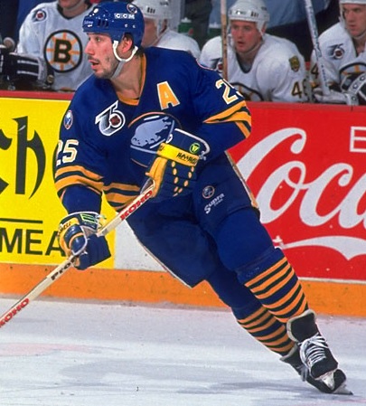
I care more about the original striping on the waist and socks.
I'd also like the primary or a secondary logo on the shoulders as well.

I'd also like the primary or a secondary logo on the shoulders as well.
Do we already know for sure that the 3rd jersey isn’t royal blue? (I’m legitimately asking)
I think a statistician who can incorporate this new logo, past track record, franchise incompetence and PR tone deafness as variables in the equation would conclude this with a reasonable level of scientific certainty.Do we already know for sure that the 3rd jersey isn’t royal blue? (I’m legitimately asking)
Honestly, the dark jersey doesn't do much for me. I like the royal blue, but I think there is too much of it. That white one is gorgeous, though. Brings back memories of when I first started paying attention to the Sabres. (I didn't really get into them until the AGH years, but I have memories before that.)I care more about the original striping on the waist and socks.
I'd also like the primary or a secondary logo on the shoulders as well.
I didn’t know that, thanks.Third jerseys have to have main color scheme colors. According to the bylaws of the league. Unless given proper notice. Though, I'm not sure how the Kings got away with the purple throwbacks.
Our 40th anniversary 3rd jersey was royal though, and royal was not in the color scheme then. Unless a rule changed?Third jerseys have to have main color scheme colors. According to the bylaws of the league. Unless given proper notice. Though, I'm not sure how the Kings got away with the purple throwbacks.
Third jerseys have to have main color scheme colors. According to the bylaws of the league. Unless given proper notice. Though, I'm not sure how the Kings got away with the purple throwbacks.
05-06 was the best Sabre team period.
The lovefest for the original jerseys is so boring.
The 96-06 jerseys were the best.
And BTW 96-97 (division title), 97-98 (ECF), 98-99 (cup final), 00-01 (the deepest Hasek led Sabre squad his entire tenure here that should have won the cup that year), and 05-06 (most complete and funnest Sabre team EVER) is what is associated with the black and red. One freakin bankrupt season and the Rigas going away for 02-03 does not "claim" association with that jersey scheme over the teams I listed above.

 Inigo Montoya should be the mascot. It would help diversify the fan base.

05-06 was the best Sabre team period.
The lovefest for the original jerseys is so boring.
The 96-06 jerseys were the best.
And BTW 96-97 (division title), 97-98 (ECF), 98-99 (cup final), 00-01 (the deepest Hasek led Sabre squad his entire tenure here that should have won the cup that year), and 05-06 (most complete and funnest Sabre team EVER) is what is associated with the black and red. One freakin bankrupt season and the Rigas going away for 02-03 does not "claim" association with that jersey scheme over the teams I listed above.
Take a look at this page and then decided which uniform colors, logos, and design are the best.
Buffalo Sabres Logos - National Hockey League (NHL) - Chris Creamer's Sports Logos Page - SportsLogos.Net
It's helpful to see them all on the same page.
My choice: the original Royal/Gold/White with the correct striping and necklines.. Hands down! 1st runner up 2006/07 alternates.
I also like the 25th yr anniversary logo much better than the 50th.
I had a lot more hope, optimism and time back then too.......
Biron changed his profile picture to him in one of those, and surprisingly, the design has improved with age.I've always mused that the old Butter Knife thirds might look sharp in Royal Blue and Gold.
See left lol.I would love to see the black and red buffalo logo in blue and gold.
I love the current set honestly.Even though I think the royal blues would look a whole lot better, the navy/gold combo still is good. If they tweaked the navy to make it "pop" a little bit more, I think the sweaters would look really good.
Reference the Sabres instagram post with Jack, Sam and VO that was put up in the Skinner thread. They look real sharp like that.
I love the current set honestly.
Sounds pretty sick honestlychatter on twitter that the sabres' 50th anniversary get up will be white jersey, white pants, white gloves, with gold as a secondary color. no mention of blue at all, let alone royal blue
this isn't coming from people with checkmarks, but yeah...we'll see soon enough
chatter on twitter that the sabres' 50th anniversary get up will be white jersey, white pants, white gloves, with gold as a secondary color. no mention of blue at all, let alone royal blue
this isn't coming from people with checkmarks, but yeah...we'll see soon enough
