
New York Islanders: Reverse Retro Jersey: Fisherman is back!
- Thread starter xECK29x
- Start date
You are using an out of date browser. It may not display this or other websites correctly.
You should upgrade or use an alternative browser.
You should upgrade or use an alternative browser.

Wanderson
Registered User
- Aug 1, 2011
- 4,347
- 1,908
- May 17, 2011
- 60,465
- 9,772
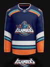
The Sharks and Kraken have cornered the market on teal and Adidas probably got direction from the NHL/Islanders to shy away from the color because of that.It could've been so much better, they really dropped the ball on this one.
Still, the concept with Barzal above is better and more teal would have been better. It definitely could have been worse though.
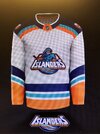
I wish it was these...

Wanderson
Registered User
- Aug 1, 2011
- 4,347
- 1,908
Not sure if serious, that’s the worst NHL jersey… ever.The Sharks and Kraken have cornered the market on teal and Adidas probably got direction from the NHL/Islanders to shy away from the color because of that.
Still, the concept with Barzal above is better and more teal would have been better. It definitely could have been worse though.
I wish it was these...
The Wahligator
Registered User
These are nice as hell, wish there was a little more teal though. I’m sure they’ll sell quite nicely.
gordie43
Registered User
- Nov 21, 2008
- 1,091
- 539
Is the lighthouse on the jersey? When they originally came out that was the only part of the jersey everyone seem to like.
Mr Misunderstood
Loser Point User
Lights911
Registered User
PK Cronin
Bailey Fan Club Prez
- Feb 11, 2013
- 34,250
- 23,615
For those of you wanting a closer look, here are a few images. I didn't notice the teal in the stick at first. It looks a lot better close up because the colors are really popping out but I think it could've been better still.


Lame Lambert
Fire Lou
- Mar 5, 2015
- 21,249
- 15,693
The Lighthouse
Registered User
- Aug 1, 2011
- 2,846
- 2,359
Could be worse, but absence of the lighthouse is a bit puzzling. Not bad overall.
doublechili
For all intensive purposes, your nuts
- Apr 11, 2006
- 18,655
- 15,026
Funny, but if they did that jersey with the regular round "NY" logo on the front I'd vote it as the team's best 3rd jersey ever, like by far. The view from the back is great. I'm just turned off by the clashing of the straight "Islanders" text in the front logo and the other curvy lines. But I think it will sell well overall.
BTW, do you all know that the original Isles' jersey was designed by Roy Boe's wife (who was a fashion designer) and had a green and black color scheme? I've never seen a depiction of it (maybe doesn't exist anymore) but would love to....
BTW, do you all know that the original Isles' jersey was designed by Roy Boe's wife (who was a fashion designer) and had a green and black color scheme? I've never seen a depiction of it (maybe doesn't exist anymore) but would love to....
PK Cronin
Bailey Fan Club Prez
- Feb 11, 2013
- 34,250
- 23,615
Funny, but if they did that jersey with the regular round "NY" logo on the front I'd vote it as the team's best 3rd jersey ever, like by far. The view from the back is great. I'm just turned off by the clashing of the straight "Islanders" text in the front logo and the other curvy lines. But I think it will sell well overall.
BTW, do you all know that the original Isles' jersey was designed by Roy Boe's wife (who was a fashion designer) and had a green and black color scheme? I've never seen a depiction of it (maybe doesn't exist anymore) but would love to....
Looks like she pitched a design but it was rejected because the politicians wanted blue and orange. I'd love to see that concept as well, f***ing politicians ruin everything.
doublechili
For all intensive purposes, your nuts
- Apr 11, 2006
- 18,655
- 15,026
Makes sense they'd want the Nassau colors, I guess. I remember talk of naming the team the Long Island Ducks. I kind of wish they did that, actually. But then Anaheim wouldn't have a team!Looks like she pitched a design but it was rejected because the politicians wanted blue and orange.
PK Cronin
Bailey Fan Club Prez
- Feb 11, 2013
- 34,250
- 23,615
Makes sense they'd want the Nassau colors, I guess. I remember talk of naming the team the Long Island Ducks. I kind of wish they did that, actually. But then Anaheim wouldn't have a team!
I agree, there was a rush job happening with everything surrounding this team at the time it seems. They could've benefitted from more time.
WangMustGo
Registered User
Could be worse, but absence of the lighthouse is a bit puzzling. Not bad overall.
Thats my biggest gripe. I would have loved a royal blue instead of the navy blue as well. Overall id give them a solid B.
PK Cronin
Bailey Fan Club Prez
- Feb 11, 2013
- 34,250
- 23,615
Funny, but if they did that jersey with the regular round "NY" logo on the front I'd vote it as the team's best 3rd jersey ever, like by far. The view from the back is great. I'm just turned off by the clashing of the straight "Islanders" text in the front logo and the other curvy lines. But I think it will sell well overall.
BTW, do you all know that the original Isles' jersey was designed by Roy Boe's wife (who was a fashion designer) and had a green and black color scheme? I've never seen a depiction of it (maybe doesn't exist anymore) but would love to....
Quickly done, but something like that?
Silent Cal
Registered User
- Apr 8, 2016
- 64
- 16
I’ve never seen a team f*** up every jersey assignment given to them like ours. This includes our current home jerseys.
The striping on these RRs are a complete fail. So many great ideas out there…
The striping on these RRs are a complete fail. So many great ideas out there…
Attachments
NYI365
Let's Go Islanders!
Very crude quick Photoshop done but the addition of lighthouse shoulder patches makes this look complete imo. I'll probably end up buying a few patches and putting em on mine when I purchase one.

doublechili
For all intensive purposes, your nuts
- Apr 11, 2006
- 18,655
- 15,026
Yeah - with the colors a match I'd like that. I get that they're trying to do something different though....
Ad
Upcoming events
-

-
-
 2024 NHL Draft Lottery Team that wins #1 pick - PICK ONLY ONE TEAMWagers: 9Staked: $11,200.00Event closes
- Updated: