New York Islanders: Reverse Retro Jersey: Fisherman is back!

xECK29x

Moderator
Sponsor
Jul 19, 2006
18,019
11,509
Deer Park, NY
On Sunday, the Vancouver Canucks new Reverse Retro jersey was leaked. Although there are no pictures of what the New York Islanders new Reverse Retro third jersey will look like, it appears it will be one that will have some Islanders faithful jumping for joy, while others will be feeling the complete opposite.

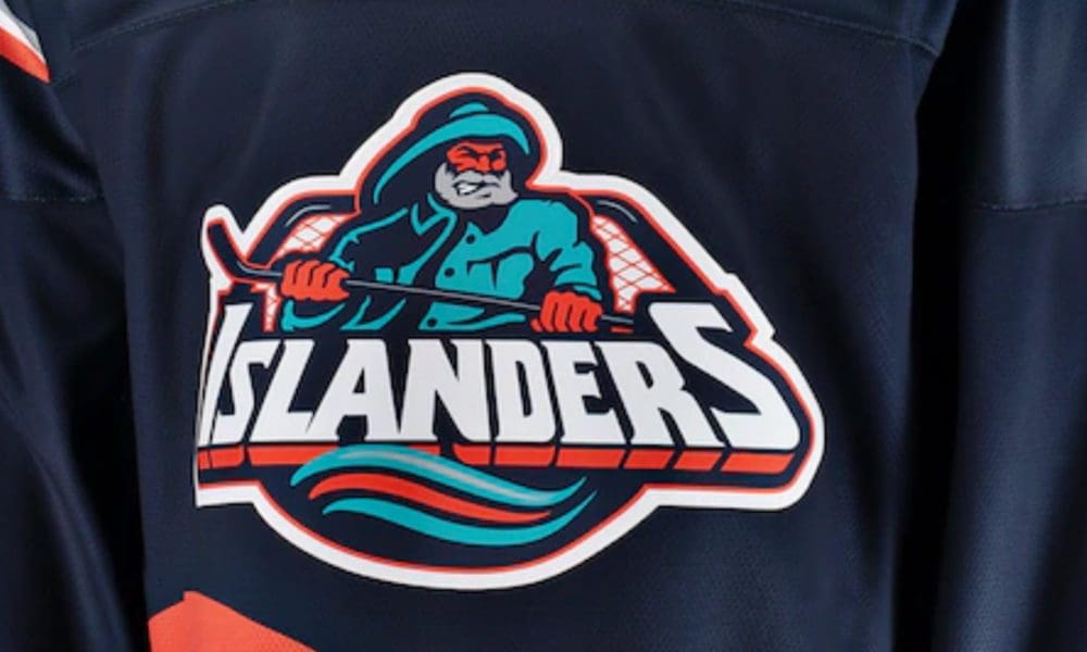
NYI Hockey Now is hearing from league sources that the New York Islanders 2022-23 Reverse Retro jersey will encompass the Fisherman logo and style.

These new uniforms will not be exact replicas of the jersey set the New York Islanders wore from 1995-1997, with a different, darker shade of blue, believed to be kind of similar to the Islanders’ 2019-20 Reverse Retro color.


Update 8/8:

 
Last edited:

Thrasymachus

Registered User
Jul 1, 2018
5,214
6,715
A hot button issue for sure.

I am firmly PRO fisherman, personally. All that goofy retro stuff is back in style nowadays, and while yes, the jersey is associated with painful memories, it is also pretty thematic for the isles as a design, and I like the idea of "reclaiming" it so to speak and finally exorcising the ghost. If the isles had a successful season with this Jersey as an alternate, I think it would go a long way to killing off the distaste some have for the fishstick.

Worth noting I am not from Long Island, so I never had to personally deal with the sting of that time. I know others who did feel different, and I can appreciate that.

Last thought - there is a decent demand for fisherman merch, I think it would be a wise decision for the Islanders to at least officially release licensed merch even if they don't use the fisherman for jerseys.
 

MJF

Hope is not a strategy
Sep 6, 2003
27,070
19,809
NYC
Last thought - there is a decent demand for fisherman merch, I think it would be a wise decision for the Islanders to at least officially release licensed merch even if they don't use the fisherman for jerseys.
I'd bet the demand is driven predominantly by a group aged 25-35 who were too young to realize that the Fisherman was embarrassingly stolen from a box of supermarket frozen fish. It was emblematic of an era where the Islanders did nothing right, on or off the ice.
 

Volek25

Registered User
Apr 23, 2007
1,864
81
St. Louis, MO
I think most of us old enough remember just how brutal this whole fisherman nonsense was when it came out. I'll never forget being 12 years old, playing for some 83 select PAL team and I clearly remember being in the locker room at the Rinx after a skate kids announced it was going to be "some fisherman guy with a beard or something" - not only was the team horrible horrible horrible, but changing the classic Islanders logo and jersey to this ridiculous fisherman and teal color scheme was just an extra shot to the gut. Talk about the dark days of that time.

Nowadays - I'm knocking on 40, it's that vintage look, nostalgia for better or worse and a memory of a time. I've grown to like the fisherman jersey (still have the white Wendel Clark one my aunt gave me back then). It's a look back to the past and a good laugh, but make no mistake, this is not the NY Islanders - it's gimmicky, its fun now, so I'm cool with whatever they do to promote this old logo, but back then in those cold dark mid late 90s, it was beyond horrible, sad and embarrassing to our already embarrassing team on/off the ice at that time - at least for me. So cheers to the old fisherman - wear it proudly.
 

Mr Misunderstood

Loser Point User
Apr 11, 2016
10,092
11,073
Charlotte, NC
I'd bet the demand is driven predominantly by a group aged 25-35 who were too young to realize that the Fisherman was embarrassingly stolen from a box of supermarket frozen fish. It was emblematic of an era where the Islanders did nothing right, on or off the ice.

Tack on 25-35 year old hockey fans that are not fans of the Isles but just think that it is a cool / unique / retro jersey. They are interested in the jersey itself only, with no allegiance to the team nor the knowledge of what it meant (detrimentally) to the franchise.
 

xECK29x

Moderator
Sponsor
Jul 19, 2006
18,019
11,509
Deer Park, NY
I'd bet the demand is driven predominantly by a group aged 25-35 who were too young to realize that the Fisherman was embarrassingly stolen from a box of supermarket frozen fish. It was emblematic of an era where the Islanders did nothing right, on or off the ice.
Stop yelling at clouds, who cares. It's a cool looking logo and jersey and people will buy it.
 

MJF

Hope is not a strategy
Sep 6, 2003
27,070
19,809
NYC
Stop yelling at clouds, who cares. It's a cool looking logo and jersey and people will buy it.
Stop being a sheeple.

Tack on 25-35 year old hockey fans that are not fans of the Isles but just think that it is a cool / unique / retro jersey. They are interested in the jersey itself only, with no allegiance to the team nor the knowledge of what it meant (detrimentally) to the franchise.
Apparently it doesn’t matter as long as it’s cool looking.

Or so I was just told. :rant:
 

seafoam

Soft Shock
Sponsor
May 17, 2011
60,465
9,772
They could wear these for all I care, I just want them to win.

1658768153965.png


These have been my favorite...

1658768240903.png
 
  • Like
Reactions: Axe Man

doublechili

For all intensive purposes, your nuts
Apr 11, 2006
18,655
15,027
If they minimize or eliminate the teal and straighten out the wavy lines, it might be okay as a 3rd jersey. The front of the jersey always looked goofy with the wavy lines and the straight logo. The back of the home white jersey was actually gorgeous IMO.
 

Richie Daggers Crime

Boosted 9 times double masked they/them
Mar 8, 2004
17,352
6,634
Boise
If they minimize or eliminate the teal and straighten out the wavy lines, it might be okay as a 3rd jersey. The front of the jersey always looked goofy with the wavy lines and the straight logo. The back of the home white jersey was actually gorgeous IMO.
The weird thing about the wavy lines was that they looked hand drawn. These were not precise things.
 
  • Like
Reactions: Riseonfire

doublechili

For all intensive purposes, your nuts
Apr 11, 2006
18,655
15,027
The weird thing about the wavy lines was that they looked hand drawn. These were not precise things.
I never noticed that but just checked and yeah, they look hand drawn. Weird.

No matter what anyone thinks of those jerseys, they can't possibly be the worst addition to the franchise in 1995.

1658770846405.png
 

seabass45

Registered User
Jan 12, 2007
8,164
1,441
Putting aside the logo and whatever, they really seem to be confused about the concept of reverse retro. The whole point is flipping the color scheme, and I'd imagine in our case we'd go with an orange, but last season we went with a darker blue and that's rumored in this case too.

I'm personally ok with this but I'd also dig it if they made a classic with an orange base instead of white or blue.
 

MJF

Hope is not a strategy
Sep 6, 2003
27,070
19,809
NYC
Putting aside the logo and whatever, they really seem to be confused about the concept of reverse retro. The whole point is flipping the color scheme, and I'd imagine in our case we'd go with an orange, but last season we went with a darker blue and that's rumored in this case too.

I'm personally ok with this but I'd also dig it if they made a classic with an orange base instead of white or blue.
I was fine with the teal and silver, fine with the waves and the font of the numbers/nameplates. They just needed to ditch the fisherman in favor of the Lighthouse.
 

seabass45

Registered User
Jan 12, 2007
8,164
1,441
I was fine with the teal and silver, fine with the waves and the font of the numbers/nameplates. They just needed to ditch the fisherman in favor of the Lighthouse.
That would be fine too, I think there have been mockups with that idea in mind.
 
  • Like
Reactions: MJF

Thrasymachus

Registered User
Jul 1, 2018
5,214
6,715
I'd bet the demand is driven predominantly by a group aged 25-35 who were too young to realize that the Fisherman was embarrassingly stolen from a box of supermarket frozen fish. It was emblematic of an era where the Islanders did nothing right, on or off the ice.
Times change, that demographic is only going to grow, and the # of people who remember / care about those embarrassing old days will only decrease.

And who cares about the fishstick thing? It isn't like rangers fans still dont call us that, logo or no.

It feels kind of gatekeepy at this point. Let the younger generation enjoy the logo. You don't see too many Ducks fans cringing at their Disney inspired retro jerseys.
 

Big L

Grandpa’s Cough Medicine is 180 Proof
Feb 7, 2013
12,106
6,517
CT
Copying the logo from a box of frozen fish, or any other brand logo, is an abomination. It is not cool, nor has it ever been. I’m surprised Gortons did not/does not sue for trademark infringement.
 

MJF

Hope is not a strategy
Sep 6, 2003
27,070
19,809
NYC
Times change, that demographic is only going to grow, and the # of people who remember / care about those embarrassing old days will only decrease.

And who cares about the fishstick thing? It isn't like rangers fans still dont call us that, logo or no.

It feels kind of gatekeepy at this point. Let the younger generation enjoy the logo. You don't see too many Ducks fans cringing at their Disney inspired retro jerseys.
The Ducks came into the league named after a Disney movie. This is different.

But I get your drift. Us old elephants are supposed to step aside and let the next generation have their fun. Give the buyer what they want.
 

Mr Misunderstood

Loser Point User
Apr 11, 2016
10,092
11,073
Charlotte, NC
Times change, that demographic is only going to grow, and the # of people who remember / care about those embarrassing old days will only decrease.

And who cares about the fishstick thing? It isn't like rangers fans still dont call us that, logo or no.

It feels kind of gatekeepy at this point. Let the younger generation enjoy the logo. You don't see too many Ducks fans cringing at their Disney inspired retro jerseys.

Well that is because those jerseys are amazing. Traditional like the Hawks, Wings or B's? Of course not, but they're still awesome.

To this day, I still want a Paul Kariya Mighty Ducks of Anaheim jersey, it's glorious in all of it's 90's stupidity.

1658780214170.png
 

Ad

Upcoming events

Ad

Ad