
Good joke.

you say that, but im pretty sure the NHL will have its way.
$$$
Good joke.
so, anyone think Lou will actually cave to using chrome logo?
What's there to release? We're wearing throwbacks and have seen the patch already.
Rangers not only release their jersey, but do it in a fun way: http://t.co/WoXt16LCGb
I hate the Rangers, but that was pretty good.
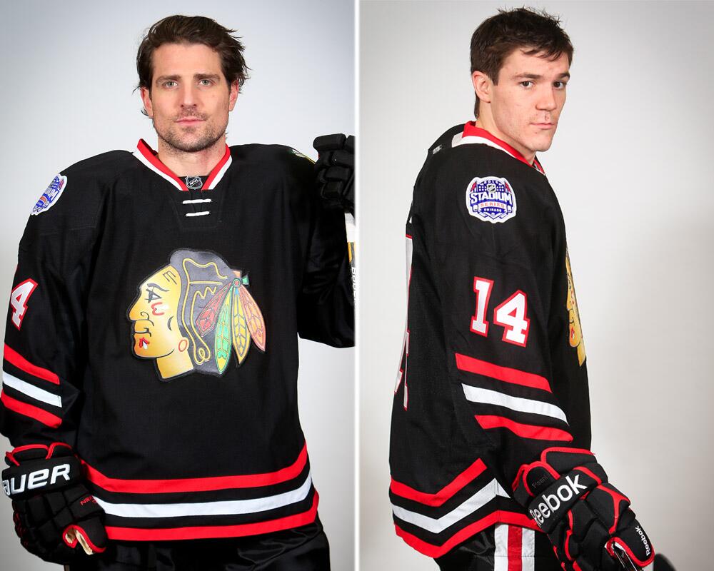
And in other news the Blackhawks basically bring back the black pre-Winter Classic alternates, but in the weird Stadium Series template.
from the nhl store's facebook

i think the devils have shirts with a chrome logo, but no player numbers. i really think they will just use the regular retros. and maybe a slight chrome.
The whole chrome idea reminds me of those stupid whiskey commercials starring Claire Forlani.
There are so many people are involved in bringing an idea like this to completion. You think someone along the line would maybe consider how dumb all of it is.
from the nhl store's facebook
i think the devils have shirts with a chrome logo, but no player numbers. i really think they will just use the regular retros. and maybe a slight chrome.
Chrome was a bad choice.
Someone said it on the main board, but it looks really cheap.
if i had it my way....90s era jerseys
fishsticks for the islanders.


So I just got an e-mail from shop.nhl.com to buy stadium series jerseys. They showed a Devils jersey... and it's the original red white green... NO chrome.

Would the present day Devils uniform look better with a vertical red or red/white stripe on both sides of the shorts?
So I just got an e-mail from shop.nhl.com to buy stadium series jerseys. They showed a Devils jersey... and it's the original red white green... NO chrome.
The Ducks jersey is beyond awful. An orange blob of **** with a few small stripes on the sleeves? How long do you think it took to draw up this masterpiece? And the Islanders, well what else do you expect from that train wreck franchise? You know it's very bad when you can genuinely look back fondly on the fisherman jerseys. As awful as those things were, they pale in comparison to some of the **** they've worn since.
I'm all for teams taking an opportunity to play in some retro gear, but even that has been beaten to death. There is nothing special about it any more. Once a year like how NJ does it keeps it as fresh as possible. It gets stale fast when you keep rolling them out too often. You might as well change back to them if that's the case.