New Jersey/Pad Concepts

Jan 25, 2013
308
0
Missouri
I know a little earlier on in the year there were some rumors about the Blues getting a face-lift on their jerseys. Has anybody heard anything recently? I thought it was kind of interesting that the Blues chose their alternates for their draftees. Rumors were that the rounded logo would possibly take over as the main one.

Link with Rutherford quote: http://frozennotes.com/2014/are-the-blues-going-to-roll-out-new-jerseys.html

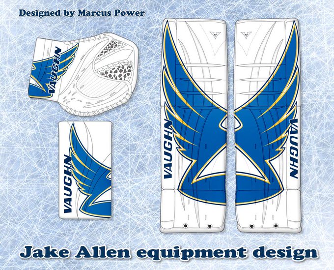
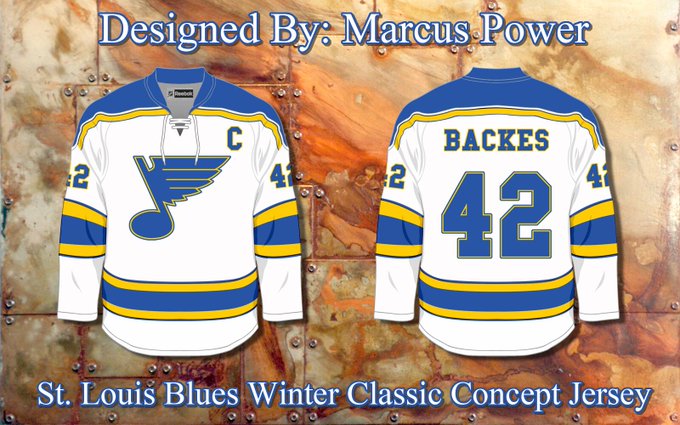
I found a guy on twitter who did some pretty cool mock-ups:

BrBaFSMCEAA1mKH.jpg:small


BppPqXxCYAA3a4w.jpg:small


BrCJS3ICAAEJUi9.jpg:small
 

Falco Lombardi

Registered User
Nov 17, 2011
23,176
8,467
St. Louis, MO
I'll post a couple I've seen that I've liked:

A take on the clown jerseys...minus the red:
KyleNicol-STL.png


White version of our 3rds...

ZcyuF9n.png


And perhaps my favorite
TristanMani-STL.png
 

superblues

:sarcasm: implied
Oct 29, 2011
3,736
0
I love Love LOVE the white third, but it needs a bluenote on the chest, not a circle. The non-red clown jerseys are kinda cool in a 90s sort of way. Someone should start photoshopping all the old images of the red ones to look like these. History will thank us for it.

I don't understand the "circle crest" trend, especially for the Blues. We have one of the most iconic, and more importantly, most recognizable logos in all of professional sports. Why minimize that branding with a cookie cutter circle on the front? In this usage, the circle is as generic a logo as one can get. Please don't misunderstand, it makes a great shoulder patch, especially because the Blues don't have a secondary logo. But for the chest, it should rightly be restricted to third jersey use only.
 

elkranio

Registered User
Jan 4, 2014
3,066
4,554
I don't understand the "circle crest" trend, especially for the Blues. We have one of the most iconic, and more importantly, most recognizable logos in all of professional sports. Why minimize that branding with a cookie cutter circle on the front? In this usage, the circle is as generic a logo as one can get. Please don't misunderstand, it makes a great shoulder patch, especially because the Blues don't have a secondary logo. But for the chest, it should rightly be restricted to third jersey use only.
Oh my god, so much this.
 

SweetyV

Registered User
Apr 27, 2014
577
0
I thought it was an interesting choice to have the prospects wear the thirds as well.
 

STL BLUES

Youth Movement
Oct 22, 2013
3,168
2,173
Up-Nort
Ditch the stupid circle crest -- it's not a Blue Note and is cluttered with detail. The dark blue is boring.

I want flashy colors so give me more yellow and bright blues. :blues
 

timtindall

Registered User
May 10, 2013
726
0
st. louis
http://www.icethetics.co/blog/2014/6/23/nhl-jerseywatch-2014-june-edition
BLUES

THE FACTS
Reebok listed new home and road jerseys for St. Louis back in January. Lending further credence to this was a question posed by a reporter to the team owner.

Jeremy Rutherford, St. Louis Post-Dispatch, wrapped up a Q&A with Blues owner Tom Stillman on the subject, published June 2.

Q: There’s been fairly strong speculation that the Blues will change their uniforms for the 2014-15 season. Is that true?
Stillman: Yeah, I think we should break some news right here. We’re going back to the clown uniforms (with the diagonal red stripes that the Blues wore in the mid-1990s).
Q: Your smile tells us that you’re kidding about that. So is it true? Will there be a uniform change?
Stillman: Let’s talk about that another time.
Can't say I care much for Stillman's sense of humor. That's just downright mean. But seriously though, he sure didn't deny it, did he?

THE RUMORS
All right, new sweaters are on the way in St. Louis. So what do they look like? When we will see them? These are questions we can't answer yet. All I know is I'll be watching the draft on Friday just in case.

Given the current trends in hockey uniform design, the Blues are probably giving up their apron-string appearance for something a little more timeless. Prior to their Reebok overhaul, St. Louis had perhaps the best non-Original Six uniforms in the NHL.

If I had to put money on it, I'd say we see something more traditional this fall. Maybe it'll be a better fit with their superb third jersey.
Rumor has it this blue is lighter than it should be. Or can we blame it on computers?

By the way, another rumor floating around is that the Blues leaked a new, recolored version of their logo in the press release announcing their new CEO on June 16.

The claim is that the light blue is much lighter than it should be, not unlike the shade the team wore during the 1960s and 70s.

However, given the issues with varying digital color spaces and CMYK to RGB conversions, this sort of color shift is hardly uncommon on the web. And while the light blue may be lighter, the dark blue and yellow are as well. It's just not as obvious.

In-house graphic artists usually catch this sort of thing, but it is the summer and a lot of those jobs are seasonal. Or maybe somebody was on vacation.

Yes, it's entirely possible the Blues' next jersey will be a lighter shade of blue, but I wouldn't call this graphic the smoking gun.
 

BrokenFace

Registered User
Aug 15, 2010
1,571
1,735
STL
I'll post a couple I've seen that I've liked:


And perhaps my favorite
TristanMani-STL.png

I've seen this set before, and I think it's the most beautiful away-white I've ever seen. I would be elated if the Blues used something close to this for their away-white going forward. The home Blue needs the most work. I'm in favor of a lighter blue, brighter yellow, and no piping. After that, I think it's hard to mess up as long as they don't replace the Blue note with the circle crest. I'm also in favor of keeping the 3rd (circle crest included) pretty much the same.
 

superblues

:sarcasm: implied
Oct 29, 2011
3,736
0
And perhaps my favorite
TristanMani-STL.png

At first I liked this, but then it dawned on me that we'd have to change our name to the Buffalo Blues, or the St. Louis Sabres.

I'm ok w the color at the wrists, but the home has too much golden yellow at the waist. It wouldn't need a huge amount to tweaking to look right to me. A little more blue, a little less yellow and I think it would be much better.

Not sure I'm sold on the yoke on the whites, either. Seeing them both on a body would help.
 

SweetyV

Registered User
Apr 27, 2014
577
0
To add fuel to the fire, all Blues jerseys (except the 3rd) are 30% off on NHL.com
 

thedustman

Registered User
Jun 19, 2013
4,200
1,246
I'll post a couple I've seen that I've liked:

A take on the clown jerseys...minus the red:
KyleNicol-STL.png


And perhaps my favorite
TristanMani-STL.png


I like both of these for the most part, but I am really fond of the lighter blue (especially due to the speculational reasoning in that icethetics post).

I also would love to see the red again. NOT AS MUCH RED as there was in the clown jerseys... just something extremely small, like maybe the "C" and "A" captain letters in red. I'd also like to see what it would look like if the bluenote was the same blue as the rest of the jersey... it may look practice jerseyish, but I think it could be cool too
 

gumption

Registered User
Jun 28, 2014
215
0
St. Louis
goalie pads look awesome, but no jerseys that really catch my eye. i don't really like the yellow color choices used on any of the jerseys.

a concept i like is:
BrandonShures-STLset.png


i think maybe trying like a very dark blue or black even may look interesting. maybe a gray?
 

gumption

Registered User
Jun 28, 2014
215
0
St. Louis
^^^Totally against going darker myself.

HATE the idea of black or grey.

yeah, i can understand where you're coming from. i personally don't like the idea of bringing back the clown jerseys but with a different color scheme, or some older jersey design. we all know what we really need:

blues.jpg
 

DeuceNine

Like You Read About
Aug 6, 2006
815
205
Stymieville
I don't understand the "circle crest" trend, especially for the Blues. We have one of the most iconic, and more importantly, most recognizable logos in all of professional sports. Why minimize that branding with a cookie cutter circle on the front? In this usage, the circle is as generic a logo as one can get. Please don't misunderstand, it makes a great shoulder patch, especially because the Blues don't have a secondary logo. But for the chest, it should rightly be restricted to third jersey use only.

I commented on this from the outset. It was designed by FH, which means hockey people were only tangentially involved. The main design team probably included 20-something women and 50-something guys, both of whom treated the project as any other. It's lazy design and a cop-out.
 

Ad

Upcoming events

Ad

Ad