
Svechhammer
THIS is hockey?
- Jun 8, 2017
- 24,279
- 89,197
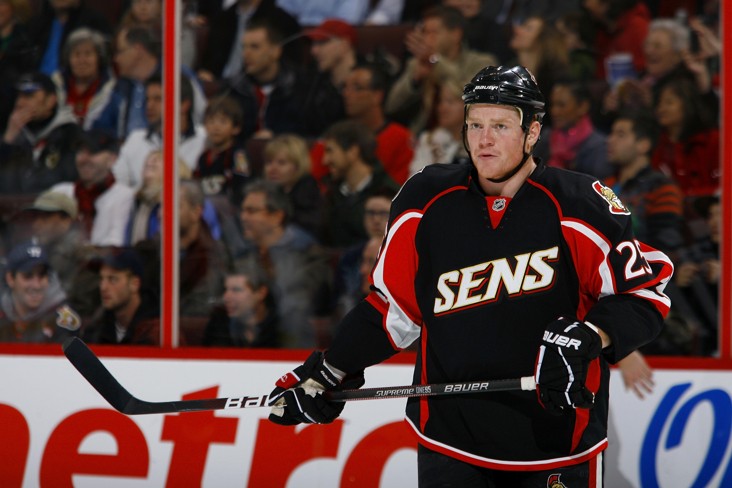
The lack of cohesion is apparently by designWith all the jerseys side by side, it really highlights the lack of coherence between all 3 jerseys.
The lack of cohesion is apparently by designWith all the jerseys side by side, it really highlights the lack of coherence between all 3 jerseys.
With all the jerseys side by side, it really highlights the lack of coherence between all 3 jerseys.
I would still have preferred a black wordmark, just to make the warning flags in the C stand out. The way it is now, they just get washed out, much like the warning flag stripe. A little too matchy-matchy for my tastes.If they were hell bent on using the word mark, this is as good as it was going to get.
It would be better with the secondary logo, but then it wouldn’t be the secondary logo anymore.


In case anyone was wondering about the Captaincy patch
Where the hell are they going to put the Stanley Cup Finals patch on them in the spring?
In case anyone was wondering about the Captaincy patch
Where the hell are they going to put the Stanley Cup Finals patch on them in the spring?
Oh shit, we're gonna be the first team to wear patches like a tramp stamp at the NHL levelLower left. Duh.
Oh god the f***ing Mooterus
This and the Bolts jersey didn't age very well, and most people knew they wouldn't at the time. I think our new jersey will be looked at as the same in the future. It's not an offensive design, it just lacks creativity and is bland.
At least they didn't try to be too bold and create something like these:

In case anyone was wondering about the Captaincy patch
Where the hell are they going to put the Stanley Cup Finals patch on them in the spring?

With all the jerseys side by side, it really highlights the lack of coherence between all 3 jerseys.

With all the jerseys side by side, it really highlights the lack of coherence between all 3 jerseys.
Actually, I think the 3 different jerseys is clever. And I do like the flags in the C on the away jersey; it is reinforcing a brand they're increasingly using, so.
I'm upgrading from "meh" to "not bad".
So would you say they are dysfunctional? Makes sense!
I don't really care 1 bit about jerseys, but have learned that unless you are the Swamp Rabbits, you can't design one that is universally liked.
I saw someone on another site nominate us as the Redneck RangersMaybe we should just swap brands with the Swamp Rabbits.
