Hurricanes Stadium Series jerseys leaked

summer tooth

Registered User
Aug 10, 2020
2,100
1,336
So cool looking - I could picture Douglas Hamilton wearing one and making a big slapper right into the net :nod:
 

ACLEVERNAME

schadenfreude
Jan 6, 2010
6,282
4,777
I like it. I also like the neon Dallas thirds. I fully support the move to loud chel 'create a team' style jerseys. I can't wait for goalies to start wearing mismatched, non team colour pads.

I'm not even joking.
 

DudeWhereIsMakar

Bergevin sent me an offer sheet
Apr 25, 2014
15,691
6,754
Winnipeg
The only ugly part of this jersey is the numbers on the arms. Other than that it's not a bad jersey, better than having CANES on the front of an away jersey which Carolina should get rid of.
 

zar

Bleed Blue
Sponsor
Oct 9, 2010
7,167
6,736
Edmonton AB
Same premise as the Oiler's alternates... they are both brutal.
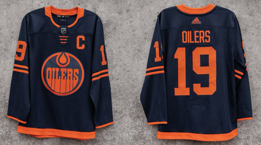
oilers-new-jersey-composite.jpg
 

DonM

The Industrial Revolution and its consequences
May 18, 2015
780
1,328
I like it. I also like the neon Dallas thirds. I fully support the move to loud chel 'create a team' style jerseys. I can't wait for goalies to start wearing mismatched, non team colour pads.

I'm not even joking.

Why are you the way that you are?
 

STHLM

Registered User
Jun 30, 2017
104
141
Stockholm
Dont get why teams go for these dark, minimalistic jerseys. Stars, Oilers, Flyers, Lightning, now Hurricanes (if theyre real). Super boring imo
 

Big McLargehuge

Fragile Traveler
May 9, 2002
72,188
7,742
S. Pasadena, CA
What’s up with the obsession with black dominating hockey jerseys?

The worst trends of the 90s are popular again. BFBS Black For Blacks Sake...black jerseys sell the best, so every marketing department gets the same idea. Red is visual shorthand for aggression and danger, so every marketing department gets the same idea.

At least the colors make sense for the Canes (hurricane flags are those colors), but taking the white out completely wrecks any semblance of balance and I despise dark on dark numbers with a light outline, but we don't even get that here. This is just a mess...as is every two-tone jersey without white. Even when the colors do contrast well it looks like shit without any white to provide some sort of pop or outline (see: Penguins gold Stadium Series jerseys...the current gold alts are neither great nor popular, but that slight bit of white made them a bit more tolerable and easier to read in motion).
 
Last edited:

Roboturner913

Registered User
Jul 3, 2012
25,853
55,526
the only thing I like about it is the italicized font - but I don't feel like the italics fit for a stadium series look either.

Would've loved something in red with cream-colored accents and the "CANES" diagonal lettering from the current away set with the third jersey logo on the shoulders.
 
  • Like
Reactions: HTFN

TheDawnOfANewTage

Dahlin, it’ll all be fine
Dec 17, 2018
12,313
17,985
Red rum red rum
Boy those jerseys sure look dumb

..except I actually kinda like em, but that didn’t rhyme.
 

JianYang

Registered User
Sep 29, 2017
17,983
16,483
Dont get why teams go for these dark, minimalistic jerseys. Stars, Oilers, Flyers, Lightning, now Hurricanes (if theyre real). Super boring imo

I think the black and red works for Carolina. I've just never been been a fan of their logos, whether it's the storm flag or the eye of the hurricane.

I will say though that the storm flag looks fine as a side patch.
 

Del Preston

Registered User
Mar 8, 2013
63,171
78,954
Same premise as the Oiler's alternates... they are both brutal.

oilers-new-jersey-composite.jpg
Love the video that was released of the designer creating these and talking about how they preserve the tradition of an Oilers uniform. :shakehead
 
  • Like
Reactions: shello

HTFN

Registered User
Feb 8, 2009
12,293
10,981
the only thing I like about it is the italicized font - but I don't feel like the italics fit for a stadium series look either.

Would've loved something in red with cream-colored accents and the "CANES" diagonal lettering from the current away set with the third jersey logo on the shoulders.
This exact template with red where the black is, and cream where the red is would be pretty hot.
 

JarvisFunk

Registered User
Apr 1, 2012
2,142
1,517
Saskatoon
So they ripped off the Dallas thirds, who ripped off the Oilers thirds, who ripped off Team North America. Excellent and innovative design.
 

Svechhammer

THIS is hockey?
Jun 8, 2017
23,946
88,145
If this is the jersey, I don't hate them. As a one off for a Stadium Series game, where we've typically had some really off the wall concepts, this is actually relatively tame.

I'm just glad its actually a Hurricanes jersey, and not another Whalers cashgrab
 

Ad

Upcoming events

Ad

Ad