Rumor: Coyotes rebranding to Kachina head logo

GiveAFlyingPuck

Boring hockey aficionado
Sponsor
Jun 19, 2011
10,281
7,479
NW Valley of the Sun
I saw way too much purple and organs for my liking. Hopefully if they’re just moving to the head, it’s not to the purple jerseys. Those are cool occasionally, not everyday.

Intestines and lungs, not the best look. ;)

The constant rebranding gets tiresome and reeks of we're really not sure of what we want the team to be. Let this be the last rebranding for the next 15 years.
 
  • Haha
Reactions: RABBIT

The Feckless Puck

Registered Loser
Sponsor
Oct 26, 2006
18,566
11,462
I love the shitting all over the howling logo.

I mean, it's not even a coyote.
Post automatically merged:

Intestines and lungs, not the best look. ;)

The constant rebranding gets tiresome and reeks of we're really not sure of what we want the team to be. Let this be the last rebranding for the next 15 years.

Honestly, though, this team hasn't been through a full rebrand since Gretzky did it back in the day. I wouldn't call what Meruelo has done "rebranding" - it's more an adaptation of an existing previous brand. I'd argue the same about the Roadrunners.

A top-to-bottom rebrand would have been nice to accompany the transition out to Tempe, but I doubt it'll happen.
 

RemoAZ

Let it burn
Mar 30, 2010
11,154
7,496
Glendale, Arizona
The head will be cool for window decals. Can't wait to get an all white one for the back window of my truck. I had the howling coyote on my last truck. Hadn't bought one for my new one yet because the full body doesn't really work for an all white decal (both white trucks).
 
  • Like
Reactions: Grimes

Jormungandr

Registered User
Aug 14, 2002
3,855
1,990
Ohio
Am I the only one who watches that video and doesn’t think “we’re rebranding to the Kachina head logo”?
 

ParisSaintGermain

Registered User
Jan 19, 2004
5,421
1,734
Hoping that it is just not about the head, the colours, the logo as nice as they are.

Hoping that it is about everything else in there.

Time will tell.

I can't say I am confident.

But this is a strong video. Can they follow it through?
 

Satan

MIGHTY
Apr 13, 2010
91,333
12,971
Lapland
1651613750568.png


neat
 

AZviaNJ

“Sure as shit want to F*** Coyote fans.”
Mar 31, 2011
6,689
4,334
AZ
Love it, love it, love it! Especially purple and burnt orange.............far enough away from Suns colors.
 

Heldig

Registered User
Apr 12, 2002
17,024
10,429
BC
Some very different colour combos. Love it. Have always preferred the head/mask as the primary logo.
 

Prarievarg

On the hype lokomotiv
Oct 27, 2016
1,983
2,638
Stockholm / Linköping
They need to use both because they head is so flexible for different design elements.
This! Looks good everywhere and very flexible. Love the full kachina but it's a bit too messy to use for everything. Let's make the head our primary logo and use the full kachina on our thirds. Never want to see the howling coyote again
 

rt

The Kinder, Gentler Version
May 13, 2004
97,492
46,440
A Rockwellian Pleasantville
What’s wrong with the current throwback logo?
It's too busy and all the colors are dark and muted and blend together.

I'm okay with leaving it alone because I like it but I can also see why they'd want to modernize it. The mistake they made in the last rebrand was abandoning it and sterilizing it. They can make it appeal to a broader audience without killing the spirit of the thing. And I think that video is a great example of one way they could potentially succeed in that effort.
 

Imaravencawcaw

Registered User
Jul 19, 2018
1,142
1,815
I feel like I heard somewhere that the NHL is doing another reverse retro jersey thing, maybe next year? They could make some beautiful jerseys with come of these new color combos.
 

rt

The Kinder, Gentler Version
May 13, 2004
97,492
46,440
A Rockwellian Pleasantville
I feel like I heard somewhere that the NHL is doing another reverse retro jersey thing, maybe next year? They could make some beautiful jerseys with come of these new color combos.
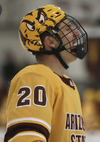
Our revers retro should be ASU colors with a Kachina and ASU sunburst logo mashup.

Use the maroon and gold. But use the Sunburst perimeter as the trim. Use the Two tone Kachina head only, and add it to our helmets for a completely unique look (like the Devils did with the sun devil for a short time).
 

Attachments

  • 98786A74-C180-441F-B252-3D74CA25EDD3.png
    98786A74-C180-441F-B252-3D74CA25EDD3.png
    798.2 KB · Views: 7
  • 46B9F65B-E714-476F-ACBD-2B8CC23811D1.png
    46B9F65B-E714-476F-ACBD-2B8CC23811D1.png
    2.6 MB · Views: 8
  • FF17C348-1935-428D-B82A-1A065E4322B3.png
    FF17C348-1935-428D-B82A-1A065E4322B3.png
    294.7 KB · Views: 8

Ad

Upcoming events

Ad

Ad