CharlesPuck
Registered User
So they just did the Rockies colors in the mountain template.
Also, they have two stripes around the mountains… why can’t they add a blue stripe to the normal away!!!
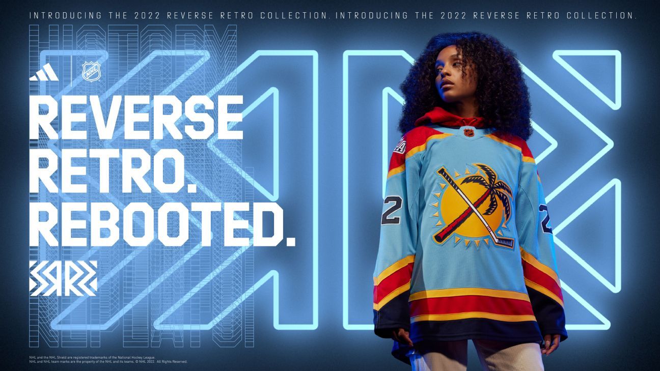

Ranking all 32 NHL Reverse Retro jerseys for 2022-23
The latest set of alternate looks is in. We run down the list, from the elite to the so-so to the head-scratchers.www.espn.com
To me... the best are Panthers, Sharks, Kings, Canucks, and Isles. Tampa's is BY FAR the worst.
Those Panthers sweaters are things of beauty. I love the Kings, Nucks and Yotes too.Ranking all 32 NHL Reverse Retro jerseys for 2022-23
The latest set of alternate looks is in. We run down the list, from the elite to the so-so to the head-scratchers.
To me... the best are Panthers, Sharks, Kings, Canucks, and Isles. Tampa's is BY FAR the worst.
It looks like they just took the old Wild jersey, tweaked the colors and slapped a C on it.
Panthers #1 and Jets #2 for me (I really like the colors).Ranking all 32 NHL Reverse Retro jerseys for 2022-23
The latest set of alternate looks is in. We run down the list, from the elite to the so-so to the head-scratchers.
To me... the best are Panthers, Sharks, Kings, Canucks, and Isles. Tampa's is BY FAR the worst.
Those Panthers sweaters are things of beauty. I love the Kings, Nucks and Yotes too.
I don't love the Avs one as much as I liked the Nords version. It was always going to be tough to top those though.
Nah.... the lighting flames on the sleeves, the wave on the bottom, and then the jagged numbers.... that jersey is just a F mess. Oilers logo sucks, but it at least isn't a disaster everywhere.I like the Stars' too.
That ugly ass Oilers logo should be dead last. It's worse than Tampa.
The retro jersey class of this year is definitely better than last year.I think I may buy a Panthers one. Those ones are so f***ing good.
If the cowards wore these during the games, it would shoot them to #1!