Canada's Hockey Uniforms - All of them!

greyraven8

Registered User
Dec 24, 2007
475
198
Thunder Bay, ON
EVCco: Great job in putting these pics all together.


Although I like the Canada Cup jerseys they wouldn't be my first choice.

1st choice would be any of the old style leaf with Canada below from the 1920's and 1930's. To pick one year I'll choose 1936 - partially for the leaf shape, partially as a 'homer' pick.
 

CpatainCanuck

Registered User
Sep 18, 2008
6,749
3,547
The 1964-1969 versions are very nice, classic designs. Most of the jerseys from the 70s-90s just seem too garish.

I liked the sweaters in 2010 too. The crest contains the art of Musqueam artist Debra Sparrow. This is actually an artistic style native to Vancouver, unlike the Olympic Inuksuk Logo which is native to the Inuit, thousands of miles away from Vancouver.

NR.122.09-en-detailed-leaf-crest.jpg
 
  • Like
Reactions: Guardian17

EVCco

Registered User
Dec 16, 2012
22
8
tlh.evcco.com
It seemed appropriate to resurrect this thread for the unveiling of Canada's 2016 World Cup sweater:

Team_Canada_Jersey_590x227.jpg

Source: http://content.****************/news/2016/03/Team-Canada-Jersey-590x227.jpg

Well, at least it's not as bad as the North American team jersey.

Due to the somewhat gimmicky format of this tournament I've been debating whether or not to consider this World Cup as a true Best-on-Best tournament for my TLH rankings page - and I might have to disqualify it based on some of the uniforms alone...

adidas_8-WCH-jersey-group-shot-770x470.jpeg

Source: http://3951-presscdn-28-25.pagely.n...3/adidas_8-WCH-jersey-group-shot-770x470.jpeg
 
  • Like
Reactions: Nerowoy nora tolad

Theokritos

Global Moderator
Apr 6, 2010
12,541
4,938
Wow, they're really trying hard to do everything wrong with this tournament. :facepalm:
 

Killion

Registered User
Feb 19, 2010
36,763
3,215
Wow, they're really trying hard to do everything wrong with this tournament. :facepalm:

..... :laugh: ... what?! .... I like those jerseys Theo, all but the Finnish version which is pretty lame. Coulda/shoulda done a way better job on that one but the rest of them?... very sharp. Especially Team NA, Team USA & Team Canada.... oh well, to each his own I guess.
 

rfournier103

Black & Gold ‘till I’m Dead & Cold.
Sponsor
Dec 17, 2011
8,418
17,294
Massachusetts
I love the '76 red Canada Cup jerseys. Those were sweet!!! I also love the '78 junior/CHL jerseys. I know they look like the '76 jerseys, but there's something eye-catching about the blue on the jersey.

Also, WHY does the United States ALWAYS have the worst hockey uniforms??? The 1980 and '84 designs were great, but they've been trying to improve on those ever since. Ugh...


To USA Hockey: STOP FUTZING WITH THE UNIFORMS. THEY WERE FINE THEY WAY THEY WERE. FOCUS ON WINNING MEDALS INSTEAD. Thank you.
 

revenantinruin

Registered User
Apr 6, 2022
1
0
Hi folks, there seems to be quite the brain trust here! Does anyone know anything about this jersey/player? Thanks so much!
 

Attachments

  • IMG_1330.jpg
    IMG_1330.jpg
    205.2 KB · Views: 3
  • IMG_1327.jpg
    IMG_1327.jpg
    139.7 KB · Views: 5
  • IMG_1328.jpg
    IMG_1328.jpg
    177.1 KB · Views: 5
  • IMG_1329.jpg
    IMG_1329.jpg
    127.5 KB · Views: 5

JianYang

Registered User
Sep 29, 2017
17,944
16,439
My favourite was probably the 96 world cup whites. I think they would look great today as well if you modernize the trimming on it.

2010 jerseys would look great if the logo was simplified from all the excess activity within the crest.

And of course, the 70s and 80s look are classics as well.
 

SealsFan

Registered User
May 3, 2009
1,716
506
Hi folks, there seems to be quite the brain trust here! Does anyone know anything about this jersey/player? Thanks so much!
Probably just a replica that someone bought and had customized with their name, the green is a giveaway. Probably was the envy of other beer league players...
 

Nerowoy nora tolad

Registered User
May 9, 2018
1,407
654
Gladstone, Australia
There is a remarkable resemblance of the Winnipeg Jets.2 jerseys to the 1948 Olympic jerseys worn by the Ottawa RCAF Flyers.

Just drop the red and replace with silver

Also makes me wonder if thats the origin of the Flyers team name, flyers as in flyboys? I cant think of any examples off the top of my head but I think the Flyers name predates the Philadelphia NHL team in a few minor league cities

Not by accident I guess, they've been building on the RCAF theme from the get-go:
Does the modern RCAF have an actual colour scheme as standard for jumpsuits, planes, etc?
 

Nerowoy nora tolad

Registered User
May 9, 2018
1,407
654
Gladstone, Australia
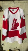
Just realizing now the team canada jersey my dad has had hanging in the closet since he last played pickup in the early 90s must be a 92 olympics version. I had always just assumed it was some sort of chinese knockoff

The 1964-1969 versions are very nice, classic designs. Most of the jerseys from the 70s-90s just seem too garish.

I liked the sweaters in 2010 too. The crest contains the art of Musqueam artist Debra Sparrow. This is actually an artistic style native to Vancouver, unlike the Olympic Inuksuk Logo which is native to the Inuit, thousands of miles away from Vancouver.

NR.122.09-en-detailed-leaf-crest.jpg

My favourite was probably the 96 world cup whites. I think they would look great today as well if you modernize the trimming on it.

2010 jerseys would look great if the logo was simplified from all the excess activity within the crest.

And of course, the 70s and 80s look are classics as well.

Obviously the native motifs wouldnt fit quite right for an Olympics outside Vancouver, but virtually everything about that jersey was pure kino. The proportions of the maple leaf are correct and recognizable as a maple leaf from all angles and distances (Looking at you 2016 abominations). The motifs inside the leaf are just right without being too visually distracting, and the slight golden piping is a nice touch that works well in retrospect while also being subtle enough that noone would notice it if team canada had lost. The piping and the extra whitespace around the logo also work to accentuate the shape of the leaf without getting too garish.

I dont really like including canada as text at the bottom, as I dont see the point of spelling it out for the small percentage of english speaking viewers who cant figure out what red and white and a maple leaf is supposed to signify, but the text has a good font (common to anything hockey canada from 1996-on) and its not ridiculously out of scale with the rest of the jersey.

If they could freeze that general 2010 jersey layout, kick the barf-inducing hockey canada logo into the trash can where it belongs, youd never hear me complain again. Its not that bloody hard to make a decent looking canada jersey.


Hurk

After a couple looks at it the bizarre shape of the logo isnt quite as bad as I first thought, but its still weird and visually distracting without having a good reason to look that way. Its like the sort of thing Id expect a four year old to come up with, not a professional designer.

And for the love of god, where does this bizarre impulse to add black to team canada jerseys come from. It isnt one of our national colours, and it doesnt go with anything that belongs on a team canada jersey besides the cheapass black pants & gloves theyve had to go with every year since... hockey canada took over. What a coincidence.

Its embarassing seeing the marquee team in every tournament they play in show up in the cheapest uniform setup possible. If every other country from Sweden to Russia to frigging Khazakhstan can find a way to work national coloured pants and gloves into the equipment budget, then I think hockey canada can shell out for red once in a while.

But anyways back to this ugly piece of whatever, the worst part of the inclusion of black in the design is they used it for the stripes, numbers, and names in the red version. I genuinely wonder if this thing was designed by somebody with minimal knowledge of the sport, as the names & numbers on that version are going to be a barely legible blur for anyone not watching a perfectly stationary player within 10-20 feet. That isnt just a sloppy aspect of the design aesthetically, its a functional problem for the officials working the game.
 

Nerowoy nora tolad

Registered User
May 9, 2018
1,407
654
Gladstone, Australia
On the other, other hand, I do notice that if you count the radiating lines in the 2022 logo, the total does come out to 8. Possibly a small clever reference to the host location.

My first instinct when I saw the new logo was that it looked like a heavily stylized chrysanthemum, but thats a national symbol of japan so...
 

buffalowing88

Registered User
Aug 11, 2008
4,313
1,754
Charlotte, NC
Those 63 WC jerseys are such a cool throwback. I'm in love.

To me the iconic jersey is probably the 87 or 88 iteration but I think the 2010 ones are great, too.

It's honestly a shame the US hasn't been able to consistently put together such nice uniforms. Canada has the best in international hockey, bar none.
 

Ad

Upcoming events

Ad

Ad