Cheddabombs
Status Quo
- Mar 13, 2012
- 24,739
- 31,559
Wouldn't it be funny if the reason they delayed announcing them was to get Marty to take the fall lol. Hmm the fans hate it... what if we say Marty helped design them, they can't hate it that much then!
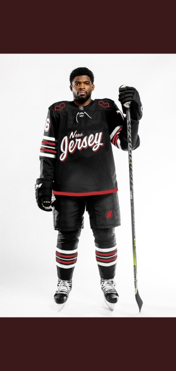
Honestly the full uniform doesn't look as bad as I thought it would. And at the end of the day if the team is winning I don't care at all.
Honestly the full uniform doesn't look as bad as I thought it would. And at the end of the day if the team is winning I don't care at all.