2020-2021 St. Louis Blues: Well, ****.

Status
Not open for further replies.

BlueKnight

Registered User
Apr 19, 2015
4,515
2,923
Alberta, Canada
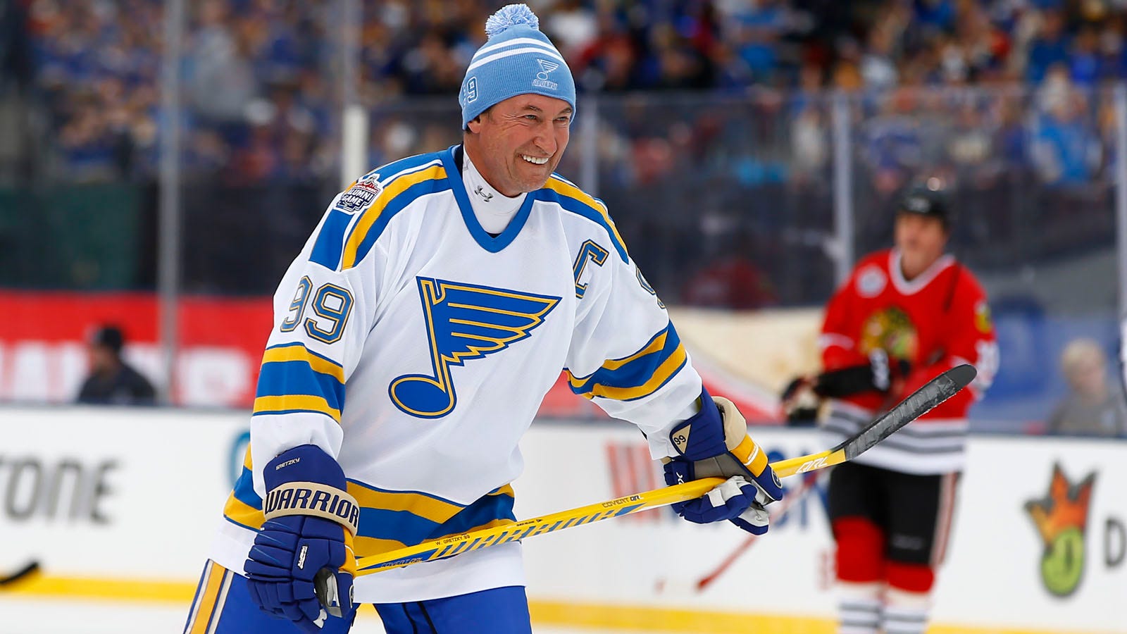
The only way to salvage it is with Blue helmets with matching socks and Blue pants but If they do something stupid like red pants and blue socks, then it’s going to look more like a clown show than before.

Blues should be burned immediately and the files deleted off all computers.
 
  • Like
Reactions: Ridge1982

MissouriMook

Still just a Mook among men
Sponsor
Jul 4, 2014
7,868
8,198
cut.jpg


Nothing we didn't really already know. Pretty horrendous, IMO.
I counted 10 out of the 31 jerseys in this program where the base color was either white or light grey, and that's excluding a handful that are yellow. Why couldn't we have had this?


67Blues

Got it for Bobby
Mar 22, 2013
4,551
4,894
Section 111
With the amount of crying about these new jerseys you’d think they were just announced as the new full time uniforms
They had a chance to do something that was interesting and reflective of the heritage of the team. They have now chosen the clown jerseys twice now, so obviously someone in the front office really likes this generation of jerseys. Hopefully they only break them out once or twice and then banish them to the 7th level of Hell where they belong.

In the end, this is a pure money grab from the NHL, Adidas, and the teams who hope to cash in on people buying jerseys. Personally I hope Adidas ends up eating a lot of inventory on this jersey to teach them a lesson to stay in their lane.
 

BlueKnight

Registered User
Apr 19, 2015
4,515
2,923
Alberta, Canada
With the amount of crying about these new jerseys you’d think they were just announced as the new full time uniforms

Blues have one of the best looking uniforms in all of sports minus the clown jerseys of the 90's and the edge uniform. This was their chance to do sonething innovative and reflective of their history. And they chose red twice now which absolutely ruins it.

Just wear it once and then burn them to hell where they belong.
 
  • Like
Reactions: Blueston

Ted Hoffman

The other Rick Zombo
Dec 15, 2002
29,257
8,686
I will get one. Because NO ONE ELSE WILL, and therefor it will be unique. That and I can wear it to the ugly Christmas sweater party.
-- Wow, that's one ugly Christmas sweater!
"Thanks, but it's an actual Blues jersey."
-- "Yeah, but ... like, not one they really wore in a game, right?"
"No, they really wore this in a game once.
-- :skeptic::skeptic::skeptic:

With the amount of crying about these new jerseys you’d think they were just announced as the new full time uniforms
DO NOT give anyone any ideas.
 

Ted Hoffman

The other Rick Zombo
Dec 15, 2002
29,257
8,686
If they were going to do something crazy with a reverse retro, take that white jersey from the Winter Classic and make it primary gold with a white logo and blue trim.

Would it have looked weird? Probably, but at least it would have fit the color scheme for the team.

If they did red and perhaps worked in some subtle imagery from the old St. Louis Eagles, ... OK, at least you have a reason for including red into the scheme and you get the throwback angle that brings in a long-forgotten part of St. Louis hockey history.

But to throw it in just because someone decided in 1994 that hey, I've got an idea - let's throw red in as a semi-primary color because once upon a time they did these weird diagonal stripe jerseys that had red on the bottom section, it'll be great once again! - ... :thumbd:
 
  • Like
Reactions: Vollie27

MissouriMook

Still just a Mook among men
Sponsor
Jul 4, 2014
7,868
8,198
If they were going to do something crazy with a reverse retro, take that white jersey from the Winter Classic and make it primary gold with a white logo and blue trim.

Would it have looked weird? Probably, but at least it would have fit the color scheme for the team.

If they did red and perhaps worked in some subtle imagery from the old St. Louis Eagles, ... OK, at least you have a reason for including red into the scheme and you get the throwback angle that brings in a long-forgotten part of St. Louis hockey history.

But to throw it in just because someone decided in 1994 that hey, I've got an idea - let's throw red in as a semi-primary color because once upon a time they did these weird diagonal stripe jerseys that had red on the bottom section, it'll be great once again! - ... :thumbd:
My son is adamant about this being a nod to the flag of the City of St. Louis, but I did drop him on his head a few times when he was a baby...
.
.
.
…and once when he was a teenager when we were playing WWE, but my wife doesn't know about that time so let's keep that between us.


pdavemoney

Registered User
May 29, 2019
174
195
If they were going to do something crazy with a reverse retro, take that white jersey from the Winter Classic and make it primary gold with a white logo and blue trim.

Would it have looked weird? Probably, but at least it would have fit the color scheme for the team.

If they did red and perhaps worked in some subtle imagery from the old St. Louis Eagles, ... OK, at least you have a reason for including red into the scheme and you get the throwback angle that brings in a long-forgotten part of St. Louis hockey history.

But to throw it in just because someone decided in 1994 that hey, I've got an idea - let's throw red in as a semi-primary color because once upon a time they did these weird diagonal stripe jerseys that had red on the bottom section, it'll be great once again! - ... :thumbd:
Exactly this. They should've used either a white jersey and yellow blue note with blue trimming
or
yellow/gold jersey with white blue note and blue trimming.
Damnit
 

Stupendous Yappi

Idiot Control Now!
Sponsor
Aug 23, 2018
8,602
13,427
Erwin, TN
I thought the red trimmed retros ended up looking pretty cool last year. I think these are interesting. Since it’s only a couple times per year, that’s pretty cool.

I think the Winter Classics home/away have other plans.
 

Bluesnatic27

Registered User
Aug 5, 2011
4,715
3,212
Well, I guess I'm one of the few that like the jersey. I don't think the red looks bad. The logo needs to go because that 80's logo looks like something you would find on legos.

Then again, I love the 90's jerseys, so either I have no taste or my morning strawberry-and-opium smoothies have finally destroyed my brain.
 

ItsOnlytheRiver

Registered User
Mar 25, 2010
970
887
Well, I guess I'm one of the few that like the jersey. I don't think the red looks bad. The logo needs to go because that 80's logo looks like something you would find on legos.

Then again, I love the 90's jerseys, so either I have no taste or my morning strawberry-and-opium smoothies have finally destroyed my brain.
80s logo? That was first worn in 89-90 and throughout the 90s. That’s the 90s logo and it’s awesome and it’s definitely not the problem with those jerseys.
 
  • Like
Reactions: Ted Hoffman

bleedblue1223

Registered User
Jan 21, 2011
51,909
14,886
We we one of the only teams that actually did a reverse color look? I couple others might count as well, but most look like previous existing retro jerseys with colors that they have previously worn or they went with a white/grey look.
 

Bluesnatic27

Registered User
Aug 5, 2011
4,715
3,212
80s logo? That was first worn in 89-90 and throughout the 90s. That’s the 90s logo and it’s awesome and it’s definitely not the problem with those jerseys.
No, that style of Blue note was first used in 1984. That would definitely constitute it as an 80's logo.

And I don't care what jersey it goes on because I think it looks goofy.

618470f022c93043.jpg
 
Last edited:

Ted Hoffman

The other Rick Zombo
Dec 15, 2002
29,257
8,686
I wouldn't have been fine if that had been the basis for our retro jersey.


Don't judge me for that. There's plenty of other things to judge me on; pick some of those instead.
 

ItsOnlytheRiver

Registered User
Mar 25, 2010
970
887
No, that style of Blue note was first used in 1984. That would definitely constitute it as an 80's logo.

And I don't care what jersey it goes on because I think it looks goofy.

618470f022c93043.jpg
We are arguing semantics, but the 80s version is sharper in the wings and also like you pointed out not the entire decade like it was used in the 90s. Also, the softer 90s version is the one I grew up with and I love it so there! I wish they would go back to the early 90s jersey at some point. Those teams weren’t as good as the late 90s, but there are some great memories in there. Hull destroying the league mostly.
 
Status
Not open for further replies.

Ad

Upcoming events

Ad

Ad