I can't decide which would look better.....gloves changed to match the pants, or pants changed to match the gloves. Does seem a bit off that they don't match, but whatevs. Still a good look overall.
Love the jersey, could be a solid alternate as I think it's better than their current home one. Not sold on the pants, but get the throwback element of them.
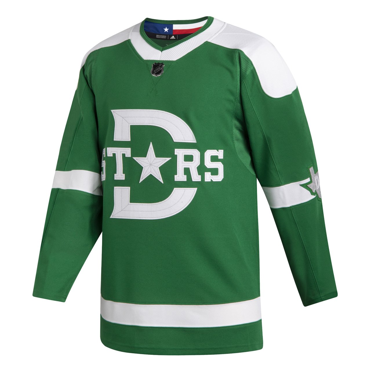
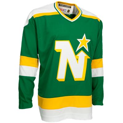
I like them a lot, much better than Nashville's jersey. With the white shoulder yoke, reminiscent of the North Stars 80s jerseys. I'm assuming that was intentional, add some yellow stripes and you are there.
Edit: someone do a mock up of the Winter classic with yellow stripes added!
I don't get how anyone is seeing North Stars at all except that they WANT to see it. The cut, the color, the stripes, everything is different. The only thing similar is a star (which is different in shape and position) and the team history.
Put it this way, if they were an original Dallas Bulls expansion team or something with no history in Minnesota, same exactly jersey with a bull head in place of the star, nobody would ever say "looks like the north stars"
I like them a lot, much better than Nashville's jersey. With the white shoulder yoke, reminiscent of the North Stars 80s jerseys. I'm assuming that was intentional, add some yellow stripes and you are there.
Edit: someone do a mock up of the Winter classic with yellow stripes added!
Early hockey pants were made out of plain or brown canvas. They started getting colors in the 30s. Personally, I love that they're doing the canvas color- if you're gonna do a vintage-esque uniform, show people what they actually looked like back in the day.
This site uses cookies to help personalise content, tailor your experience and to keep you logged in if you register.
By continuing to use this site, you are consenting to our use of cookies.


 GAME 6 - Saskatoon Blades @ Moose Jaw Warriors - Saskatoon Blades leads series 3-2Wagers: 3Staked: $1,525.00Event closes