Stars unveil Winter Classic jersey

TaLoN

Red 5 standing by
Sponsor
May 30, 2010
50,873
24,526
Farmington, MN
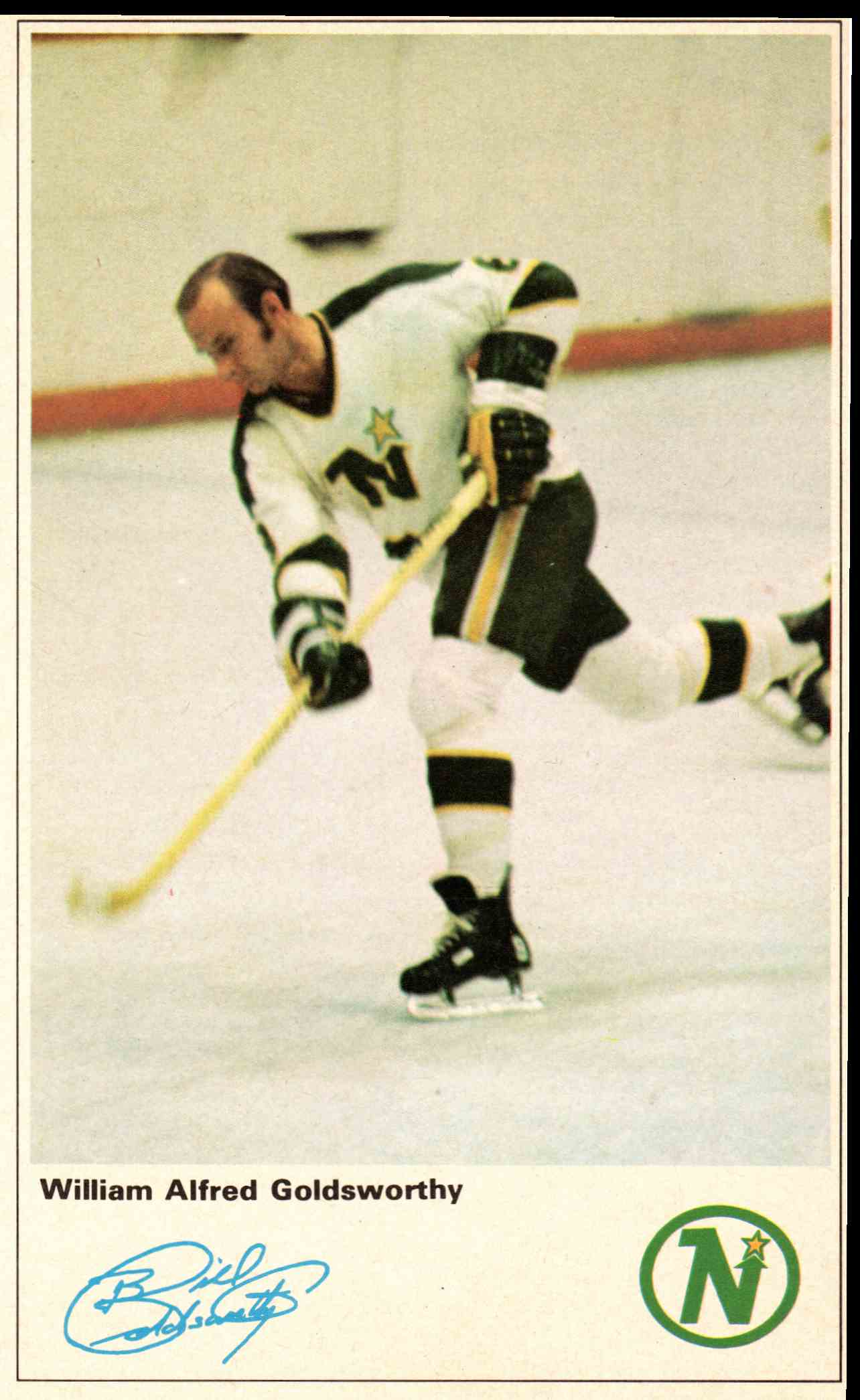
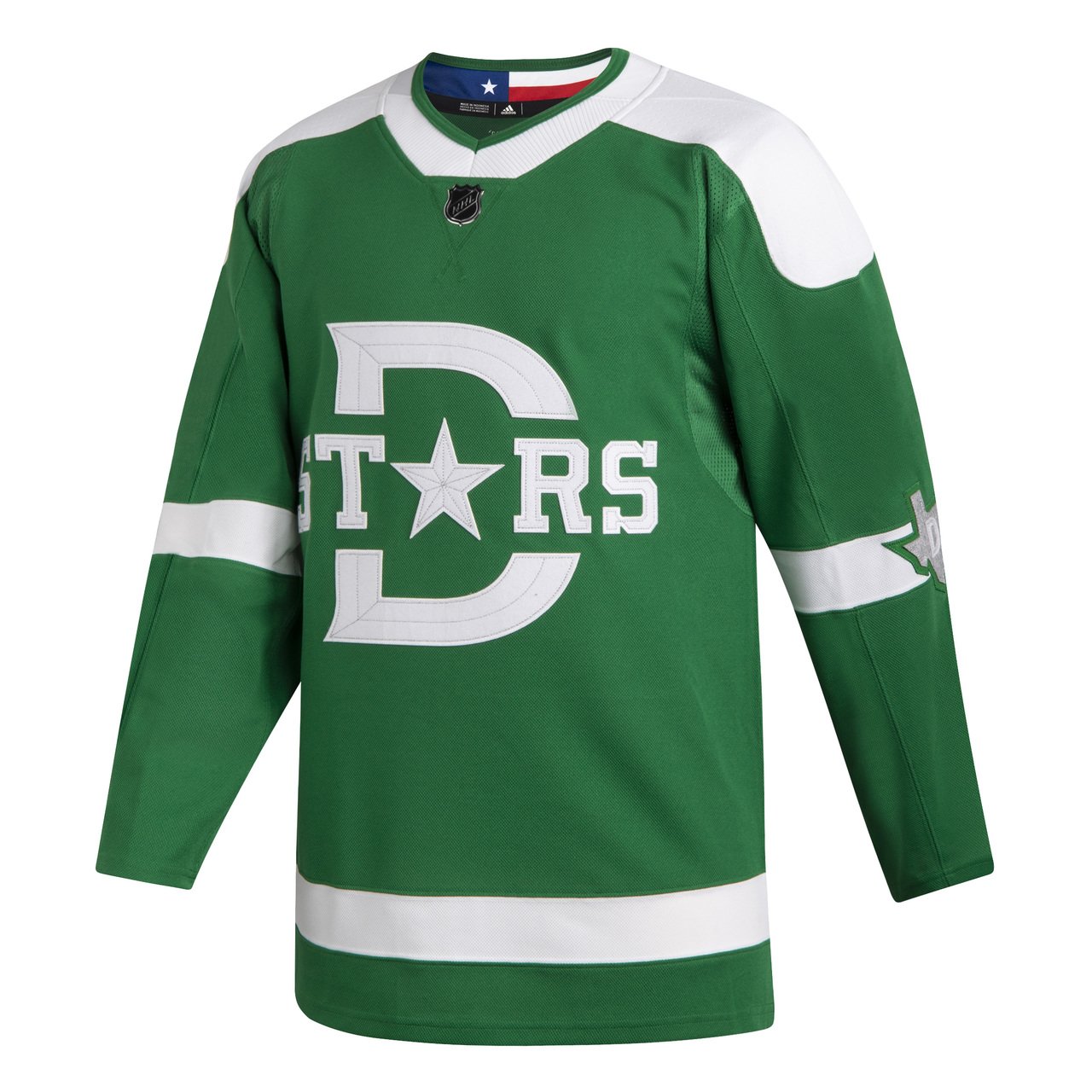
Look great! Not sure if the slight early North Stars jersey look is intentional but looks awesome.

6550174ffd624051b9c8d39f7fd408f0_front.jpg


Although I think it would be better without the "D" and just the "Stars" wordmark.
EIs4O_BWoAAZ8X2

8096_1968_mike_mcmaho.jpg

08d7e46cf9d4c89c.jpg

Again... not very similar

IMG_4826-e1565054909896.jpg


Here's a colored version of the Dallas Texans kit
And here we find something similar! Thank you for pointing out the true inspiration for the jersey!
No, the Predators think classic means something from the hockey history in the area, which is why they mimicked the Nashville Dixie Flyers uniforms of the 1960's. Seems "classic" to me.
Well said, both team's jerseys are inspired by local hockey history! The definition of classic!

Still don't know why so many dislike the Preds jersey.
 
Last edited:
  • Like
Reactions: AD Skinner

cptjeff

Reprehensible User
Sep 18, 2008
20,724
35,337
Washington, DC.
Second, that entire uniform is a REPRODUCTION which is not historically accurate. Those are 1920's era pants. The colour scheme is also incorrect.

The uniform is a reproduction, the equipment is authentic. You were thrown off by the lighting or filters from an old black and white photo. You were wrong, move on.

And canvas pants (not leather like you claimed earlier) were still common in lower levels of hockey (with correspondingly lower equipment budgets) after the NHL stopped using them, which was in the late 30s.
 

Chips

Registered User
Aug 19, 2015
8,371
7,112


There it is . Looks good to me.

Looks way better than just the jersey alone I’ll admit. Still not my favorite logo but overall looks good. Maybe I’d go the same yellow for the pants as the gloves, but I’d guess I have to see it to be sure. Oh well
 

Ad

Upcoming events

Ad

Ad