Oilers Darkening blue to navy for jerseys next year

the4thlinegrinder

Registered User
Jul 25, 2011
1,771
2,260
The Bench
That’s more of a...Shelbyville idea.
Whoa... a line has been crossed. :laugh:

Some people in this thread have been saying that they wish the Oilers would try something new (like the Spawn 3rd) rather than continually going with past designs. A green and gold jersey would be fresh as well as being a nod to the city’s sports history.
 

Oilers Propagandist

Relax junior, it’s just a post.
Aug 27, 2016
8,064
5,995
Edmonton, AB
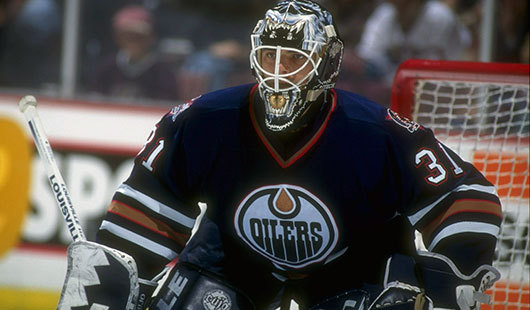
The Oilers wore navy blue for like 15 years and made a Cup finals in one. At least there's some history there.

Bright freaking neon orange though ... I'd say that's a bigger problem.
I agree with you, I just don't like navy in general though and realize my opinion is not representative of everyone. It's just too drab for me.

The pylons are too much but imo could be better with a lighter blue.
 

Zenos

Registered User
Oct 4, 2009
2,195
2,417
I dunno, seems kinda odd to not include Hamilton's 3 on the patch. I can understand why they did it, but don't necessarily agree. I mean obviously he wasn't a big part of the NHL-oilers (only a half season under his belt), but his number was still mothballed and they cared enough to put up his banner at Rexall (sometime around 2000, I remember being at the game) and later Rogers Place.

In the end, it's all just nitpicking, but the oilers were founded in 1971 and played their first game in 1972. Why not celebrate that entire history?

On another note though, do we know when yet when they'll wear these threads? If I had to guess, I'd say we see them don the new "throwbacks" for a home game each against Calgary, Vancouver, Winnipeg, and LAK (i.e.. our traditional Smythe foes).
 

Jamin

Registered User
Aug 25, 2009
4,924
778
Anyone with good photoshop skills wanna make an oilers jersey in Eskimo colors? It would be interesting to see what it would look like.

My perfect world would be drop the orange altogether. The 3rd jersey is copper n blue from 2006. The last couple away jerseys have looked really good so keep that. Make what they just showed as 3rds the home jersey.

Does anyone like the orange? Maybe when it was reebok but this adidas neon is just blah imo
 

Supermassive

HISS, HISS
Feb 19, 2007
14,612
1,090
Sherwood Park
Whoa... a line has been crossed. :laugh:

Some people in this thread have been saying that they wish the Oilers would try something new (like the Spawn 3rd) rather than continually going with past designs. A green and gold jersey would be fresh as well as being a nod to the city’s sports history.

It might look like they're stealing the U of A colours, rather than honouring their history. Would be cool to see some mockups, although my credit card balance doesn't want to see any more new jerseys.
 
  • Like
Reactions: the4thlinegrinder

Skar

Registered User
Jul 2, 2016
1,397
1,823
Anyone with good photoshop skills wanna make an oilers jersey in Eskimo colors? It would be interesting to see what it would look like.

My perfect world would be drop the orange altogether. The 3rd jersey is copper n blue from 2006. The last couple away jerseys have looked really good so keep that. Make what they just showed as 3rds the home jersey.

Does anyone like the orange? Maybe when it was reebok but this adidas neon is just blah imo
I really liked the reebok orange jerseys from the playoff run year. Maybe I'm just biased because we made the playoffs with those, but it just felt right to watch them play in that jersey.
 

Soundwave

Registered User
Mar 1, 2007
72,159
27,861
Well the Sportscheck "leak" from a few months back seemed to list two separate blue jerseys, I noticed it pretty much straight away:

DgKGUsQU8AA4PSG


There's a "3rd Jersey Blue" and a "Heritage Jersey Blue". Look at the last two listings specifically (Draisaitl and McDavid), there are two different listings for "Authentic" blue jerseys, one is a "3rd jersey blue" the other is a "Heritage" blue jersey.
 

ujju2

Registered User
Apr 9, 2016
9,647
6,500
Edmonton, AB
Nothing really important, but starting from 2:03 in this video from the 2017 playoffs, the changing lighting in the stands makes the jerseys change colour between the old colours and the new colours almost perfectly. It's really weird.

 
  • Like
Reactions: ConnorMcMullet

ConnorMcMullet

#12 Colby Cave
Jun 10, 2017
10,295
18,037
Nothing really important, but starting from 2:03 in this video from the 2017 playoffs, the changing lighting in the stands makes the jerseys change colour between the old colours and the new colours almost perfectly. It's really weird.


Haha that's true.

I think I prefer the new ones. The navy makes the whole thing pop out more.
 

Alberta

Registered User
Jul 20, 2005
1,710
18
I dunno, seems kinda odd to not include Hamilton's 3 on the patch. I can understand why they did it, but don't necessarily agree. I mean obviously he wasn't a big part of the NHL-oilers (only a half season under his belt), but his number was still mothballed and they cared enough to put up his banner at Rexall (sometime around 2000, I remember being at the game) and later Rogers Place.

In the end, it's all just nitpicking, but the oilers were founded in 1971 and played their first game in 1972. Why not celebrate that entire history?

On another note though, do we know when yet when they'll wear these threads? If I had to guess, I'd say we see them don the new "throwbacks" for a home game each against Calgary, Vancouver, Winnipeg, and LAK (i.e.. our traditional Smythe foes).

I mean, the patch specifically is for a 40th anniversary in the NHL and Hamilton barely played in the NHL. If they were doing, say, a 50th anniversary patch in 2022 to celebrate the entirety of the organization, by all means including him then.
 

ujju2

Registered User
Apr 9, 2016
9,647
6,500
Edmonton, AB


The Condors swapped their colors to the navy/bright orange scheme this year. I know a lot of people are happy to get the vintage look back here as a 3rd but I still really like the look of these personally. Would've been cool to see something like this as the 3rd.


Really, really don't like these. They look as bad as I expected. The orange shoulder yoke makes it horribly unbalanced. It would look much better without the shoulder yokes or orange cuffs, but the royal blue and classic orange is still my preferred look.
 
  • Like
Reactions: MessierII

Supermassive

HISS, HISS
Feb 19, 2007
14,612
1,090
Sherwood Park


The Condors swapped their colors to the navy/bright orange scheme this year. I know a lot of people are happy to get the vintage look back here as a 3rd but I still really like the look of these personally. Would've been cool to see something like this as the 3rd.

The Condors always trial a jersey the year before we get it, so this will hopefully be next year's home jersey. It looks sharp to me.
 

Del Preston

Registered User
Mar 8, 2013
63,171
78,954
Really, really don't like these. They look as bad as I expected. The orange shoulder yoke makes it horribly unbalanced. It would look much better without the shoulder yokes or orange cuffs, but the royal blue and classic orange is still my preferred look.
I'm not much of a fan either. They would like much nicer without the orange yoke and cuffs. Something similar to the 97-07 navys.
 
  • Like
Reactions: ujju2

Canada Drai

Dwemer Remix
Oct 4, 2017
3,248
3,156
I miss the flying gear and no-one will EVER convince me that it's not the best Oilers jersey of all time.

Sick of jerseys with a yolk. Guess we should start calling them eggs, not players.

In reality I am quite bored by the yoke design, we need freshness.
 

ujju2

Registered User
Apr 9, 2016
9,647
6,500
Edmonton, AB
I miss the flying gear and no-one will EVER convince me that it's not the best Oilers jersey of all time.

Sick of jerseys with a yolk. Guess we should start calling them eggs, not players.

In reality I am quite bored by the yoke design, we need freshness.

Disagree on all points. I loved the flying gear when I was younger and I still have a soft spot for it, but it doesn't represent the Oilers well. It would be decent if we were an early 2000s expansion team, which we are not. Oh, and the navy blue was too dark, looked black on the ice. The orange shoulder yoke and white-orange-white striping is iconic to the Oilers, should be kept.
 

Canada Drai

Dwemer Remix
Oct 4, 2017
3,248
3,156
Disagree on all points. I loved the flying gear when I was younger and I still have a soft spot for it, but it doesn't represent the Oilers well. It would be decent if we were an early 2000s expansion team, which we are not. Oh, and the navy blue was too dark, looked black on the ice. The orange shoulder yoke and white-orange-white striping is iconic to the Oilers, should be kept.

My idea of iconic as a 90's kid is dark blue , no yoke, badass oil rig worker. Rough, tough, blue collar badboy.

So pretty much the opposite of myself.

90s-edm-g-curtis-joseph.jpg
 

Ad

Upcoming events

Ad

Ad