
Maple Leafs Uniform and Jersey Concepts Thread
- Thread starter jlog3000
- Start date
You are using an out of date browser. It may not display this or other websites correctly.
You should upgrade or use an alternative browser.
You should upgrade or use an alternative browser.
I like the new logo. I also liked previous one, I started supporting Leafs because of it, it was such a beautiful logo.
And I really hope that the 3rd jersey will be in St. Pats colours, that would be fantastic, green jersey with white leaf logo.
And I really hope that the 3rd jersey will be in St. Pats colours, that would be fantastic, green jersey with white leaf logo.
Stephen
Moderator
- Feb 28, 2002
- 79,429
- 55,071
Okay, silly question, but what is this 'yolk' everyone is referring to on jerseys?
Shoulders.
Stephen
Moderator
- Feb 28, 2002
- 79,429
- 55,071
The veins are symmetrical? Coulda fooled me.
No, the Leafs logo isn't symmetrical and it doesn't have to be. People like to nitpick that, but if you look at most NHL logos, they aren't symmetrical designs.
KGL
Auston 3:16
- Sep 5, 2014
- 7,499
- 9

Mike1
Registered User
Loved that they went back to the older style logo. It should stay that way from now on & never be changed.
Le Cobra
Rent A Goalie
dubey
$$$$$$$*NICE*$$$$$$$ 69 in 79 $$$$$$$*NICE*$$$$$$$
Toad
Registered User
- May 18, 2013
- 137
- 4
Seriously, just copy this one. Done. Re-design finished, true Leafs identity recaptured. Don't mess around. Slap that big, classic, imposing, original 6 logo at centre ice and cleanse the ACC and Toronto of the losing era.


This is still my favourite concept...just update the logo and remove the shoulder leafs and there you have it, IMO.
LeafsNation75
Registered User
I think they look a lot like this hoodie they already sell.I hope the jerseys look something like these..


AngryScotsman
Registered User
This is still my favourite concept...just update the logo and remove the shoulder leafs and there you have it, IMO.
Agreed. Absolutely beautiful... I'd buy one of each right away
HellasLEAF
'93 to Infinity
- Sep 14, 2006
- 15,345
- 1,800
Agreed. No yolk at home, but yolk on the road. Though what I think they really need to do is go to a slightly lighter shade of blue like the Blue Jays have. That royal blue looks so much better on white than what we have now.
Ya I don't think they will adopt it, look at the shade of the blue logo, but I agree the royal blue with white would really pop, but the slightly darker shade has a more classy look.
Clark4Ever
What we do in hockey echoes in eternity...
This is still my favourite concept...just update the logo and remove the shoulder leafs and there you have it, IMO.
Those look fantastic.
Muston Atthews
Bunch of Bangerz
Seriously, just copy this one. Done. Re-design finished, true Leafs identity recaptured. Don't mess around. Slap that big, classic, imposing, original 6 logo at centre ice and cleanse the ACC and Toronto of the losing era.
Take ma money
Le Cobra
Rent A Goalie
Not a fan of the white shoulders
it'll grow on you. plus its better at hiding dandruff.
I meant the left one was perfection
HellasLEAF
'93 to Infinity
- Sep 14, 2006
- 15,345
- 1,800
Curious question.
But the logo displayed in the reveal video, and the logo that is on the site. I mean they are different no?
Which one is THE logo..
But the logo displayed in the reveal video, and the logo that is on the site. I mean they are different no?
Which one is THE logo..
Stephen
Moderator
- Feb 28, 2002
- 79,429
- 55,071
Curious question.
But the logo displayed in the reveal video, and the logo that is on the site. I mean they are different no?
Which one is THE logo..
They're not different. The one in the video is just shaded.
The Podium
Registered User
Seriously, just copy this one. Done. Re-design finished, true Leafs identity recaptured. Don't mess around. Slap that big, classic, imposing, original 6 logo at centre ice and cleanse the ACC and Toronto of the losing era.
Perfection
man, that stem is killing me, lol.. they should have done it like this:

Oh great... Thanks man. Now I have to see how much better a straight stem would look. It's such a minor thing but really bugs me.
This is still my favourite concept...just update the logo and remove the shoulder leafs and there you have it, IMO.


Last edited:
Man Bear Pig
Registered User
spidergoalie
Registered User

I will honestly be surprised if this isn't what the uniforms will be, and they look pretty great. (Except for the straight stem on the home sweater
") . That has to go!)
. That has to go!)I would like if they use the Winter classic as the third though.
I know it is sacrilege here, but the 67 is my least favourite logo.
hockeywiz542
Registered User
- May 26, 2008
- 15,956
- 5,018
if what the maple leafs introduced this week counts as a new logo, allow me to recommend a new musical group. They’re called the beatles. Discovered those mop tops myself. Lou lamoriello thinks they’ll be huge, too, if only they’d get some haircuts.
Giggles aside, let’s just agree that the leafs’ redesigned crest, which will be worn as their main insignia beginning next season, is about as original as a 1960s cover band. It smells of a time when players reached for a nutritious in-game snack known as a cigarette. It’s as fresh as your great-grandfather’s ear hair.
And it’s exactly, precisely, unquestionably what the maple leafs needed. The not-so-new logo, closely modelled on the oft-tweaked one the club wore from around the 1940s into the 1960s, is a redrawing of canadian classic, warm and fuzzy and familiar, with a touch of clean-lined modernity.
And it’s just the latest bit of evidence that the man who is in charge of the operation, team president brendan shanahan, has a deep and sophisticated understanding of the importance of embracing the right parts of the club’s past in the ongoing process of building its future.
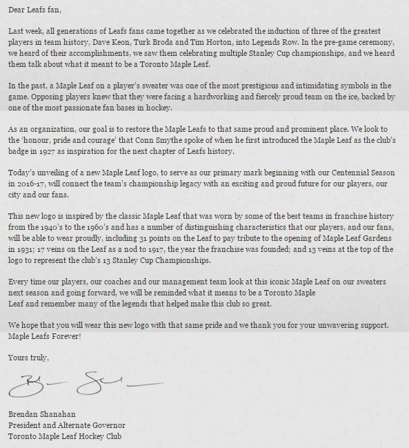
as shanahan noted in a letter to season-ticket holders explaining the change, the maple leaf was once “one of the most prestigious and intimidating symbols in the game.†it only makes sense for the maple leafs to take those formative parts of their history — the teams, say, that won five cups in eight years in the ’40s, and four cups in six years in the ’60s — and celebrate them prominently.
A radical makeover wasn’t in the cards, shanahan said, because “we’ve got too much respect for our history, for the people that built this organization — guys like teeder kennedy and syl apps and george armstrong.â€
the idea the leafs were beholden to the sweater they’d been wearing since 1970 was always hard to figure, especially considering how effusive players and fans became in recent years when the team wore throwback versions of their glory-days uniforms. The circa-1970 uniform has been worn by a long list of fine players, sure, but it has also been balled up and tossed on home ice in disgust. It has also been sported by some of the worst teams on the franchise’s ledger.
So give credit to shanahan for asking a simple question: Why did the leafs go away from a logo synonymous with success in thefirst place?
“i didn’t get a good answer,†shanahan said.
hockeywiz542
Registered User
- May 26, 2008
- 15,956
- 5,018
Le Cobra
Rent A Goalie
[nhl][/nhl]
noooooo hahaha
i'm all for a laugh. Homer gives us the 'butt' of the joke.

noooooo hahaha
Ad
Latest posts
-
 D Alfons Freij - Växjö Lakers HC J18, J18 Nationell (2024 Draft)
- Latest: MichaelFarrell
Upcoming events
-
 Game 4 Boston Celtics @ Indiana Pacers - Boston leads series 3-0Wagers: 1Staked: $1,857.00Event closes
- Updated:
-

-
 Game 3 Dallas Stars @ Edmonton Oilers - Series tied 1-1Wagers: 7Staked: $14,490.00Event closes
- Updated:
-
