Speculation: League-wide jersey reboot speculation [MOD: Jerseys now revealed]

lakewinnipeg

Registered User
Mar 27, 2017
76
0
That's my favorite part! Goes to show how subjective it is.


i dont think red #'s would be allowed. Redblacks said it was a major mistake on their part the 1st few seasons.

[mod]
 
Last edited by a moderator:

DowntownBooster

Registered User
Jun 21, 2011
3,202
2,414
Winnipeg
i dont think red #'s would be allowed. Redblacks said it was a major mistake on their part the 1st few seasons.

[mod]

I really can't see that being an issue with the NHL. The Calgary Flames have black numbers on their red jerseys and the Carolina Hurricanes have red numbers on their black alternate jerseys. Also, the New York Rangers have red numbers on their blue jerseys so it really seems like a non-issue for the Jets to have red numbers on blue jerseys. After all, it worked fine for them in the WHA which is what the Heritage Classic jerseys are based on.

:jets
 

YWGinYYZ

Registered User
Jul 3, 2011
28,480
7,117
Toronto
i dont think red #'s would be allowed. Redblacks said it was a major mistake on their part the 1st few seasons.

[mod]

These guys would probably disagree with you:

5743036_orig.jpg


They've had variations of this dating all the way back to the mid to late 1920's, such as this (from '29-34'):

Rangers04.png


These threads always tend to go the same way - graphic design and style is very, very subjective. As someone who's been in the graphics industry for 30+ years, I've found that opinions on almost any design run the gamut from love to hate - nature of the subject.
 

lakewinnipeg

Registered User
Mar 27, 2017
76
0
Red #'s are not allowed due to media and fan complaints. No team will do it.

The NYR has 3D numbers so its a bit different. NHL told teams about this years ago.
 

YWGinYYZ

Registered User
Jul 3, 2011
28,480
7,117
Toronto
Red #'s are not allowed due to media and fan complaints. No team will do it.

The NYR has 3D numbers so its a bit different. NHL told teams about this years ago.

Link? This is different than claiming it's a mistake, which was your original argument against the red numbers.

So: Red Wings? Flames? Hurricanes? NYR? Did they not get the note from the NHL?
 

Jeti

Blue-Line Dekes
Jul 8, 2011
7,141
1,683
MTL
I'd like to see a logo re-design. The jet doesn't even fit the maple leaf and the proportions are all wrong for a strong logo (i.e. the jet is too small so it lacks a central focus). It's not cohesive enough to look like one object and it lacks a single main object. It looks disjoint and the more you look the worse it gets.

Aside from that, pick a blue and stick with it. Two shades of the same colour is a weak low-contrast look. Only the Jets and Blues even try it and neither pull it off. I'm okay with red as a third colour but I'd prefer grey - dark grey with the lighter RAF blue would be cool.
 

DowntownBooster

Registered User
Jun 21, 2011
3,202
2,414
Winnipeg
Red #'s are not allowed due to media and fan complaints. No team will do it.

The NYR has 3D numbers so its a bit different. NHL told teams about this years ago.

If the NHL told teams about this years ago, how do you explain the Hurricanes alternate jerseys which are black with red numbers? :huh: If there is a white border around the red numbers I still can't see it being an issue.

:jets
 

nobody important

the pessimist returns
Jul 12, 2015
6,426
1,719
a quiet suburb
I've said it before (too lazy to find my old post), but my preferred design would have had the lighter blue as the primary colour and a "swoosh" logo along the lines of this.

2951307-fighter-jet-leaving-smoke-trail-Stock-Photo.jpg
 

Gm0ney

Unicorns salient
Oct 12, 2011
14,612
13,365
Winnipeg
st-louis-blues-third-jersey.png


Mike Keenan's best decision was refusing to dress the Blues in these. Should've won the Jack Adams just for that.
 

Huffer

Registered User
Jul 16, 2010
16,723
6,429

Not sure if this combo was the one I liked the best on the other thread (the one that had I think 6 different options of this similar theme), but it's an easy yes to this as a concept. They are absolutely stunning.
 

DowntownBooster

Registered User
Jun 21, 2011
3,202
2,414
Winnipeg
When you compare the jerseys in posts #62 & #63 it's easy to see why the one in post #62 appears more vibrant than the one in post #63. It's mainly because the colour of the stripes are separated (the red and white on the dark jersey and the blue and red on the white jersey) which allows each colour to stand out better.
 

Neuf

Leaving HFBoards for now
Dec 17, 2016
6,217
9,290
Please oh please oh please oh please oh please oh please make this.

I absolutely love these.

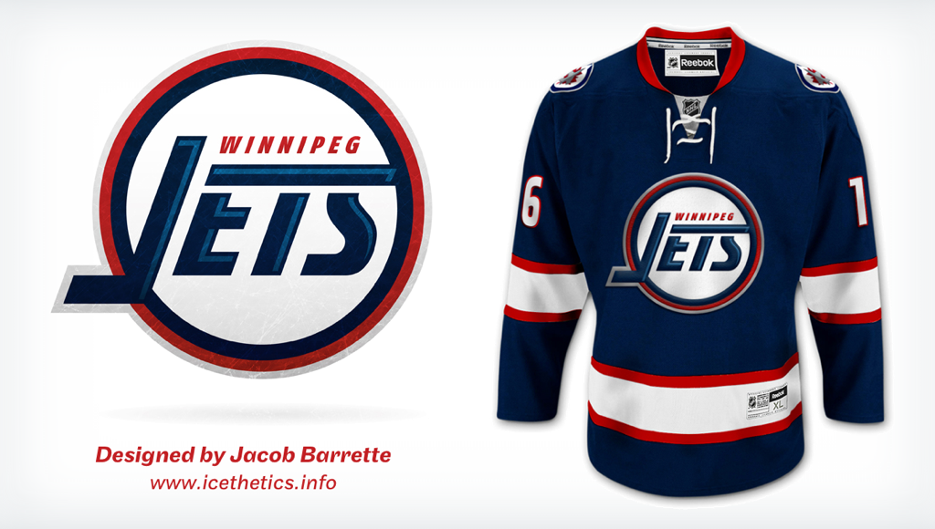
1102-barrette-jets.png

^^ This is so unbelievably bad. Brutal.

I'm in favour of keeping the current logo, anyway.
 

Tom ServoMST3K

In search of a Steinbach Hero
Nov 2, 2010
27,814
18,619
What's your excuse?
I think the Jersey reboot comes at a great time for the Jets to tweak their current jersey, especially the home set.

Keep the logo, and branding, just change the background.
 

Peggy

Registered User
Aug 6, 2016
5,274
1,307
^^ This is so unbelievably bad. Brutal.

I'm in favour of keeping the current logo, anyway.

The jersey design is the concern more than the logo is

So to you it's unbelievably bad, but slap on the new logo and it's an upgrade from what we currently have which is top 10 ugliest jersey in the league
 

YWGinYYZ

Registered User
Jul 3, 2011
28,480
7,117
Toronto
It's interesting how so many opinions can be fact when it comes to design, which is arguably in the eye of the beholder. ;)
 

Peggy

Registered User
Aug 6, 2016
5,274
1,307
It's interesting how so many opinions can be fact when it comes to design, which is arguably in the eye of the beholder. ;)

If someone can mathematically beautiful
Think a proper jersey design can be a little objective

Like lines crossing over longs
Symmetrics make a difference

And also why is there no pink and brown jerseys? If it's all just an opinion right?

The whole "it's just your opinion" argument is a scape goat
 

veganhunter

Mexico City Coyotes!
Feb 15, 2010
2,934
3
Calgary
I'd like to see a logo re-design. The jet doesn't even fit the maple leaf and the proportions are all wrong for a strong logo (i.e. the jet is too small so it lacks a central focus). It's not cohesive enough to look like one object and it lacks a single main object. It looks disjoint and the more you look the worse it gets.

Aside from that, pick a blue and stick with it. Two shades of the same colour is a weak low-contrast look. Only the Jets and Blues even try it and neither pull it off. I'm okay with red as a third colour but I'd prefer grey - dark grey with the lighter RAF blue would be cool.

The first paragraph I am in total agreement and it's bugged me since day one. I don't necessarily have a huge problem with logo as a whole but the the Jet nose + tip of the maple leaf spot looks awful and amateur. The proportions are also pretty strange to me.
 

Ad

Upcoming events

Ad

Ad