Alessandro Seren Rosso
Registered User
I'm so glad I was able to get a HK Sochi jersey for Christmas from my soon-to-be-in-laws in Russia. It's a replica, but it's difficult to find over here, if at all.
Welcome to the forums. What about sharing a pic?

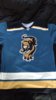

 D itself is a stylized sabre so it not just bland letter - thumbs up from me.