Interesting Info: Part XVIII (Jackets-related "tidbits" here)

Status
Not open for further replies.

Forepar

Registered User
Nov 6, 2011
1,235
703
South-Central Ohio
Just 13 points? I'm expecting more :naughty: :D

The schedule to finish out January is quite favorable. We've been a very good road team, so that's not really a concern. My expectation is that, at worst, we win 2 of 3 against Carolina and split with Ottawa. The rest of the games we play are extremely winnable. We've already beaten Tampa twice (and they're really struggling now), should have beaten Florida, dismantled the Islanders, and should have beaten the Rangers twice.

I'll place the over/under at 14.5 points for the remaining January games. Through 49 games (end of January), I predict that we'll have 74 points - or on a 124 points pace :handclap: :yo:

Ten games, 14.5 points is 7-3-0/7-2-1....my, how our expectations have happily been raised!

But methinks possibly "unsustainabowl."

110 point pace is roughly 6-3-1 (13 points for 10 games) for a full season. That is stout hockey. We just came off 16 in a row, and are ahead of that pace. Not saying CBJ will regress all the way back to the mean (slightly over .500), but anticipating 14.5 points in any 10 game stretch is bit rich for any team at any time in the league. And 7/ of next 10 on the road (regardless of who they play - way too much parity in the NHL). They need to find their legs and re-find their swagger... and expecting that they will with the relatively good spacing of games (generally every other day with the exception of 2 b2bs and a 4-day lull before NYR game on the 31st).

Also expecting to see some Forsberg in net, at least for the 2 b2bs. Playing well is the main thing - there is going to be a series or two that CBJ needs to win 4-2 or even a game 7, so might as well face a little of that pressure now (and CBJ did face it against NYR, just not sure how they handled it - play was NOT SAFE for 40 minutes with rocking results, then became SAFE = DEATH for 20, but was that primarily a confidence issue in the G, or did the entire team spit the bit? - either way a moment of revelation for the boys). There are going to be nights when they play well and lose to a G standing on his head or a team of equal talent gets one more goal of puck luck. There shouldn't be too many more 4 unanswered goal nights, however. Looking forward to the ride and trying not to get over-stimulated by losses. I could have had a coronary at end of NYR game - and that needs to stop for me.
 
Last edited:

Forepar

Registered User
Nov 6, 2011
1,235
703
South-Central Ohio
For whatever reason we seem to struggle against Carolina and Ottawa. I am nervous.

According to this post on the forums, due to the NHL switching jersey providers there will be no alternate jerseys next season, so our 3rd Cannon jersey will be gone.

http://hfboards.mandatory.com/showthread.php?p=126611717#post126611717

I'm always nervous...well maybe not late in the 2nd period against Montreal 2 moons ago...but almost always.

And I changed my avatar- the prior King of Torts" was obviously a play on my law school background, and was sort of an acknowledgment last year that Torts was here, but somebody else was King. Today, after the move to waive C-Mac (whom I like but agree with the move to see if Forsberg is the playoff answer) -- Torts is all in and so am I. Will back him...so adopting a version of his "Safe is Death" mantra.

CBJWennberg, you should make your change. The streak is over, I was with you on not changing it during, but the bag must come off. Wennberg is the real deal, the Jackets are contending...
 

Zarathustra

This is not my hat.
Nov 21, 2007
3,981
194
Salzburg
I wouldn't fully put stock in the third jersey being gone for good for two reasons:

1) Some teams (Oilers and Wild for example) are going to promote their current third jerseys to full-time status as their colored jerseys. Could see the same here, which I would support.

2) Alternates will be reintroduced at some point, most likely the following year - similar to what happened when Reebok introduced their "edge" uniforms in '07. If the cannon jersey is scrapped for next year, it could be revived again in the future.


I'd be curious to see how many people would want the canon logo to become our primaries. That is exactly what happened with the edge jersey's were introduced, the team went with the third jersey logo for their primary.
 

Tulipunaruusu*

Registered User
Apr 27, 2014
2,193
2
The cannon logo is too cartoony.

2000px-Arsenal_FC_logo_(2001-2002).svg.png
 

Heinze 57

Registered User
Jan 3, 2009
540
12
Cincinnati, Oh
I'd be curious to see how many people would want the canon logo to become our primaries. That is exactly what happened with the edge jersey's were introduced, the team went with the third jersey logo for their primary.

I am vehemently against the third jerseys becoming the primary uniform/logo.

They switched logos in 2007 because our first logo was trash and the flag logo was better. The cannon logo isn't an improvement. We found an emblem that represents our team and where we're from. The cannon logo is borderline stock clipart, in a roundel, an overused trope in today's logo landscape, that is way too detailed for full time logo use. I still think it looks bad on the shoulder patches of the home and roads and I miss the oval Kepi hat logo every game.

IF that's what we're wearing for home games we better go all the way and make a white (not cream) road uniform. The visual inconsistencies between our white roads and the alternate uniform would be too much.

Something like this:
C1Xx9paVQAAUUeV.jpg:large
 

Heinze 57

Registered User
Jan 3, 2009
540
12
Cincinnati, Oh
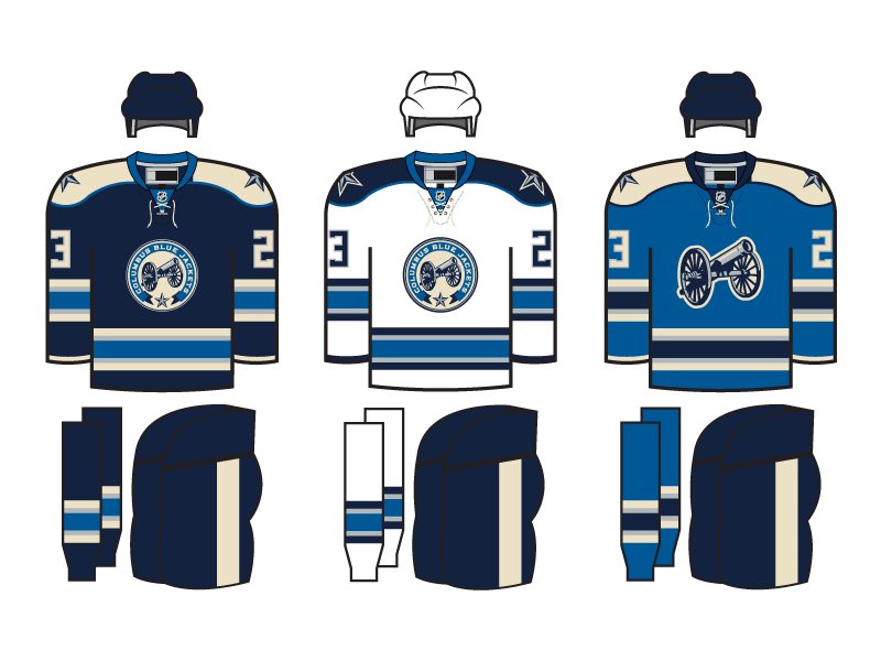
I could live with the cannon logo becoming a full-time thing.

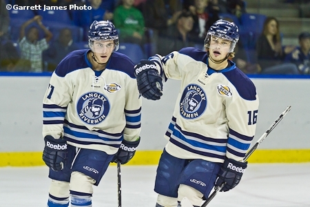
Oh, and as for road variants - Google image search: langley rivermen <-- those guys basically copied the cannon uni wholesale.

cope3.jpg


Here's why I think they'd have to use white versions of this and not cream: The NHL has a rule that the team in the road white uniform can't use a colored helmet (except for outdoor games), which means if the Blue Jackets want to use cream uniforms they'll have to match them with a cream colored helmet and I think that would look like butt. The better solution is white jerseys, socks, and helmets on the road and we leave the "vintage white" to the crest and the home blues.
 

JohnnyJacket13

(formerly PD9)
Sponsor
Jan 14, 2015
4,751
2,400
Columbus
Here are a couple of uni/logo concepts I've made over the last few weeks...I'd love to see either of these happen

This one is sort of based off of the military style that the Panthers wear


And this is with a logo that pays homage to the Cleveland Barons


And a cannon-esque version

 
Last edited:

EdwardG

Let's Dance!
Mar 17, 2009
1,089
170
Columbus
I like the alternates becoming the regular jerseys. The regular jersey is kind of boring and the colors are bland. The cannon is distinctive and let's face it, the cannon is one of the main things the CBJ is known for.
 

Heinze 57

Registered User
Jan 3, 2009
540
12
Cincinnati, Oh
You do remember that our current jerseys were based on the original third jersey design, yah?

aa1b8cbb4de38825.jpg

Of course I do and I loved those. For some reason the black and navy blue with red just works. I wish they kept our primary jerseys exactly as those were.

I don't see what any of that has to do with not wanting the current third jersey becoming the full time uniform. It's not comparable. Those third jerseys work for a full-time identity, I don't think our current thirds do.
 

Hello Johnny

Registered User
Apr 13, 2007
13,208
1,142
I wish I could find the image, but when the thirds were first being announce, someone photoshopped red for the powder blue on the thirds and I thought it looked excellent.

I've also really liked this color scheme that the Clippers use:

201330a7fb67559283f564469e5acab1.jpg


Wouldn't mind a powder blue alternate with red, navy, and white as accenting colors.

Please no, make the block numbers stop

I'm with you, I've always wanted numbers similar to this:

images


Lastly, I just found these while trying to find something else, and I gotta say I dig them, though the home is kind of meh. If they had the same numbers as I mentioned above, and maybe had some other tweaks, they'd look pretty sharp IMO

0712-jamestaylor-cbj.png
 

Zarathustra

This is not my hat.
Nov 21, 2007
3,981
194
Salzburg
I like the alternates becoming the regular jerseys. The regular jersey is kind of boring and the colors are bland. The cannon is distinctive and let's face it, the cannon is one of the main things the CBJ is known for.

I wouldn't mind the cannon logo becoming the primary, but I would want to see the Ohio flag somehow incorporated with it as well. The cannon by itself is too bland, imo.
 

Jackets Woodchuck

Registered User
Dec 27, 2010
4,163
292
How about sticking with a look for a while? I'd rather not have the Jackets become the NHL version of the Padres or Cavaliers in terms of inconsistent visual identity.
 

Viqsi

"that chick from Ohio"
Oct 5, 2007
53,891
31,527
40N 83W (approx)
Catching up with Twitter during the intermission and just saw this:

http://www.jacketscannon.com/2017/1/10/14222970/the-cannon-has-lost-one-of-its-own

:(

I don't know if he ever posted here. but Jeff was one of the few Jackets bloggers I followed regularly pretty much everwhere he went even as others went nuts, dropped out, or otherwise faded. To lose him is a huge blow to the community and the world as a whole.

May his memory be a blessing.
 

Hello Johnny

Registered User
Apr 13, 2007
13,208
1,142
How about sticking with a look for a while? I'd rather not have the Jackets become the NHL version of the Padres or Cavaliers in terms of inconsistent visual identity.

We've had our primaries for almost 10 years, the logo of which has been around since '03. Alternates have been around since November 2011. Plenty of teams change it up more frequently.
 

major major

Registered User
Feb 18, 2013
14,598
1,669
I am vehemently against the third jerseys becoming the primary uniform/logo.

They switched logos in 2007 because our first logo was trash and the flag logo was better. The cannon logo isn't an improvement. We found an emblem that represents our team and where we're from.

You can ask outsiders to check, but I doubt anything about the team, where they're from, or what their identity is, is conveyed by the flag logo. You are clearly seeing somethings in it that non-Ohioans can't see. To them it just conveys stars and stripes: "America! " "Go generic sports franchise!"

And for those pushing the Ohio map in to the logo, the shape of Ohio doesn't help convey anything kind of identity on a jersey. It looks like a square that a mouse nibbled on. Not jersey material.
@JD19: I actually really like the military themed one you came up with. There's team identity in that.

I still hear people say, "isn't a Blue Jacket some kind of insect". I think we ought to have something clear about what a Blue Jacket is on the logo. That means union army, and that's the cannon. It's the clearest epitome of what the team is and we need more of that. I really don't get it when folks say "the cannon is too generic" - how many other clubs have cannon jerseys exactly? And how many have stars and stripes?
 
Status
Not open for further replies.

Ad

Upcoming events

Ad

Ad