Babych Moustache
Don'tBashThe'Stache
#KillTheReebokTemplateReds
Yes. Yes. Yes. They look AHL-like.
#KillTheReebokTemplateReds
When they wore them last game, a guy in Devils jersey told me: "Man, I'm glad they're wearing those jerseys, makes them look like a professional team."
#KillTheReebokTemplateReds

Laziness overcome... I think. Not sure it's one from Jerkstore, but I love this. Simple, timeless, something that could just stick with the team forever, with the introduction of special 3rds when they want to make more cash from fans.
Love jerseys without shoulder patches too (they are okay on the 3rd jersey below, but look how great a simple, clean 2D design looks like on the away/home...
Current home/away have way too many Reebok lines and swooshes for my liking... AHL like I said earlier...
Please, one day, just go with the following 3 below...
It can't be an opinion, it's mathematically incorrect.If you see the "O" as negative, that's your opinion.

I'd keep the cream color, it's what gives it the heritage feel.I like the Heritage template, but the O logo is boring.
Keep the Heritage design, ditch the cream for solid white, and replace the O with the round updated 2D logo. White away, Red home, Black third, and you have a nice jerseys set.
Laziness overcome... I think. Not sure it's one from Jerkstore, but I love this. Simple, timeless, something that could just stick with the team forever, with the introduction of special 3rds when they want to make more cash from fans.
Love jerseys without shoulder patches too (they are okay on the 3rd jersey below, but look how great a simple, clean 2D design looks like on the away/home...
Current home/away have way too many Reebok lines and swooshes for my liking... AHL like I said earlier...
Please, one day, just go with the following 3 below...
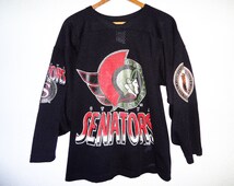
Am i the only one who doesnt like those old 90's jerseys?? They are just plain ugly in my opinion
Am i the only one who doesnt like those old 90's jerseys?? They are just plain ugly in my opinion
It can't be an opinion, it's mathematically incorrect.
I like the Heritage template, but the O logo is boring.
Keep the Heritage design, ditch the cream for solid white, and replace the O with the round updated 2D logo. White away, Red home, Black third, and you have a nice jerseys set.
Weird, any hockey fan I talk to that isn't an idiot (durr it's a zero!) always tell me that it's criminal that the third jersey isn't our regular jersey. It's been voted on icethetics as one of the top 5 jerseys in the league....
#KillTheReebokTemplateReds


We are a laughing stock with the ZERO Heritage jersey.
Put an S instead.
I hate this logo, just terrible.
Thick, cartoonish borders.
Cartoonish cape and cutout in the galea's brush
Moon slice accents on the hinge
Helmet is separate from the laurels except for at the tip for some magical reason
A wanna-be symmetric logo that isn't symmetric.
The cartoonish-ness of this logo on the clean-cut vintage heritage jersey would be an abomination.
Notice the best jersey in sports does not sport the childish/cartoonish features (Chi)