
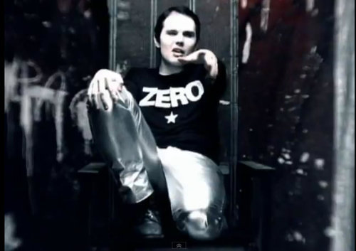
I am tired of the Zero Jersey replace it with the S Super Sens
- Thread starter Rolie
- Start date
You are using an out of date browser. It may not display this or other websites correctly.
You should upgrade or use an alternative browser.
You should upgrade or use an alternative browser.
- Status
- Not open for further replies.


Super Cake
Registered User
- Jun 24, 2013
- 31,024
- 6,469
BonkTastic
ಠ_ಠ
Heritage jersey is the best alternate jersey we've ever had.
It's not even close. It's no contest.
It's not even close. It's no contest.
Established teams with retro jerseys usually have some fans that are still alive and remember a version of the original(s). Ottawa not so much. Overall its a nice design but you get the impression they don't win much when wearing it.
I wouldn't mind seeing a modified version but more to highlight the numbers. Some player numbers are hard to read even on large projected image. So maybe a better contrast outline would help.
I wouldn't mind seeing a modified version but more to highlight the numbers. Some player numbers are hard to read even on large projected image. So maybe a better contrast outline would help.
BonkTastic
ಠ_ಠ
Established teams with retro jerseys usually have some fans that are still alive and remember a version of the original(s). Ottawa not so much.
So what, we get punished because we didn't have an NHL team back then?
I've always disliked that point (whenever it gets brought up, which is too often). We have a rich local hockey history in Ottawa, to ignore our city's heritage in the sport just because we didn't have one team in one league seems petty.
The barber pole look may be historical but many fans of the modern team aren't in love with it. It might help explain why there is less of a buy-in because the association is not as strong with this generation. The pole look in the black version used by the Sens is not as pronounced but like it or not it still has to fight a degree of negativity from those looking for a more splashy modern look. I admit that it has grown on me a bit compared to the unveiling but it doesn't mean I wouldn't like to see some modifications.
The standalone "O" adds a bit to the negativity. Boston has a B but it's in a crest. On their Heritage jersey they spell the name Boston. The "O" inside a crest would have looked better imo and it didn't have to be a centurion.
Last edited:
BonkTastic
ಠ_ಠ
The barber pole look may be historical but many fans of the modern team aren't in love with it.
Wait, many fans aren't in love with it? Everything I have heard (from both friends who still work with the team, as well as friends who work for independent retailers) claims the exact opposite: it is our most popular jersey as far as sales are concerned, AINEC.
And even aside from sales, just on this very website (which, I don't think is in question, is mostly populated by the "under-30" demographic), the "Tournament of Logos" polls I ran in the offseason had the Heritage "O" as the second most popular logo of all time among users on this site.
It might help explain why there is less of a buy-in because the association is not as strong with this generation.
Less of a buy-in? Again, everything I have heard as far as sales are concerned paints completely the opposite picture.
The standalone "O" adds a bit to the negativity. Boston has a B but it's in a crest. On their Heritage jersey they spell the name Boston. The "O" inside a crest would have looked better imo and it didn't have to be a centurion.
Look, you are well in your rights to dislike the jersey. No one will argue with you about your own personal preference. If this is the way you interpret the jersey, that's totally fine. If you see the "O" as negative, that's your opinion.
... Just understand that you are in the minority.
Last edited:
Nac Mac Feegle
wee & free
- Jun 10, 2011
- 34,925
- 9,339
The O + barberpole is, by far and away, my favorite and the jersey I see most often on the streets.
It is an amazing jersey.
It is an amazing jersey.
Boud
Registered User
- Dec 27, 2011
- 13,570
- 6,995
Personally, I really like the jersey as it is right now and it's easily my favourite Sens jersey. I find the ''S'' would take out the simplicity of the jersey and that's what I like about it. It's also an heritage jersey, and I think it's neat that they decided to go with the same pattern as 100 years ago. I feel like it's that kind of thing you just leave like that, kinda like changing a habs jersey, just something I wouldn't do or that shouldn't be done IMO.
Heritage jersey is the best alternate jersey we've ever had.
It's not even close. It's no contest.
For sure this....it's a landslide victory and a pleasant visual distraction from that garbage edge design we have been rocking for what seems like forever at this point!
I am enjoying the retro black and red striped with 2d logo they have brought back in the arena shops and am currently toying with the idea of getting one, not sure whether i should go non numbered and named or retro/modern player.
When it first came out, people either loved the design or disliked it at times intensely although more are accepting it as part of the set now. I much prefer the red. My kids picked it too and they chose first. From what I see it's still the most popular in our neighborhood by a wide margin.
This sweater raises strong feelings when someone suggests any changes or just says that they don't prefer it. I say, to each his own. There is no reason to take a simple fashion preference by others too seriously one way or the other. If you like it then buy it and if you don't like it then don't buy it!
This sweater raises strong feelings when someone suggests any changes or just says that they don't prefer it. I say, to each his own. There is no reason to take a simple fashion preference by others too seriously one way or the other. If you like it then buy it and if you don't like it then don't buy it!
Babych Moustache
Don'tBashThe'Stache
For sure this....it's a landslide victory and a pleasant visual distraction from that garbage edge design we have been rocking for what seems like forever at this point!
I am enjoying the retro black and red striped with 2d logo they have brought back in the arena shops and am currently toying with the idea of getting one, not sure whether i should go non numbered and named or retro/modern player.
The original logo from back in the early 90s? Awesome... been waiting for this. I find the 3D logo irritating to look at.
No problems with the "O"... barber pole stripes are rad.
Buck Aki Berg
Done with this place
We are a laughing stock with the ZERO Heritage jersey.
Rather than design an entirely new jersey because you're too sensitive to take a little teasing from opposing fans who are so uncreative that they go for the most obvious joke - lol the O looks like a zero, lawl!!1! - perhaps you could stop crying long enough to toughen up a little bit.
PoutineSp00nZ
Electricity is really just organized lightning.
I think the heritage Jersey's are beautiful. Best sweaters the sens have had since the early changes to the original whites and blacks in the 90s.
Who cares if people make a joke about the O looking like a 0? People who brag about cup wins they don't remember are compensating for something.
Like their penis.
Who cares if people make a joke about the O looking like a 0? People who brag about cup wins they don't remember are compensating for something.
Like their penis.
BonkTastic
ಠ_ಠ
Who cares if people make a joke about the O looking like a 0? People who brag about cup wins they don't remember are compensating for something.
Like their penis.
Precisely this.
If your friends are making jokes about "The O looks like a zero, lulz", then you need new friends, not a new jersey.
The original logo from back in the early 90s? Awesome... been waiting for this. I find the 3D logo irritating to look at.
No problems with the "O"... barber pole stripes are rad.
I want to say it's very close to this if not the exact one....had a few pops so my details may be a touch off....Prince was rocking a "Retro Neil" version in the halloween pics posted on twitter

Babych Moustache
Don'tBashThe'Stache
I want to say it's very close to this if not the exact one....had a few pops so my details may be a touch off....Prince was rocking a "Retro Neil" version in the halloween pics posted on twitter
Yeah, my gf follows a few of the players on Twitter and showed me Prince's get-up. Love the suttle jab at a vet like Neiler. Teeth blacked out, nice.
If this jersey had just a bit of white striping on the arms/bottom of the jersey, I think I'd love this as our 'home' jersey... although it changes things from a predominantly red home jersey.
How would the 2D logo look with a more modern jersey design - either black or red? I'm sure something was put together on a jersey thread in the past...
ChocolateLeclaire
Registered User
Weird, any hockey fan I talk to that isn't an idiot (durr it's a zero!) always tell me that it's criminal that the third jersey isn't our regular jersey. It's been voted on icethetics as one of the top 5 jerseys in the league....
When they wore them last game, a guy in Devils jersey told me: "Man, I'm glad they're wearing those jerseys, makes them look like a professional team."
#KillTheReebokTemplateReds
When they wore them last game, a guy in Devils jersey told me: "Man, I'm glad they're wearing those jerseys, makes them look like a professional team."
#KillTheReebokTemplateReds
Yeah, my gf follows a few of the players on Twitter and showed me Prince's get-up. Love the suttle jab at a vet like Neiler. Teeth blacked out, nice.
If this jersey had just a bit of white striping on the arms/bottom of the jersey, I think I'd love this as our 'home' jersey... although it changes things from a predominantly red home jersey.
How would the 2D logo look with a more modern jersey design - either black or red? I'm sure something was put together on a jersey thread in the past...
Our good HF friend Jerkstore who is responsible for the O jersey we see and love today has done a few lovely mock ups of just what you have suggested here....to lazy to search for but they are also glorious.
Last edited:
Babych Moustache
Don'tBashThe'Stache
Our good HF friend Jerkstore who is responsible for the O jersey we see and love today has done a few lovely mock ups of just what you have suggested here....to lazy to search for but they are also glorious.
Ah, the lazy is strong in us. Was hoping you'd share the link. Mad props for being equally as lazy though. I am familiar with Jerkstore awesomeness though.

- Status
- Not open for further replies.
Ad
Latest posts
-

-
-

-
Biggest Chokers Showdown: Toronto Maple Leafs VS San Jose Sharks
- Latest: WetcoastOrca
-

Upcoming events
-
 TO ADVANCE SEMIFINAL - Borussia Dortmund @ Paris Saint-Germain - 2nd leg. 1st leg result: Borussia Dortmund1-0Wagers: 5Staked: $2,973.00Event closes
- Updated:
-
 2024 NHL Draft Lottery Team that wins #1 pick - PICK ONLY ONE TEAMWagers: 19Staked: $25,242.00Event closes
- Updated:
-
 Stanley Cup 2024 Stanley Cup Champion - ONLY BET ONE TEAMWagers: 11Staked: $56,709.00Event closes
- Updated:
-
Game 2 Carolina Hurricanes @ NY Rangers - NYR leads 1-0Wagers: 7Staked: $18,125.00Event closes
- Updated:
-