
These Are The Days
Oh no! We suck again!!
Makes sense as that goaltender was none other than Jaroslav Janus2 has history in both Slovakia and the Czech Republic as a goaltender's number. Different, but not out of the ordinary.
Makes sense as that goaltender was none other than Jaroslav Janus2 has history in both Slovakia and the Czech Republic as a goaltender's number. Different, but not out of the ordinary.
The only thing wrong with that jersey is the lettering, the rest is great.The current Nashville yellow jerseys are an assault on the retinas. The fact that they’re paired with yellow helmets just makes it worse.
The original Preds jerseys were great, and should have been left alone.
I’m a Canucks fan, but despise their home unis. You’re at HOME! Who needs reminding that they’re in VANCOUVER? Yet, there it is, emblazoned above the crappy corporate Orca.
And oh yeah, the Canes new thirds with the double hurricane flags. Might as well throw a sharknado shoulder patch on it and call it a day.
It tells you on the front what it isView attachment 160319 No offence to To Montreal Canadiens fans but this has got to be the ugliest jersey I have ever seen
No, not him. He deserves an even uglier number like 78 or 84.
Like, not even 69. Brady Skjei doesn't deserve snickers.
Subban breaks my heart with 76. Daley wears like 83 or some ****. Chabot wears 72. (Like, you could easily make that 27 and it's ****ing classic). Matter of fact, pretty much the whole Senators D corps is killing me on this, but like Skjei, you could argue they deserve it. Evan Bouchard wears god damn 75. Like, are we defensemen, or are we 300 pound offensive linemen in the NFL?
Even EK's 65 is pretty bleh, although it's sort of become iconic to him.
But, it's not "double" hurricane flags. The two flags together signals a "hurricane", while a single flag signifies a "tropical storm".The current Nashville yellow jerseys are an assault on the retinas. The fact that they’re paired with yellow helmets just makes it worse.
The original Preds jerseys were great, and should have been left alone.
I’m a Canucks fan, but despise their home unis. You’re at HOME! Who needs reminding that they’re in VANCOUVER? Yet, there it is, emblazoned above the crappy corporate Orca.
And oh yeah, the Canes new thirds with the double hurricane flags. Might as well throw a sharknado shoulder patch on it and call it a day.
Nothing is worse than this:

As a general rule I go with any of the oilers puke orange jerseys... but man some of these are so so so much worse
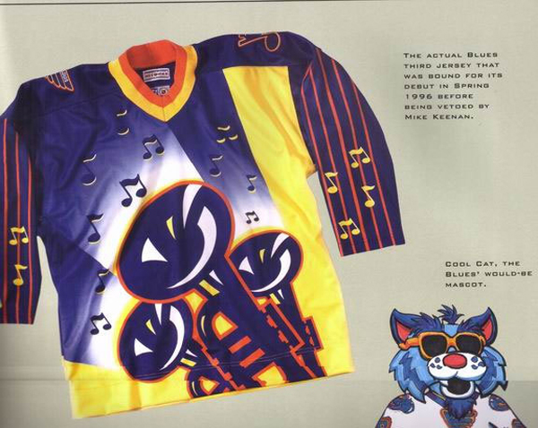
Was going to post the Vancouver “V” jersey but nothing could ever be worse than this. I had forgotten all about them.Bonus pic of cool cat too.

There were some nice ones too
- The captain patch is a triangle for some reason...three rivers or what?
Bonus pic of cool cat too.
This is your example of a nice one?
It's so amateurish it's almost laughable. Take a look at the logo. It's italicized. Then take a look at the star that the striping on the jersey makes, it is not italicized. So you have star on top of a star, but they don't line up, making the entire logo look off centre and pushed to the left. This thing is an embarrassment to design.
You might not like stuff, but lots of people do.
Your opinion is not some kind of universal truth.
In terms of principles of design, yeah, its a universal truth that the italicized star inside a non italicized star is beyond amateurish and creates a series of lines that don't work together and are visually extremely messy.
")

