During the last couple of seasons, quite a lot was made of Crosby's point per game pace. Some people argued that it wasn't as impressive as it seemed because it was misleading to pro-rate his scoring pace, while others pointed out that over the last 82 games he had scored significantly above 130 points. The problem was that we really didn't have anything to compare with. There was no easily accessible data (as far as I know) on how common it was for a player to score at such a high pace for a (somewhat cherry-picked) 82 game stretch.
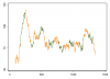
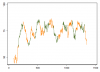
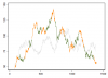
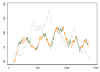
Using game-by-game data, available for the 87/88 season and onwards, I have created a visual representation for all 82 game point stretches for a couple of select players. These can be seen in the attached PDF file. For each game, seen along the x-axis, the y-axis show the amount of points scored over the last 82 games. For each player, I have also written out their best and worst 82 game point stretch. The first figure shows a comparison between Jaromir Jagr and Joe Sakic, two of the most prolific scorers with long careers that started after the 87/88 season. The second figure shows a comparison between Sidney Crosby, Evgeni Malkin and Alex Ovechkin. Finally, the third figure shows a comparison between Sidney Crosby, Peter Forsberg and Eric Lindros, three players with injury-riddled careers. Because these three players played at different times, I have used adjusted points (adjusted by the scoring pace of the ten percent highest scoring players in a given season) to account for their respective scoring environment.
Some features I think are nice with these graphs:
*Provides a visual representation of a player's scoring over his career, showing both ebbs and flows in scoring.
*Makes it easier to contextualize number such as player X has scored Y amount of points during the last 82 games.
*Facilitate a reasonable comparison of players who were injured a lot to players who were relatively injury free without giving an unfair advantage to either group.
So far I have used game-by-game data from 87/88 which are of high quality. I could add HSP data from the 52/53 season. These data are of slightly lower quality (but still excellent) but would facilitate a comparison of players from different eras. This is pretty much work in progress so any thoughts or comments on how these graphs could be improved would be very much appreciated! If you have any players you would like to see a comparison of, let me know and I might be able to provide it.
Mod edit: Sometimes people have issues with being able to download attachments.
I've thrown a copy of it on my google drive: Link here
You should be able to easily view/download it from there
Attachments
Last edited by a moderator:
 I am very interested in this.