The Vasili Jerry
Serenity now!
“Nothing f***s you harder than time.” — Ser Davos

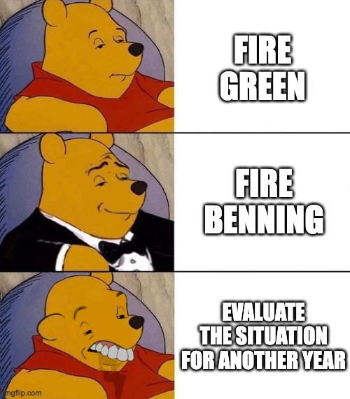
We need a president to come in like Tyrion did in A Clash of Kings/season 2. Can we send John Weisbrod to the Night's Watch?
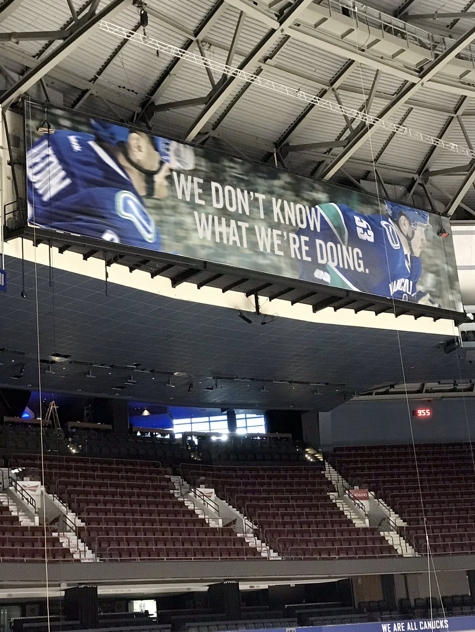
Question: There hasn't been a president or CEO here for more than two years - both roles that carry a lot of importance - uhm, speaking of ownership - do you feel you've been given enough space to actually do the GM's job properly?
Answer: Yes, like we, y'know, like we, like I have a good like I said I have a good relationship with Francesco .. we y'know, we talk about - in the summertime - a plan, we formulate a plan, y'know we execute a plan y'know it's, y'know we like when we plan the team out this summer, y'know, before it.. we were in the pacific division we were going to be playing all the teams in the league y'know with the pandemic, with the border being closed, y'know it turned out we're we're just gonna be playing these canadian teams this year so, y'know, things have changed, uh, in that regard uhm .. and we're in uncharted territory here like I've I've been associated y'know with the league for 40 years now as a player, scouting and management positions and like y'know we're we're playing every second night and uhm...
Cheers! It's quite fun messing about.Those are really nice - nice work!
Slick! I love the correction from royal blue to navy blue (the Canucks need to do this - the Sprite can unis showed how much better it looks) and the striping is really nice. And outlined numbers too.I was so pumped for some good Canucks news that I made a couple of jersey concepts. Not memes, obviously, but this is the closest thread to put these in.
I took a little inspiration from the first Vancouver Canucks jersey from 1945 (first photo) and then made them a bit more modern.
View attachment 487852
View attachment 487853
View attachment 487854
View attachment 487855
2 things here
They need to pay for a top notch agency/designer and re-do it all. There are so many super talented people out there that would make the Canucks’ branding look a million times better. The weak effort on the Abby Canucks branding summed up what the org thinks of it all, though.Slick! I love the correction from royal blue to navy blue (the Canucks need to do this - the Sprite can unis showed how much better it looks) and the striping is really nice. And outlined numbers too.
That base with the modern logo (that has freaking green in it somewhere) would be miles better than what they have.
Hey M2B! I bet you wish you could’ve lived in the 80s, yeah? Rocking a mullet!2 things here
1.) I love it, this should def be a thing
2.) Hey Jerr
I was so pumped for some good Canucks news that I made a couple of jersey concepts. Not memes, obviously, but this is the closest thread to put these in.
I took a little inspiration from the first Vancouver Canucks jersey from 1945 (first photo) and then made them a bit more modern.
View attachment 487852
View attachment 487853
View attachment 487854
View attachment 487855
Thanks mate. I’ll have to give that a whirl.Very cool man. I would love to see your work with the newer version of the stick-in-rink logo front and centre.