
Masao
Registered User
They've had them for 15 years or so, but I think it looks better without.
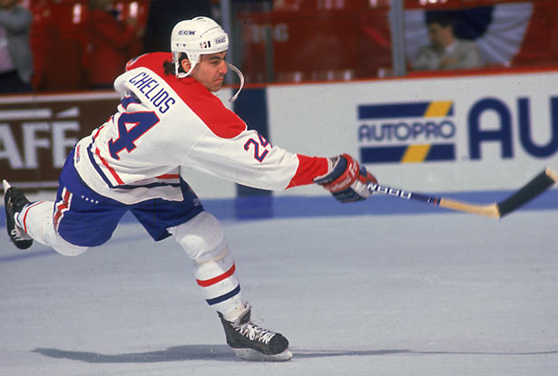
I couldn't find a better pic than this:

Anyone agrees?
I hated that white stripe between the blue and red from they day they started using it...
I couldn't find a better pic than this:
Anyone agrees?
I hated that white stripe between the blue and red from they day they started using it...


