OT: slightly darker colour of the logo at the front

BostonFighting

Registered User
Jun 20, 2015
2
0
Hey guys, :)

sorry for my off-topic, but I have one question and hope that you could help me.

I ordered a Bruins Home-Jersey at the NHLShop and finally received it today. I live in Germany so its pretty hard to get one. So I got it but there's one question remaining: The yellow colour of the logo at the front is slighty darker than the other yellow parts e.g. the yellow shoulders or strips. Is it common or unusual? When I look at pictures, the colours of the logo at the front looks always like the remaining parts in yellow. It's an officially licensed product!

Thank you in advance!!
 

Fenway

HF Bookie and Bruins Historian
Sponsor
Sep 26, 2007
69,071
100,063
Cambridge, MA
I wish the B's would return to this as the alternate

Bruins19.png
 

Ratty

Registered User
Feb 2, 2003
11,970
3,488
Rive Gauche
Visit site
I liked the big bear head sweaters. If they'd only put a couple of fangs in that rascal to make him more intimidating instead of Pooh Bear, it would have been a great 3rd sweater.
 

Mpasta

Registered User
Oct 6, 2008
5,804
722
Looks yellow to me, too. For gold, look to Penguins, BC Eagles, Florida State, Notre Dame.

Most Bruins fans don't want to admit that the color is yellow. If you want to see gold, look at Notre Dame.
 

nmbr_24

Registered User
Jun 8, 2003
12,864
2
Visit site
Most Bruins fans don't want to admit that the color is yellow. If you want to see gold, look at Notre Dame.

As someone who works with color I feel confident that the color on the Bruins jersey is a shade of gold. Gold has more orange in it that yellow and they are close in color and neither is very close to metallic gold.
 

talkinaway

Registered User
Mar 19, 2014
6,973
4,126
On the couch
As someone who's red-green colorblind and thus should have, in theory, better perception of yellows and blues (this is 100% true - look up Ishihara plate #19, which I can identify), I can say that there is a slight difference between the gold of the spoked B and the gold on the shoulder. This is for a home Chara jersey purchased a couple of years ago from Fanatics (which I think is basically the same thing as the NHL shop).

But to be honest, I never really noticed the difference before, and it could be because the material in the shoulder patch area is different than the material in the spoked B.
 

Lobster57

Registered User
Nov 22, 2006
7,721
5,918
Victoria, BC
When the Bruins sweaters look like the color of the Mask of Tutankhamun, I'll call them gold.

I'm now writing a buddy-cop movie and when buddy #2 get shot and is bleeding to death, that's gonna be his last line.

i'm not going to give you any credit
 

Fenway

HF Bookie and Bruins Historian
Sponsor
Sep 26, 2007
69,071
100,063
Cambridge, MA
Here is where it gets tricky.

Gold is a metallic color and it really shows well on objects like football helmets - fabric not so much.

Nashville also says their color is gold

Shea+Weber+Phoenix+Coyotes+v+Nashville+Predators+q88gqWurCZfl.jpg


As I said previously I would love to see the B's return to this

wcsturmface.jpg
 

Bruinswillwin77

My name is Pete
Sponsor
May 29, 2011
22,298
11,315
Hooksett, NH
I've always seen it as yellow bit I'll go by gold as I have checked out the wiki article on the color of gold... Good link Fenway... So crazy Orr won the Norris, Hart, Art Ross, and Smythe in one season... Dayumm..
 

crimsonace

Registered User
Mar 7, 2010
2,162
1,575
Indianapolis, IN
Here is where it gets tricky.

As I said previously I would love to see the B's return to this

wcsturmface.jpg

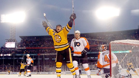
I loved those uniforms, and I wish they'd replace the "walking bear" alternates. I don't mind the current alts - as they use the sleeve piping and color of the 1970s-1995 uniforms combined with an updated version of the 1920s logo - but the 2010 Winter Classic fauxbacks were just beautiful. Classic piping on the gold sweater and use either the 1948-49 logo used in 2010 or the 1949-95 spoked-B, either works.
 

Bmessy

Registered User
Nov 25, 2007
3,295
1,601
East Boston, MA
Hey guys, :)

sorry for my off-topic, but I have one question and hope that you could help me.

I ordered a Bruins Home-Jersey at the NHLShop and finally received it today. I live in Germany so its pretty hard to get one. So I got it but there's one question remaining: The yellow colour of the logo at the front is slighty darker than the other yellow parts e.g. the yellow shoulders or strips. Is it common or unusual? When I look at pictures, the colours of the logo at the front looks always like the remaining parts in yellow. It's an officially licensed product!

Thank you in advance!!

To answer your question, yes it is common. I have a jersey that I bought from the proshop where the color of the numbers are a small shade different from the rest of the jersey. Now it's annoying for sure, but I guess the NHL and whoever makes the jerseys don't care too much about consistency. As long as it's not like a yellowish green like some jerseys I see people buy from China, you'll look fine. Is it worth returning and gambling on them sending you one that is perfectly the same? Probably not since you're overseas and can't go into a shop.

For me, it was an offically licensed product, bought from under the garden in the proshop, and the difference in color wasn't too large so i shade screw it and bought it anyway
 

talkinaway

Registered User
Mar 19, 2014
6,973
4,126
On the couch
I don't like the "Walking Bear" alternates that we have now (nor do I really like the original 1920s version), but I just can't stand the 2010 "Deflated Balloon B" uniform from the WC that, at least according to Wikipedia, was designed in part by Cam. (A YouTube video I found produced by the B's sort of confirms this.) Then again, I'm biased against the whole concept of the WC to begin with, so maybe some of that carries over. My main dislike of it is the ugly B - replace it with any of the "normal" spoked Bs, and I'm good with the colors.

I only hope that the WC 2010 jersey is the worst thing Neely does to the Bruins.

I really do like Fenway's alternate - to me, it just makes sense that if your team colors are Black and Gold, and you have black as your primary home color, then make the alternates gold.
 

Ad

Upcoming events

Ad

Ad