Is there any word... (mod: on a switch to heritage jerseys?)

Step

It's been a tough year...
Nov 9, 2007
4,104
22
Ottawa
On whether we're gonna switch to our heritage jerseys full time for 2014-2015?

Too lazy to sift through threads to find out, so sorry if this has been beaten to death already.
 
Last edited by a moderator:

Derivation

Registered User
Jan 4, 2010
2,050
1
On whether we're gonna switch to our heritage jerseys full time for 2014-2015?

Too lazy to sift through threads to find out, so sorry if this has been beaten to death already.

I heard we can only wear the white heritage vs leafs and Habs because of the colour of the helmets?
 

saskriders

Can't Hold Leads
Sep 11, 2010
25,065
1,607
Calgary
Icethetics says no heritage classic jerseys next year, but "Throwback Thursdays" for the blacks

Hopefully the season after the pair becomes our regulars
 

danielpalfredsson

youtube dot com /watch?v=CdqMZ_s7Y6k
Aug 14, 2013
16,575
9,269
I heard we can only wear the white heritage vs leafs and Habs because of the colour of the helmets?

Seems like that would be an easy fix.

No super secret inside sources, but I recall hearing through the grapevine casually that the Senators were planning on going with the Heritage jerseys as the home and away, but the person may have just been bsing me, or might have been mis-informed themselves, as it's obviously not happening this season.

The Senators have had their current home and away for almost a decade. I can't imagine that they sell very well any more since most fans have them.

The "classic" hockey jersey style is popular right now amongst jerseys. The best thing the Senators could do would be to use a version of the heritage set full time with regular white on the away jerseys instead of off white, while reintroducing the 90's black jersey as either the home or alternate. They could use the updated logo if need be.
 

DrakeAndJosh

Intangibles
Jun 19, 2010
11,863
1,781
Kanata
It's funny, we have two of the worst jerseys and two of the best jerseys in the entire league. Should be a no-brainer decision.
 

salomonster

Registered User
Oct 7, 2006
2,663
147
Double dot
Highly doubt any heritage ever becomes a regular.

Maybe the current 3rd could share with the current red homes 50/50 but not more.

The red main home is too closely tied to the team's major sponsors (Cdn tire and Sport Chek), the team's marketing is all about "united in red" and quite simply they will sell more jerseys by having more models to sell.

And merchandise sales is the name of the game.

I personally hate the heritage classic white as a color. If that jersey was in regular white it could be worthy of an away swap.

If they re'released the 1993 whites i would be into 50/50 slip with the above noted.
 

vdB

Registered User
Dec 28, 2006
4,302
19
Toronto
The main logo has WAY more character than the "O" logo. The heritage jerseys look much nicer I agree, but you can't ignore that fact.

Looking deeper into this, what logo would resonate more with kids (who are a big part of the revenue coming in)? A slightly annoyed Roman Soldier or some random "O" that was relevant way back in the 1920's?

If I was part of the marketing team/jersey crew/whatever, this would be a tough choice.
 

General Zodd

Registered User
May 6, 2013
3,323
87
Toronto
I personally hate the heritage classic white as a color. If that jersey was in regular white it could be worthy of an away swap.
Agreed there is something off about that particular shade of white that I don't like. I wish it was a regular white and I'd be all over that like bees on honey! On the flip side, I love the heritage black but don't have much use for either of the current home and away jerseys.
 

Smash88

Registered User
Mar 15, 2012
3,484
344
Ottawa
I like the red jersey. The logo could be changed, but I really hope we keep Red as our main home jersey.

Keep black as a 3rd that we wear on special nights.

I don't really care for the white heritage either way.
 

Nac Mac Feegle

wee & free
Jun 10, 2011
34,900
9,314
I would love the heritage jerseys be our regular colours. While several teams have variants of black/red/white, no one else in the league has that kind of striping as a regular jersey.
 

danielpalfredsson

youtube dot com /watch?v=CdqMZ_s7Y6k
Aug 14, 2013
16,575
9,269
The main logo has WAY more character than the "O" logo. The heritage jerseys look much nicer I agree, but you can't ignore that fact.

Looking deeper into this, what logo would resonate more with kids (who are a big part of the revenue coming in)? A slightly annoyed Roman Soldier or some random "O" that was relevant way back in the 1920's?

If I was part of the marketing team/jersey crew/whatever, this would be a tough choice.

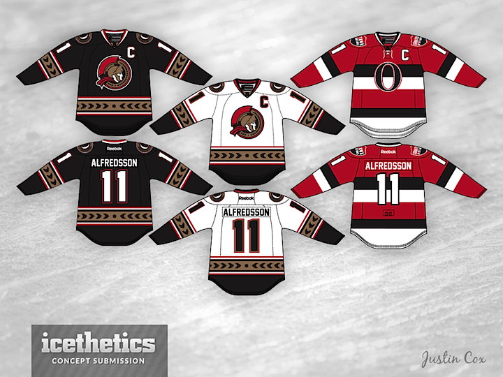
I agree that the "O" on the main set isn't ideal as a crest/logo.

The newer round centurion logo could work on the Heritage jersey template. This concept isn't exactly what I mean, but it is the closest I could find to what I am suggesting.

tlaJOAX.png


As far as "United In Red" goes. Here's a concept that shows the Heritage in red.

1210-justincox-ott.png


Throw on the round centurion logo, and it could be a nice solution to a red home jersey.

In the end, I'm not a big fan of the Senators using red. The Leafs have blue, Montreal has red, let Ottawa take black.
 

Benjamin

Differently Financed
Jun 14, 2010
31,118
438
yes
I want to go back to the jerseys from 2005. Should never of switched.

I'd be happy with anything different tho.
 

Tap on the Ankle

Registered User
Jun 9, 2004
3,558
1,247
Ottawa
My preference would be for the heritage as main jerseys. Second option would be the classic logo on those jerseys (with a red main instead of black if the team is insistent on it)

Anything else is disappointing. Not a fan at all of our default Reebok Edge layout and silly looking logo.
 

DrunkUncleDenis

Condra Fan
Mar 27, 2012
11,820
1,682
The main logo has WAY more character than the "O" logo. The heritage jerseys look much nicer I agree, but you can't ignore that fact.

Looking deeper into this, what logo would resonate more with kids (who are a big part of the revenue coming in)? A slightly annoyed Roman Soldier or some random "O" that was relevant way back in the 1920's?

If I was part of the marketing team/jersey crew/whatever, this would be a tough choice.

This is the best description of our logo I have ever heard.

It has grown on me over the years. But it is still brutal. At least it isn't the slightly drunk and cross-eyed original 3D logo.
 

DrunkUncleDenis

Condra Fan
Mar 27, 2012
11,820
1,682
My dream:

1896751_10153820180340607_121838626_n.jpg

It's so simple and beautiful. For the life of me I can't understand why we don't just go back to a modified version of our old black and whites.

OMG but we're red now, branding! Sponsors!

This is what happens when a team relies on outside sponsorships etc for cash flow. Sad stuff.

And for the record, our old 2D logo would look TERRIBLE on a red jersey.
 

mcnorth

Registered User
Jun 28, 2011
4,266
3
I really hate the laurel (or whatever the hell it is) stripe. Always have hated that - looks terrible on the jerseys IMO. Looks good on the ice, though.
 

robsenz

Registered User
Apr 15, 2007
3,560
2,423
I agree that the "O" on the main set isn't ideal as a crest/logo.

The newer round centurion logo could work on the Heritage jersey template. This concept isn't exactly what I mean, but it is the closest I could find to what I am suggesting.

tlaJOAX.png


As far as "United In Red" goes. Here's a concept that shows the Heritage in red.

1210-justincox-ott.png


Throw on the round centurion logo, and it could be a nice solution to a red home jersey.

In the end, I'm not a big fan of the Senators using red. The Leafs have blue, Montreal has red, let Ottawa take black.

Those white jersey are so s exy.
 

Ad

Upcoming events

Ad

Ad