Do you want our alternate jersey be the primary one

Drury_Sakic

Registered User
Jul 25, 2003
4,935
809
www.avalanchedb.com
Mountain sweaters forever.

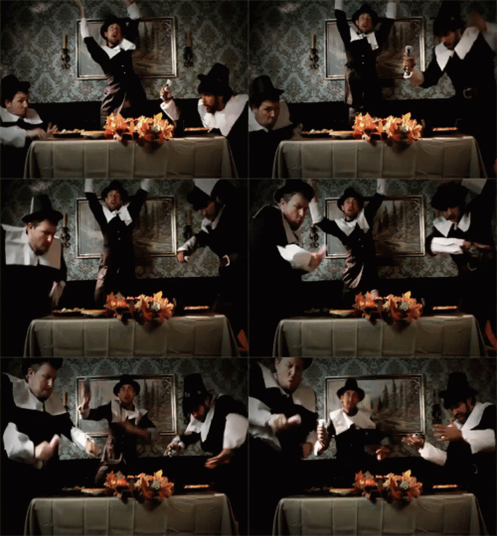
The white trim on the shoulders of the Avluminati/Deathly Hallows 3rds still reminds me of a pilgrim collar. :shakehead

tenor.gif
^This

These are terrible. Blueberry was way better, or even the Colorado wording fronted one from the past. I think a modernized version of the Blueberry would be ideal for a 3rd, lighten up the blue just a tad so it an homage to the Quebec days and it is perfect. Blue pants too, not black...

erik-johnson-nhl-st.-louis-blues-colorado-avalanche.jpg

Colorado-Avalanche-Maroon-Alternate-Jersey-2001-07.jpg
 

Foppberg

Registered User
Nov 20, 2016
24,168
26,671
Summerside, PEI
Eh, they were just done poorly. Replace a good bit of the maroon with white (basically flip flop the white and maroon), wear blue pants, use different arm/waist patterns.

I do also like the maroon Colorado jersey, but again it needs work.
I did love the maroon Colorado ones, those ones were nice.
 

UncleRisto

Not Great, Bob!
Jul 7, 2012
30,982
26,012
Finland
Eh, they were just done poorly. Replace a good bit of the maroon with white (basically flip flop the white and maroon), wear blue pants, use different arm/waist patterns.

I do also like the maroon Colorado jersey, but again it needs work.
Mmm I see, they were good if they were a different jersey.
 

S E P H

Cloud IX
Mar 5, 2010
31,136
16,657
Toruń, PL
Not sure why we have to get into a comparison contest here, I personally like our entire jersey set and how they're setup with the current alternative as an alternative.
 

Pokecheque

I’ve been told it’s spelled “Pokecheck”
Sponsor
Aug 5, 2003
46,441
29,576
The Flatlands
www.armoredheadspace.com
Oh good Lord, the blueberries were awful.

The ONLY thing I'd consider changing on the alternate is the flared out shoulder yoke. Just make it normal and it'd be perfect.

I really like their current uniform set. I'm glad the unipron (and the blueberries) were left in the past with all that mediocrity and losing. At least I'm hoping they're finally done with the losing...
 

MacBradley

Registered User
May 5, 2014
361
418
It's a hard NO from me.

The 3rds are nice enough designs, but..

- The Mountain jerseys have one of the most unique color palettes and designs in the league. The alts aren't even the Av's colors!

- The Mountain jerseys have arguably more historical importance to them than any other "modern" expansion or relocation team in the NHL. First year in, those jerseys were fresh to everyone's to crush the Red Wing behemoth that year and win the Stanley Cup. And the team won another cup a few years later. I believe that sticking close to the jerseys from a winning era is a great point of pride for a franchise. O6 teams do it, and when teams like the Pens/Oilers/ect stray from it, they look worse and eventually try to reboot their classic jerseys. Leave the jersey flip flopping to teams still looking for a winning history like Florida/Arizona/ect.

- The Colorado Rockies moved to New Jersey, and the alt logo is basically the Colorado Rockies logo. It would be like the Jets styling their main Jerseys with the Thrasers logo.

- MOST IMPORTANTLY...the Hockey Gods have spoken! It was never the cap that killed the Avs...it was the backslide from the original jersey design! When the Mountain design returned, the Avs went from the worst team in modern history to making the playoffs two years in a row and once again having two players among the best of the league! Do you really think MacKinnon would have gone from a 63 point career high in points to Sakic like point totals without the Mountain jerseys? NO WAY!!
 

Ad

Upcoming events

Ad

Ad