
Iam frustrated since I was really happy when we switched to the classical design of 1995-2007 though I do love the alternate scheme with its colors and especially the logo, which seems to me an iconic classic like those of the old Jets or Whalers while the current one is more of cartoonish 90s style.
Do you want our alternate jersey be the primary one
- Thread starter Lavina21
- Start date
You are using an out of date browser. It may not display this or other websites correctly.
You should upgrade or use an alternative browser.
You should upgrade or use an alternative browser.
Ararana
Registered User
No. They brought back the old jerseys and they are fire.

UncleRisto
Not Great, Bob!
Foppa2118
Registered User
- Oct 3, 2003
- 52,476
- 31,797
I still want them to go back to the home whites.
No. Leave things the way they are. The ONLY thing I'd adjust is the letters on the burgundy jerseys. The silver-on-white gets washed out on TV, just throw a little black outline on there and they'd be perfect. But alas, that's getting nitpicky.
Few things irritate me more than when they take their alternates and make it the regular uniform (aka, pulling a Penguin). Why the Wylde insisted on spending so many years in those gawdawful red Christmas sweater nightmares I will never know. I like the alternates, but they need to STAY alternates.
Few things irritate me more than when they take their alternates and make it the regular uniform (aka, pulling a Penguin). Why the Wylde insisted on spending so many years in those gawdawful red Christmas sweater nightmares I will never know. I like the alternates, but they need to STAY alternates.
RockLobster
King in the North
Agreed w/ @Foppa2118--go back to wearing whites at home.
But as for the question asked by OP, no, I don't think it's necessary anymore. The changes made with the switch to Adidas are f***ing amazing. The only tweak I'd make is finding more reasons to wear the alternate. So bump it up a few more games going forward.
(I would, however, adjust the Colorado "C" on the shoulder pads so they're both facing the right way, instead of the way they are now)
McMetal
Writer of Wrongs
- Sep 29, 2015
- 14,204
- 12,325
Ew, no, I hate the alternates. That navy blue just looks ugly on the ice.
Foppberg
Registered User
No, they're perfect. I used to LOVE our navy 3rds, now... Eh. They're still nice but I love our current set.
madman
Deadmarsh Deli Dills
Nope. The new primaries are great. And I still don't like the huge white shoulder section on the thirds - makes them look like pilgrims on the ice. Needs a band of burgundy between the white and navy.
Spleenless Wonder21
Done like dinner
Mountain sweaters forever.
The white trim on the shoulders of the Avluminati/Deathly Hallows 3rds still reminds me of a pilgrim collar.

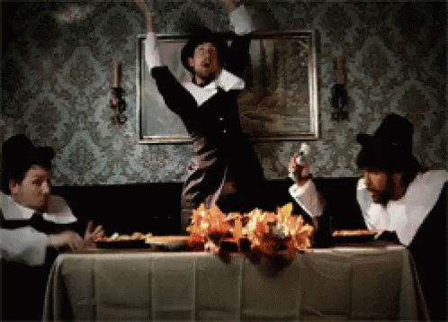
The white trim on the shoulders of the Avluminati/Deathly Hallows 3rds still reminds me of a pilgrim collar.
Veritas0Aequitas
Registered User
No. The new jerseys are not as good as their original but they’ll do. Go back to home white though it’ll never happen.
Bill Peckerskull
Fargin' Icehole
If anything, I feel like they need a different alternative. I hate the navy ones. The old burgundy alternates were perfect, IMO.
The Kingslayer
Registered User
quesosauce
Registered User
If anything, I feel like they need a different alternative. I hate the navy ones. The old burgundy alternates were perfect, IMO.
I liked them, in fact I own one, but I wouldn't want that one back now. DEFINITELY not the blueberries either.
klozge
Avs
The Kingslayer
Registered User
Nalens Oga
Registered User
Surprised how many people love the whites here. I have nothing against them but in my opinion they are mediocre while the burgundy and blue are perfect. I also prefer silver line over black and white of 1995-2007 design as a homage to Colorado’s silver mine industry.
As for burgundy alternate of 2002-2007, it is cool but the lettering in a Rangers style is quite annoying.
As for burgundy alternate of 2002-2007, it is cool but the lettering in a Rangers style is quite annoying.
to answer the OP: NEVER
the alternates are fine are as alternates, to commemorate the hockey-related past, but use them as primary and might as well rename Avs to Rockies.
the alternates are fine are as alternates, to commemorate the hockey-related past, but use them as primary and might as well rename Avs to Rockies.
Tike Myson
Registered User
Def want to bring back whites for home, now and then I’ll see a home team choosing to use whites which makes the whole godamn thing even more confusing. Wish it never changed in the first place
I’m indifferent to the logo change, I think both with the color schemes look good. I’d be ok with switching over to new design for primary if only for the sake of making the 90’s AVS Jersey the 3rd “retro throwback jersey”
I’m indifferent to the logo change, I think both with the color schemes look good. I’d be ok with switching over to new design for primary if only for the sake of making the 90’s AVS Jersey the 3rd “retro throwback jersey”
Hennessy
Ye Jacobites, by name
I love the 3rds, but they're fine being just that. Avs use them often enough as it is. And I also wish the shoulders weren't white, or at least not so much of it.
AvsFanInMichigan
“Thank you, thank you, thank you!”
Ad
Latest posts
-

-
 GDT: WCF | II | "They Have Faults, Ref" | Oilers @ Stars | 5.25.24 | 6:00PM | SN/CBC
- Latest: jesusbuiltmyhotrod
-

-
