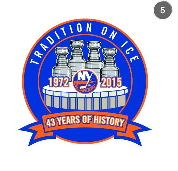
Commemorative Coliseum Logo

Levi Walking Bear

Very Interesting
Oct 8, 2009
5,004
27
Anywhere
I agree. That was the birth of the glory years. That season made me an Islander fanatic rather than just a fan. I can remember everything about it. I was 15 years old and we did not have cable, so I listened to every home game on the radio with Dom Valentino. I also remember watching road games on channel 9 with Tim Ryan and George Michael. That was a magical season that started a great 10+ year run.

Good memory remembering the announcers, like you would listen on radio and see the road games that were on TV. Went to about 12 home games and one road game where the Islanders beat Buffalo for the first time 3-0. Just a fantastic season.
 

BroadwayJay*

Guest
BvkqvsyIMAAuC5j.jpg
 

doublechili

For all intensive purposes, your nuts
Apr 11, 2006
18,655
15,027
Or,

"Tradition on Ice: 43 Years of History
The First 12 Years Amazing
The Last 31 Years, Not So Much"
 

TheWhiteWhale30

Registered User
Dec 3, 2007
3,876
230
There is zero need for "tradition on ice" and "43 years of history" the cups, the coli, the date and the logo say all of those things...that's why they are there. Take away those things and I like it. It looks corny and crowded. Way too much going on.

The lettering above and below makes me feel like I'm listening to a commercial for PC Richards. Less is more
 

SI90

Registered User
Jul 25, 2011
85,731
63,378
StrongIsland
Tradition on ice sounds like a Disney event.


Patches look nice though. I like the cups on top of the Coli.
 

TheWhiteWhale30

Registered User
Dec 3, 2007
3,876
230
Tradition on ice sounds like a Disney event.


Patches look nice though. I like the cups on top of the Coli.

This. Exactly what I mean. Adding the text to it made it corny. Now that I see the actual patch it looks better then I thought but would still be better without the text. Isles have done worse but could be better.

Also the black lines on the cup look pretty bad...idk anything about what it takes to make one especially at that small of a size (maybe that's about as good as it can be done) but it leaves a lot to be desired. They should just remove the wording and at the top and put it the outer circle 1972-2015 and the bottom "NVMC" or Nassau Coliseum or the whole thing spelled out. 2nd other option would be removing the words again and leaving the dates where they are and put Nassau veterans on the top half of the outer circle and bottom half of the outer circle "memorial coliseum"

Overall I give it a 5/10. I'd rather have that then nothing at all I guess. When it comes down to it all that matters is how they play in this final season..nothing else matters. Can we drop the puck already ?!?
 
Last edited:

Space Herpe

Arch Duke of Raleigh
Aug 29, 2008
7,117
0
The patch looks nice.
Nicer than the graphic.
The graphic looks like it was made on MSPaint.
By an intern.
Which is probably how it came to be.
 

IceAce

Strait Trippin'
Jun 9, 2010
5,166
10
Philadelphia
Lousy logo from a design point of view.

There's WAY too much negative space (blue). "Tradition on Ice" should be bigger and bolder. Not to mention that sucks in and of itself. What does it mean? Are we putting our tradition on ice, as in away in the closet? (insert jokes here)

The Cups are the only things in the logo outlined in black for some reason, and the Coliseum rendering looks like a tupperware container.

It's like the team's marketing director hired a 12 year old to design this or the team's marketing dept is using design software that's 20 years behind the current industry standard.
 
Last edited:

Ad

Upcoming events

Ad

Ad