2017 New Logo/Jersey News And Concepts

Status
Not open for further replies.

great1

Registered User
Nov 13, 2009
1,314
57
Fergus, Ontario
So the banners at the CTC have been replaced/updated and the 3D centurion is used on all of them. Clue that it ain't going anywhere...

https://twitter.com/senatorsdj/status/774656494482620416

The new Finnigan banner looks really nice imo but those other banners are horrible.

I didn't like that the previous Stanley Cup banners had the 2D logo because it wasn't that teams identity. Would it not have made sense to use the heritage O logo on those banners?!

I was really hoping that we could ditch the carton 3D logo when Adidas took over.
 

BonkTastic

ಠ_ಠ
Nov 9, 2010
30,901
10,092
Parts Unknown
I can deal with keeping our less-than-stellar logo if we can get nice-looking jerseys to compliment it.

I mean, it's not ideal, but there's nowhere to go from our current home/away sets but up.
 

Viletho

Registered User
Jan 20, 2015
3,863
1,327
I can deal with keeping our less-than-stellar logo if we can get nice-looking jerseys to compliment it.

I mean, it's not ideal, but there's nowhere to go from our current home/away sets but up.

Seriously just a nice Jersey would be more than welcome. The jersey in the OP with the current logo would still look WAY better.

Our jersey look unfinished, plus the sox they are using don't compliment the jersey.
 

saskriders

Can't Hold Leads
Sep 11, 2010
25,065
1,608
Calgary
Terrible move. Why can't this team understand that the fans hate the current logo? Is Melnyk just so attached to it he can't let go?
 

L'Aveuglette

つ ◕_◕ ༽つ
Jan 8, 2007
47,845
19,809
Montreal
Terrible move. Why can't this team understand that the fans hate the current logo? Is Melnyk just so attached to it he can't let go?

And for a team that isn't exactly rich, you'd think getting a better logo and jersey would go a long way in improving revenue.

Really disappointed.
 

great1

Registered User
Nov 13, 2009
1,314
57
Fergus, Ontario
I can deal with keeping our less-than-stellar logo if we can get nice-looking jerseys to compliment it.

I mean, it's not ideal, but there's nowhere to go from our current home/away sets but up.

A horrible logo can make a good uniform look bad.

yJaKxZQ.jpg
 

BonkTastic

ಠ_ಠ
Nov 9, 2010
30,901
10,092
Parts Unknown
A horrible logo can make a good uniform look bad.

yJaKxZQ.jpg

In fairness, any logo that wasn't made to mesh with the rest of the uniform can also look bad.

I mean, we have a bad logo, I'm not challenging this... but if we're insisting we keep it, the challenge then is to find the right jersey design to pair with it.
 

danielpalfredsson

youtube dot com /watch?v=CdqMZ_s7Y6k
Aug 14, 2013
16,575
9,269
In fairness, any logo that wasn't made to mesh with the rest of the uniform can also look bad.

I mean, we have a bad logo, I'm not challenging this... but if we're insisting we keep it, the challenge then is to find the right jersey design to pair with it.


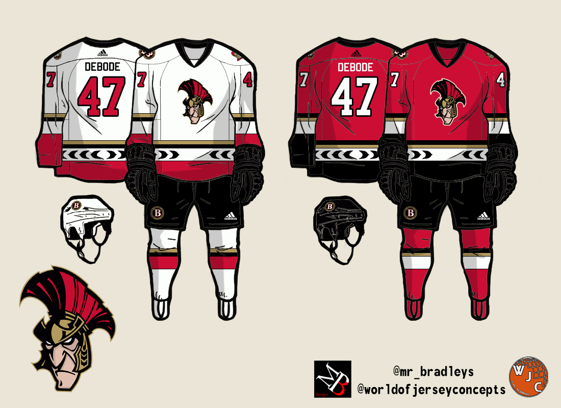
Here's a decent concept that might fit, obviously swap out the Bsens logo for the Sens one.

BradleyDeBode-BIN%2528AHL%2529.jpg
 

Senzilla

Registered User
Aug 20, 2016
218
0
Ottawa
So the banners at the CTC have been replaced/updated and the 3D centurion is used on all of them. Clue that it ain't going anywhere...

https://twitter.com/senatorsdj/status/774656494482620416

This actually enrages me. That logo has no business on those banners, those things are not supposed to be replaced. We've had those banners since the Civic Centre days. It's also distressingly out of touch with what the fanbase wants. My gauge seems to be that 60% want the 2D Senator back while 40% want the "O." No one wants the 3D Senator to come back.
 

mat_sens

@mat_sens #lalala
Jan 22, 2007
6,417
292
Ottawa
This actually enrages me. That logo has no business on those banners, those things are not supposed to be replaced. We've had those banners since the Civic Centre days. It's also distressingly out of touch with what the fanbase wants. My gauge seems to be that 60% want the 2D Senator back while 40% want the "O." No one wants the 3D Senator to come back.

Should start some kind of petition again. It worked out once with the Heritage jersey.
 

edguy

Registered User
Feb 5, 2014
8,915
1,455
Charlottetown, PEI
This actually enrages me. That logo has no business on those banners, those things are not supposed to be replaced. We've had those banners since the Civic Centre days. It's also distressingly out of touch with what the fanbase wants. My gauge seems to be that 60% want the 2D Senator back while 40% want the "O." No one wants the 3D Senator to come back.

Guess im a no one :laugh: I really dislike that old 2D one..
 

benjiv1

Registered User
Mar 8, 2010
5,230
3,368
Ottawa
I'm pretty sure that the banners are temporary, and the originals are going to be used for the 25th Anniversary Display.
 

MarkZackKarl

Registered User
Jun 29, 2002
2,978
12
Ottawa
Visit site
Ah man. What a downer. It's like the org just doesn't get it. So out of touch or just plain stubborn; it's costing them a lot of money.

For what its worth. I spoke to one of the head merchandisers last season as i had one of the old 2d jerseys. I basically told him that no one likes the current look and asked when there would be a change. He indicated that a change was coming for the 2017-18 season. If they stick with the crap 3d logo ill be pretty annoyed. So change might be a jersey design change. Still their marketing and branding decisions continue to baffle me aside from the heritage jersey that they needed outside help to think up...
 

danielpalfredsson

youtube dot com /watch?v=CdqMZ_s7Y6k
Aug 14, 2013
16,575
9,269
For what its worth. I spoke to one of the head merchandisers last season as i had one of the old 2d jerseys. I basically told him that no one likes the current look and asked when there would be a change. He indicated that a change was coming for the 2017-18 season. If they stick with the crap 3d logo ill be pretty annoyed. So change might be a jersey design change. Still their marketing and branding decisions continue to baffle me aside from the heritage jersey that they needed outside help to think up...

It makes sense that there'd be a change over in 2017-18 because the entire league is switching to the Adidas uniforms which judging by the WCOH on ice jerseys are an entirely different jersey build than the current Edge 2.0s.

I was baffled that Florida would change over their uniforms this season given that it is so close to the change over. Seems like a waste.

On a side note, I wouldn't buy any Sens jerseys this year. I am guessing once the change over happens there'll be loads of liquidated outdated jerseys for cheap prices.
 

Rodzilla

Registered User
Aug 31, 2010
10,969
3,364
Canada

These are perfect, would be nice to see us go back to black. The thing I don't like with the big O is that it's too simple for a logo and even though it's historic, too easy for other fan-bases to say "O for 0 cups" and cheesy insults like that. Just MO.
 

Engineer

Rustled your jimmies
Dec 23, 2013
6,143
1,892
So the banners at the CTC have been replaced/updated and the 3D centurion is used on all of them. Clue that it ain't going anywhere...

https://twitter.com/senatorsdj/status/774656494482620416

There are no words for the level of stupid here.

WTF are (even newer) modern logos doing on the banners that pay homage to the original Senators?

It was stupid enough that they had the 2D ones, but to spend money on new banners and update them to the even ******** 3D logo isn't only baffling, but this organization is completely tone deaf.
 
Status
Not open for further replies.

Ad

Upcoming events

Ad

Ad