
Should Sens get an alternate uniform?
- Thread starter JMACole
- Start date
You are using an out of date browser. It may not display this or other websites correctly.
You should upgrade or use an alternative browser.
You should upgrade or use an alternative browser.

PoutineSp00nZ
Electricity is really just organized lightning.
Either the gold trim or the O jerseys. Best alternates this team has ever had.
StoicSensFan
ᕕ(ᐛ)ᕗ
frightenedinmatenum2
Registered User
The biggest thing they could do marketing wise that would be a win would be to do a limited run of the Peace Tower jerseys as alternate jerseys.
The crappy mesh versions sell for 100+ on eBay. There is demand for them. The demand is partly predicated on them being limited. I don't think people like the jerseys as much as hardcore fans/collectors like the idea of having a status symbol. That is why I would do them as a limited thing. Quite frankly, I'm surprised they never did them for Reverse Retro.
If they want to do something really wacky and wild, they could do a Peace Tower green version of our home jersey. Or a gold version.
Masterplan
Registered User
- May 9, 2022
- 101
- 103
As the saying goes "Lipstick on a pig". Lets start winning games before we deck the team out in new garb.
Sens of Anarchy
Registered User
- Jul 9, 2013
- 65,732
- 50,561
StoicSensFan
ᕕ(ᐛ)ᕗ
And the 3D logo isn't?! Unless you mean the Senagoth oneBring back the 3d logo and don't use the one that says "sens" or the striped O, each of those are hideous
Golden_Jet
Registered User
- Sep 21, 2005
- 23,341
- 11,431
No, finally they dumped that one.Bring back the 3d logo and don't use the one that says "sens" or the striped O, each of those are hideous
Tuna99
Registered User
- Sep 26, 2009
- 15,098
- 7,085
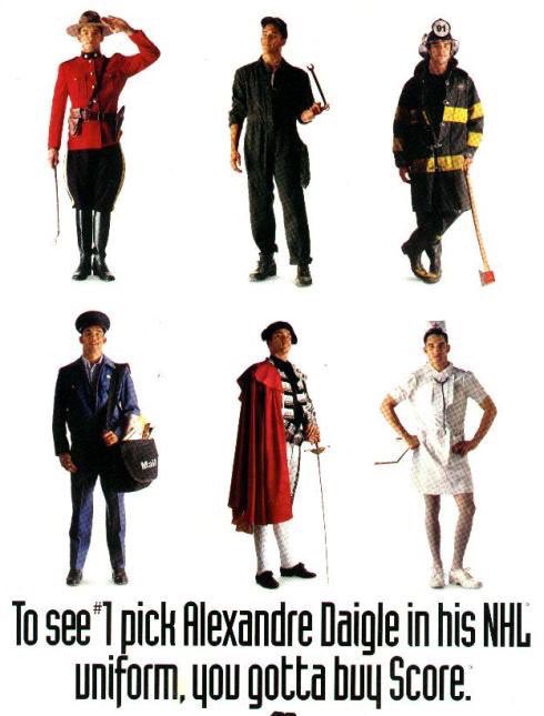
Better not John Cooper see him
I’m that nurses skirt or he’ll blow a gasket
Golden_Jet
Registered User
- Sep 21, 2005
- 23,341
- 11,431
Why is Daigle making a comeback.Better not John Cooper see him
I’m that nurses skirt or he’ll blow a gasket
BonHoonLayneCornell
Registered User
Maybe that new documentary? Got the juices flowing again. Comeback number 2 time.Why is Daigle making a comeback.
Tuna99
Registered User
- Sep 26, 2009
- 15,098
- 7,085
Why is Daigle making a comeback.
Not how you think, He has taken up nursing
frightenedinmatenum2
Registered User
Keep in mind, I don't know how to use Photoshop.
Could Adidas make a copper jersey that changes colour after getting wet? Or, a copper jersey where after every wash cycle the copper dye has a chemical reaction and it turns green? Something like that.
Colors and stuff are way off, I didn't intend to create the Boston Dallas Senators.
You can't have red in the logo or else it looks too Christmas themed with the green. The logo should be the two toned black/white version of our logo but I just made it hued copper because pasting the former is way above my pay-grade editing images.
Maybe it could use a Rangers style wordmark going down the jersey. Or, the O logo. I think using the Peace Tower logo is a bit much with a copper/green jersey.
frightenedinmatenum2
Registered User
Here is a red version.
While it doesn't seem like a big deal, I think the black forearms is something we need to bring back on our jerseys. As good as the home/away look, they could be about a dozen different teams once you take the crests off of them. Ottawa's original white home jersey was one where you knew it was a Sens jersey just based on the template of the black arms and two colored stripes.
I think we need a really cool alternate Lion logo though. Not like Spartacat flying through the air with a hockey stick and a cape, but a scary and majestic MGM style lion, possibly wearing a Spartan helmet.
Sens won’t have new Jerseys until at least 2026 as far as I am aware.
No new projects were on the go until Andlauer came on board, and they are still in the process of hiring their Managers/Directors of Creative Content and Marketting
It’s about 2 years between concept and roll out, minus exceptional circumstances.
That being said, internally they are wanting to do something related to the black/gold Senagoth template.
frightenedinmatenum2
Registered User
Sens won’t have new Jerseys until at least 2026 as far as I am aware.
No new projects were on the go until Andlauer came on board, and they are still in the process of hiring their Managers/Directors of Creative Content and Marketting
It’s about 2 years between concept and roll out, minus exceptional circumstances.
That being said, internally they are wanting to do something related to the black/gold Senagoth template.
I'm pretty sure that outside of special event jerseys, there aren't going to be any new jersey designs for any teams for a few years because Adidas is losing the license.
The black/gold template is what the team should have gone for years ago. Vegas jerseys are very close to it now, except they have grey instead of black.
Neil Patrick Harris
Now sponsored by Zoom™
Hmm... maybe some sort of green shoulder element à la the Parliament roofs?View attachment 862570
Keep in mind, I don't know how to use Photoshop.
Could Adidas make a copper jersey that changes colour after getting wet? Or, a copper jersey where after every wash cycle the copper dye has a chemical reaction and it turns green? Something like that.
Colors and stuff are way off, I didn't intend to create the Boston Dallas Senators.
You can't have red in the logo or else it looks too Christmas themed with the green. The logo should be the two toned black/white version of our logo but I just made it hued copper because pasting the former is way above my pay-grade editing images.
Maybe it could use a Rangers style wordmark going down the jersey. Or, the O logo. I think using the Peace Tower logo is a bit much with a copper/green jersey.
frightenedinmatenum2
Registered User
frightenedinmatenum2
Registered User
This would be 10/10.
I like the current home jersey aesthetically, but I don't like it identity wise. You put it on a poster or a small print ad where the logo isn't completely visible, and you don't know it's the Senators. The home jersey could basically be any team, the design is not unique enough. Conversely, if you throw the above jersey in the same situation and it's either the Senators or Golden Knights (who ripped that jersey off, so it's a moot point)...
Faux-backs are also going out of style as well. The big trend last decade was to go back to the jerseys teams wore in the 60s, or have jerseys look simple with striping and drawstrings. Now this decade it's moving towards where people want more late 90s types of busier designs, but maybe with a bit more care and self-awareness. I understand the irony that our home jersey was created in the 90s.
They should figure out what kids think is cool because at the end of the day anybody who is in their 20s, 30s, or beyond and cheering for the Senators is stuck here forever. It's all about getting the next generation and having Etienne from Orleans cheer the Sens instead of the Canadians, or George in Arnprior tell his dad he wants a Brady Tkachuk jersey for Christmas, not his dads old Dave Keon jersey.
frightenedinmatenum2
Registered User
Burrowsaurus
Registered User
- Mar 20, 2013
- 42,671
- 16,235
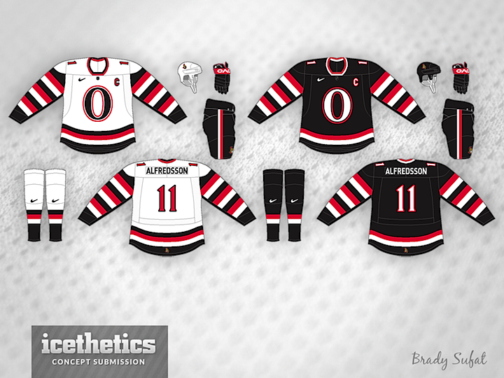
Bring back the red O jersey. That thing was beautiful on the ice
frightenedinmatenum2
Registered User
Bring back the red O jersey. That thing was beautiful on the ice
I like it, but I think the striping is a bit boxy.
I have seen a few concepts that are a similar idea, but seem a bit sleeker.
L'Aveuglette
つ ◕_◕ ༽つ
Definitely the gold trim/laurels jerseys should be brought back, and I'm glad to hear that is actually the plan down the line.
Ad
Upcoming events
-
-
 French Open - Women's FINAL - Iga Swiatek vs Jasmine PaoliniWagers: 2Staked: $2,010.00Event closes
- Updated:
-
 Stanley Cup PICK ONE PLAYER - Conn Smythe Trophy WinnerWagers: 13Staked: $19,415.00Event closes
- Updated:
-
 Series Winner Edmonton Oilers vs Florida PanthersWagers: 24Staked: $87,937.00Event closes
- Updated:
-
