European Clubs mimicking NHL jerseys and logos

filip85

Registered User
Feb 7, 2017
1,589
779
From 1995-1996 on, this was the alternate logo of the Washington Capitals:

View attachment 352884

(Later it would become the main logo from 2002-2003 to 2006-2007.)

In Germany, a club called Preussen Berlin went through financial troubles and a few renamings in the mid-1990s. In July 1996, the organization was rebranded as the Berlin Capitals. The logo they came up with:

View attachment 352883

Not exactly a copy, but it's obvious that they had the Washington alternate logo in front of them when they "created" this one. The elements are the same (puck, stars, a central nameplate) with slight variations (one stick instead of two, the way the star band and the puck form an almost-line balances out the missing stick; the Capitol building was replaced by a globe).
One spanish team had similiar logo to Caps eagle (?) in fly from 90-s.
 

Theokritos

Global Moderator
Apr 6, 2010
12,542
4,945
HV71 Blue Bulls

Björklöven Lynx

Good examples.

the following Luleå bear logo was the standard until a couple of seasons ago when they went back to the original logo from the 70s as the main one. I still like it, I grew up with it and as a kid I was proud of my team having a really cool looking, “modern” logo. It’s also quite well thought out, in my opinion, with the “fire” actually symbolizing the Northern lights and the snowflakes putting an extra emphasis on just how freakishly far north we’re from.

It's one of the very best NA-style logos in Europe for sure, one of the few worth keeping.

KHL Teams do it with jerseys too

The newer Magnitogorsk logo isn't a copy of an NHL logo, but clearly an attempt at Americanization and it's needless and cringeworthy as hell to me.
 

vorky

@vorkywh24
Jan 23, 2010
11,413
1,272
Sibir Novosibirsk. A few pictures of their jerseys here & here.

Hockey started in Novosibirsk after WWII, earlier they played bandy. Several clubs played in the city in the 1950s, the strongest being Dynamo & Khimik. In 1962, both clubs merged & Sibir was created as a successor. The new club used a snowflake in the logo.

In mid-1960s the club used "Canadiens logo." There is a legend (in blog) claiming that a hockey referee Karandin brought Montreal´s merchandising from some international hockey tournament. And someone in Sibir realised "Club de Hockey Canadien = Сибирь Новосибирск" I have no clue if a legend is true, just the blog claims it.

In 1984 Sibirs used a snowflake again for a short period of time. Later, Montreal´s logo again.

In 1993-1995 Sibir had another logo, the blog claims that jersey was similar to Edmonton (see a photo in source above).

After 2000 they used another logo. Pictures in link above.

Current logo is

HC_Sibir_Novosibirsk_logo.png


E: Karandin story was earlier written by another poster.
 
Last edited:

MadArcand

Whaletarded
Dec 19, 2006
5,872
411
Seat of the Empire
The infamous Slovan Bratislava ripped off the Penguins:
hc-slovan-bratislava-133895.jpg


Even more hilarious is Senica copying Sens:
images

They used to call themselves Knights (Rytiers), but they made a typo in the name and ended up calling themselves Asswipes (Ritiers). Not kidding. Unfortunately Google doesn't help me to find their old logo...
 
  • Like
Reactions: Yozhik v tumane

Robert Gordon Orr

Registered User
Dec 3, 2009
979
2,039
Very much in-your-face. You'd expect that from the 1960s or 1970s when there was less global exposure, but nowadays? How is this not copyright infringement?
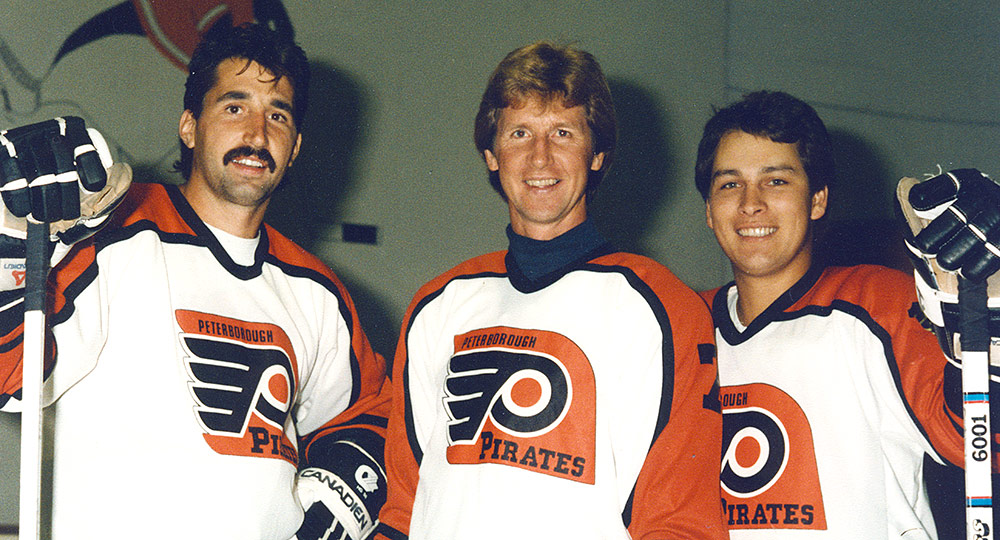
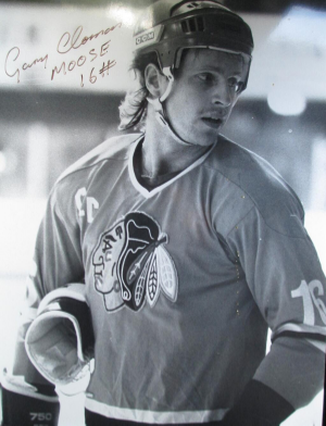
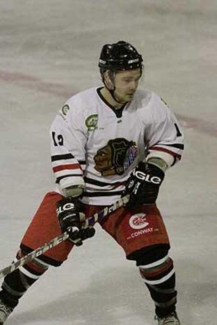
Let us not forget some of the other teams in the UK.

image-004.jpg

Peterborough Pirates (yes, that's Garry Unger in the middle).


image.jpg

Fife Flyers (from Scotland)


87357039_1076982545969340_2137781299698466816_n.jpg

Ayr Bruins (Also from Scotland)


moose_smll.jpg
1158100.jpg

Streatham Redskins - The almost identical jersey was also worn by Whitley Warriors
 

vorky

@vorkywh24
Jan 23, 2010
11,413
1,272
Gornyak Uchaly in the VHL a few years ago. Now, they have a different logo

scale-1200.png
 

Robert Gordon Orr

Registered User
Dec 3, 2009
979
2,039
It's well known that the Montreal Canadiens were probably the NHL team most adored and idolized by European hockey followers in the 1960s and 1970s. However, I wasn't aware that some European clubs went as far as even wearing 'Canadiens jerseys' (very similiar to what the NHL Canadiens wore) during that time. Photos I have stumbled across recently show that HC La Chaux-de-Fonds (Switzerland) and Sibir Novosibirsk (Soviet Union) actually used such jerseys as their regulars.

1) HC La Chaux-de-Fonds
Located in the francophone part of Switzerland, similiar to the Canadiens in Quebec. It was easy to connect the name La Chaux-de-Fonds with the CH logo of the Montreal Canadiens.

Another Swiss club, Fribourg-Gotteron have a similar logo.

oBfekoF3LKtrtBOCMhvWmA9j8BDXU4p4QLVLJwT8.jpeg


30405-1-hc-fribourg-gotteron.png
 

Sanf

Registered User
Sep 8, 2012
1,948
902
This may have been thing in other countries too. Never done research.

In the late 60´s early 70´s Helsinki (and some other cities) started to play junior hockey league between different neighbourhoods of the cities. The leagues were often called Kanada sarja (Canada Series) or korttelikiekko. The junior teams directly took the names from NHL clubs. For example Jari Kurri started "organized" hockey in Toronto Maple Leafs of Vuosaari. (With quick googling I guess Vuosaaren Toronto may still exist in some form in veteran hockey).

Some of those "unofficial" clubs later became official clubs. Atleast one still exist as Helsinki Red Wings.

Old logo
206px-Helsinki_Red_Wings_logo.png


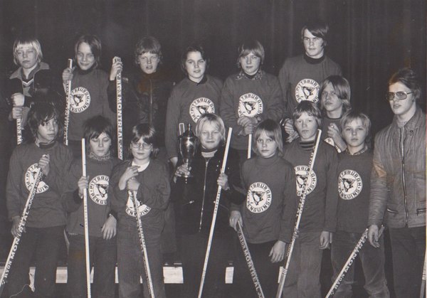
Photo from Canada Series team from Rovaniemi (1974 apparently). Kids representig Pittsburgh Penguins
58913_big.jpg


In many forms these still exists, but the names atleast directly (full names) aren´t from NHL clubs. Personally I have represented Philadelphia :)
 

alko

Registered User
Oct 20, 2004
9,389
3,104
Slovakia
www.slovakhockey.sk
From 1995-1996 on, this was the alternate logo of the Washington Capitals:

View attachment 352884

(Later it would become the main logo from 2002-2003 to 2006-2007.)

In Germany, a club called Preussen Berlin went through financial troubles and a few renamings in the mid-1990s. In July 1996, the organization was rebranded as the Berlin Capitals. The logo they came up with:

View attachment 352883

Not exactly a copy, but it's obvious that they had the Washington alternate logo in front of them when they "created" this one. The elements are the same (puck, stars, a central nameplate) with slight variations (one stick instead of two, the way the star band and the puck form an almost-line balances out the missing stick; the Capitol building was replaced by a globe).
Bratislava Capitals
Bratislava_Capitals_logo.png


Prešov Penguins

tEN9gTWmguG_r9a9qoXIyZEi-yBm2oN0mhi049lnHEISvD22MlghnF_APfUVHi20vxNSLJI_9_sIAuiYm8svF8x6wrfMX97sQ6qeFUFZtTTNG7quaw


NfJuD0EHhBBZS0s-73ggXIS0BdzTAkQCpyeaVFwBAmOjsMsjcJL1hdt4EAk9Ce4rywyIvLigl-usOHBZLRer5bn1WpRvsg32jANESCYJHn-JjRVr5bUxW-ISg7vsj26fFUq-XyXErsaX8Q_IjMSq
 

Theokritos

Global Moderator
Apr 6, 2010
12,542
4,945

Good one. Germany is one of the European countries that has gone full North America from the mid-1990s on.

Frankfurter SC → Frankfurt Lions (1994)
Schwenninger ERC → Schwenninger Wild Wings (1994)
SB DJK Rosenheim → Starbulls Rosenheim (1994)
EC Kassel → Kassel Huskies (1994)
EC Hedos München → Maddogs München (1994)
ESC Wedemark → Wedemark Wildcats (1994), Wedemark Scorpions (1996)
EHC Nürnberg → Nürnberg Ice Tigers (1995)
BSC Preussen → Preussen Devils (1995), Berlin Capitals (1996)
Düsseldorfer EG → DEG Metro Stars (2001, dropped in 2011)
EV Landshut → Landshut Cannibals (2002)
 
Last edited:

Robert Gordon Orr

Registered User
Dec 3, 2009
979
2,039
Good one. Germany is one of the European countries that has gone full North America from the mid-1990s on.

Frankfurter SC → Frankfurt Lions (1994)
Schwenninger ERC → Schwenninger Wild Wings (1994)
SB DJK Rosenheim → Starsbulls Rosenheim (1994)
EC Kassel → Kassel Huskies (1994)
EC Hedos München → Maddogs München (1994)
ESC Wedemark → Wedemark Wildcats (1994), Wedemark Scorpions (1996)
EHC Nürnberg → Nürnberg Ice Tigers (1995)
BSC Preussen → Preussen Devils (1995), Berlin Capitals (1996)
Düsseldorfer EG → DEG Metro Stars (2001, dropped in 2011)
EV Landshut → Landshut Cannibals (2002)


Speaking of Germany. I'm going a bit off-track here. One of the more bizarre sponsorship deals was the German club ECD Iserlohn, using Libyan politician/dictator Muammar Gadaffi's "Green Book" on their jerseys in 1987. The club was in financial difficulties and got this unexpected "help" from Libya. Needless to say that this did not go over very well with the German Ice Hockey Federation, and I believe the jersey was only used for one game. Two jerseys have survived. One is in an ice hockey museum and the other in the German Hockey Hall of Fame. It's a highly sought after collectors item today.

Those were the days when something 'whacky" like this could happen.
Apparently when the Iserlohn owner Heinz Weifenbach flew to Libya and met with Gaddafi, the dictator asked what the name of the tennis club was that he was sponsoring. He most likely had never heard about ice hockey. o_O

11-126.jpg


3-format2020.jpg
 

Theokritos

Global Moderator
Apr 6, 2010
12,542
4,945
Those were the days when something 'whacky" like this could happen.

I'm not sure what was more misguided: The club accepting that sponsorship or Gaddafi believing German sports fans would buy his Socialist-Arab-Islamic theory of the world...
A little irony: In the Green Book, Gaddafi speaks out against spectator sport. ("The thousands who crowd stadiums to view, applaud and laugh are foolish people who have failed to carry out the activity themselves.")
 
  • Like
Reactions: Tarantula

iamjs

Registered User
Oct 1, 2008
12,573
936
Bratislava Capitals
Bratislava_Capitals_logo.png


Prešov Penguins

tEN9gTWmguG_r9a9qoXIyZEi-yBm2oN0mhi049lnHEISvD22MlghnF_APfUVHi20vxNSLJI_9_sIAuiYm8svF8x6wrfMX97sQ6qeFUFZtTTNG7quaw


NfJuD0EHhBBZS0s-73ggXIS0BdzTAkQCpyeaVFwBAmOjsMsjcJL1hdt4EAk9Ce4rywyIvLigl-usOHBZLRer5bn1WpRvsg32jANESCYJHn-JjRVr5bUxW-ISg7vsj26fFUq-XyXErsaX8Q_IjMSq

I believe that secondary Penguins logo was a prototype that was designed by the same people who created by the hummingbird/robopenguin. A number of designs were released in the last year or so, and I think that one was on it.
 

Ad

Upcoming events

Ad

Ad