European Clubs mimicking NHL jerseys and logos

Theokritos

Global Moderator
Apr 6, 2010
12,542
4,945
It's well known that the Montreal Canadiens were probably the NHL team most adored and idolized by European hockey followers in the 1960s and 1970s. However, I wasn't aware that some European clubs went as far as even wearing 'Canadiens jerseys' (very similiar to what the NHL Canadiens wore) during that time. Photos I have stumbled across recently show that HC La Chaux-de-Fonds (Switzerland) and Sibir Novosibirsk (Soviet Union) actually used such jerseys as their regulars.

1) HC La Chaux-de-Fonds
Located in the francophone part of Switzerland, similiar to the Canadiens in Quebec. It was easy to connect the name La Chaux-de-Fonds with the CH logo of the Montreal Canadiens.

1969, white jersey:
1968-69HCLaChaux-de-Fondsteam.png


1973, white jersey:
HCC1973.png


White jersey:
1768-1.jpg


Red jersey, apparently 1974:
turlerHCLaChauxdeFond.jpg


2) Sibir Novosibirsk
In Cyrillic letters, Sibir Novosibirsk is spelled Сибирь Новосибирск. The initials СH match Montreal's CH logo perfectly, a fine coincidence. Sibir did some twisting with the style and the colour of their Canadiens jersey over time.

Mid-60s:
0_4df4b_c858a199_orig


1970 (vs Kharlamov's CSKA Moscow):
0_4df4c_12461bcd_orig


Early 70s:
0_4df4d_4d7a1091_orig


1980 (vs Dinamo Moscow):
0_4df4e_d87a820c_orig


Another re-styling (junior team):
0_4df4f_96bbe97d_orig
 
Last edited:
  • Like
Reactions: DaveG and DN28

Killion

Registered User
Feb 19, 2010
36,763
3,215
Wow, just a super find, terrific photo's. Had no idea. Im sure if we do some digging, come up with the stories behind these jerseys, possibly find some other examples. Really interesting. Thanks. Piece of history I was completely unaware of.
 

Theokritos

Global Moderator
Apr 6, 2010
12,542
4,945
Are you sure this is the same team? These jerseys look identical to the Canadiens and for some reason this team seems to be playing swedish Södertäle. Could very well be, just a reflection.

I don't think their opponent is Södertälje, I think it's Sparta Prague. La Chaux-de-Fonds had an exhibition/friendly game against them in January 1974, I guess that's when the picture was taken. You are right that this jersey is a full flight replica, but it's still the same team, no doubt. Team pic from 1970:

La Chaux-de-Fonds.png


From the same season, November 1970:

file.php

link dead

Obviously they were using the red replica as home jersey and the white imitation as away jersey.
 
Last edited:

Killion

Registered User
Feb 19, 2010
36,763
3,215
Looks like they voluntarily dropped using it around 73 in order to avoid the obvious conflict of interest, lack of permission to do so, unaffiliated as they were with the Montreal Canadiens however... one of the picture's above is clearly post 75, 76 or 77'ish (Tuuk blades as opposed to full tube) and is listed as 1980 so not sure what gives with that one. That club won 6 Swiss Championships consecutively between 67 & 73...

If you visit the teams website, History page, a B&W photo of an action shot across the top of a game in which one teams wearing what appears to be Blackhawks jerseys absent the cossed tomahawks on the shoulders, another some sort of take-off on the Bruins uni's. Looks to be about the same vintage, 68-73 or so. I dont recognize that player in the shot, #15, vaguely resembles Stan Mikita however he wore 21 throughout his career & that jerseys not entirely authentic. Maybe the top tier Swiss league replicated the NHL's colors etc through this period in their history?

heres a link to their site with the aforementioned mystery picture across the top... www.hccnet.ch/club/historique
 
  • Like
Reactions: DaveG

Theokritos

Global Moderator
Apr 6, 2010
12,542
4,945
The 1980 picture is from Sibir Novosibirsk, not from La Chaux-de-Fonds. Sibir kept using CH jerseys well into the 80s, they only dropped them after the 1983-1984 season. Permission? I don't think they even thought of that behind the Iron Curtain. Allegedly referee Yuri Karandin, who was from Novosibirsk, brought the CH logo (in some form) with him when he returned from a trip to Canada and the club leaders were amazed to discover that the logo of the famous Montreal team they had heard so much about looked exactly like the initials of their own team Сибирь Новосибирск, CH (Sibir Novosibirsk, SN). The opportunity was too good to pass up, a gift from god (or rather nature/history/... in the USSR).

As for the following picture:
banner-histo.jpg

link dead

I would have sworn it actually shows the Chicago Black Hawks if not for the missing tomahawks. Puzzeling, don't know what to make of it.
 
Last edited:

Killion

Registered User
Feb 19, 2010
36,763
3,215
^^^ Indeed. The Defenceman well behind the play as well, top of the photo, darned if that doesnt look like the Indian Head from the Blackhawks uniform. And if you notice, #15 is wearing his elbow pads on the outside of his jersey, something that was fairly common in the NHL during the 40's (perhaps in Europe & the Swiss League as well?). Also that Goalies catcher appears to be circa late 40's early 50's or somewhere in that era, possibly a bit later. Though difficult to make out, and it would stand out if the Bruins looking uniforms featured the hubbed 'B' of Boston, I suspect that may be HC Davo's. Just barely make out the logo which is very similar to todays, hasnt changed much over the past 8 decades or so.
 

Theokritos

Global Moderator
Apr 6, 2010
12,542
4,945
3) Sokol Kiev (Soviet League) used jerseys with a Maple Leaf logo from 1979 on. The original version from 1979 is clearly inspired by the Toronto Maple Leafs, the later versions are more stylized with the Maple Leaf pulled out of shape, making the descent less obvious. Note that the Sokol jersey even had shoulder patches, very unusual in Europe.

1979-80:
0_96380_93ec9776_orig


Shundrov.jpg


1981-82:
0_96382_43073451_orig


Various versions and rebrandings were used into the 1990s. The Maple Leaf is still incorporated in the logo of Sokol Kiev as of today, although in a less prominent role. Google "Sokol Kiev" to see for yourself.
 
  • Like
Reactions: DaveG

Theokritos

Global Moderator
Apr 6, 2010
12,542
4,945
From 1995-1996 on, this was the alternate logo of the Washington Capitals:

Washington-Capitals.png


(Later it would become the main logo from 2002-2003 to 2006-2007.)

In Germany, a club called Preussen Berlin went through financial troubles and a few renamings in the mid-1990s. In July 1996, the organization was rebranded as the Berlin Capitals. The logo they came up with:

BerlinCapitals.gif


Not exactly a copy, but it's obvious that they had the Washington alternate logo in front of them when they "created" this one. The elements are the same (puck, stars, a central nameplate) with slight variations (one stick instead of two, the way the star band and the puck form an almost-line balances out the missing stick; the Capitol building was replaced by a globe).
 
Last edited:

Sanf

Registered User
Sep 8, 2012
1,948
902
Saipa wore this from mid 80´s? to early 90´s. Couldn´t find photos of the original but this is "retro" version that they used few years ago.

eca208fb208ea1d9e4b610c83e8e565d3ebb1f1193044ad301490de23eff46cf.jpg
 

sr edler

gold is not reality
Mar 20, 2010
11,915
6,348
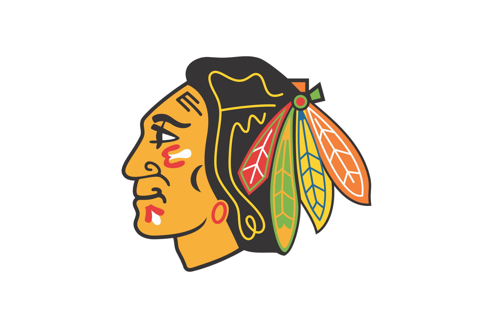
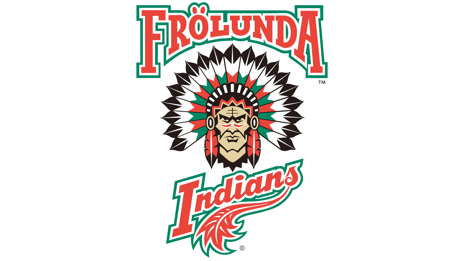
Frölunda Indians (club of Daniel Alfredsson, Henrik Lundqvist, Erik Karlsson, et cetera) is a pretty shameless steal from the Chicago Blackhawks, although it's made with a different type of name and in a bit different type of style too for the logo.

It's possible the real (or official) name of the club is still Frölunda HC though, and that the "Indians" thing is just a nickname. I don't know. :dunno:

While I'm aware of the background for the original name (Black Hawks) of the NHL club, i.e. Major McLaughlin's army affiliations, I don't know the backstory for the Frölunda Indians name (though I wouldn't be surprised at all if there is none whatsoever, probably just a bunch of yuppies getting together somewhere on a lunch).

I think it came along sometime in the mid or late 90s (or early 00?), changing from Västra Frölunda HC. Malmö IF around the same time switched name to Malmö Redhawks. This was around the time NHL games were beginning to get broadcasted on television on a more regular basis in Sweden.

Even though Sweden sometimes is an embarrassingly Americanized country I do think these type of names, Frölunda Indians and Malmö Redhawks, in English, sounds a bit dorky to most Swedish ears. I know it does to mine. I also have no idea what Indians have to do with Gothenburg or the Västra Frölunda area of Gothenburg. It also shows in the fact that not a lot of other Swedish clubs followed suit.

The only similar type of name situation I can come up with, off the top of my head, regarding Sweden is the sport of speedway where the Swedish elite clubs are named things like Vargarna (The Wolves), Örnarna (The Eagles), Getingarna (The Wasps) or Solkatterna (The Reflections of the Sun). Those are popular and not official club names though, and they are in Swedish not English. Speedway is a very rural sport in Sweden, by the way. I think it's mostly popular in Sweden, Poland and somewhat in the UK, and no one else cares.

Logo%2BChicago%2BBlackhawks.png

fhc-logga-shl_fri.jpg
 
  • Like
Reactions: tarheelhockey

Ceremony

blahem
Jun 8, 2012
113,282
15,619
The Guildford Flames of the EIHL have a distinct whiff of the randomly generated EASHL team about them.

752814-780x520.scale_type-center_crop_ffffff.scale_type-center_crop.jpg
 
  • Like
Reactions: JMCx4

Sanf

Registered User
Sep 8, 2012
1,948
902
Interesting. I guess the similiar colour scheme is what prompted them to mimick the Boston Bruins?

Possibly. Though most of the 80´s they went with blue and yellow so it didn´t even suit that well. Ofcourse pure speculation, but maybe part of the reason could have been taking more "hip" and "western" logo. They had gone long with Sputnik as their first or secondary logo.

saipa-jpg.6211


images


edit. And ofcourse at the time they changed to sputnik it was probably "hip"
 

Theokritos

Global Moderator
Apr 6, 2010
12,542
4,945
I don't know the backstory for the Frölunda Indians name (though I wouldn't be surprised at all if there is none whatsoever, probably just a bunch of yuppies getting together somewhere on a lunch).

I think it came along sometime in the mid or late 90s (or early 00?), changing from Västra Frölunda HC. Malmö IF around the same time switched name to Malmö Redhawks. This was around the time NHL games were beginning to get broadcasted on television on a more regular basis in Sweden.

Good examples. The time frame sounds right. From the mid-1990s on (self-)Americanization certainly became fashionable throughout Europe. NHL attire became widely available (the same goes for NBA, MLB, NFL and even NCAA stuff). Clubs and leagues started becoming globally accessible through websites. I also remember Leksands IF rebranding themselves as Leksand Stars and Luleå HF as Luleå Bears. In Switzerland you had Zürcher SC becoming ZSC Lions and EHC Kloten turning into Kloten Flyers. In Finland Kiekko-Espoo turned into Espoo Blues.
 

Theokritos

Global Moderator
Apr 6, 2010
12,542
4,945
The Guildford Flames of the EIHL have a distinct whiff of the randomly generated EASHL team about them.

752814-780x520.scale_type-center_crop_ffffff.scale_type-center_crop.jpg

Very much in-your-face. You'd expect that from the 1960s or 1970s when there was less global exposure, but nowadays? How is this not copyright infringement?
 

Theokritos

Global Moderator
Apr 6, 2010
12,542
4,945
Possibly. Though most of the 80´s they went with blue and yellow so it didn´t even suit that well. Ofcourse pure speculation, but maybe part of the reason could have been taking more "hip" and "western" logo. They had gone long with Sputnik as their first or secondary logo.

saipa-jpg.6211


images


edit. And ofcourse at the time they changed to sputnik it was probably "hip"

Sure, the hipness of the North American style was the decisive factor. I just wonder why they picked the Bruins out of all clubs.
 

Yozhik v tumane

Registered User
Jan 2, 2019
1,835
1,931
Stavanger Oilers was the first club that sprung to mind, however their color scheme and logo looks nothing like the original. Well I guess both logos are circular, but that’s about it.

Here’s some more 90s-00s goodness of Swedish clubs “going NHL” with their branding:

HV71 Blue Bulls
DpztpxaXUAEi7yh.jpg


Brynäs Tigers. I thought they actually had used the tiger for their jersey logo at some point, however I seem to have been mistaken.
i286823014204932774._szw1280h1280_.jpg


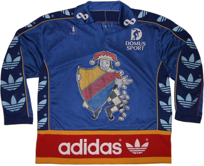
Djurgården ”Joker” jersey. This was earlier, mid-eighties I think, and wasn’t so much the club trying to brand themselves like an NHL team as it was one of the all-time most hideous examples of jersey advertisements (the Joker being placed there because of their sponsor Tipstjänst).
DwFEWeDW0AAoVQs.jpg


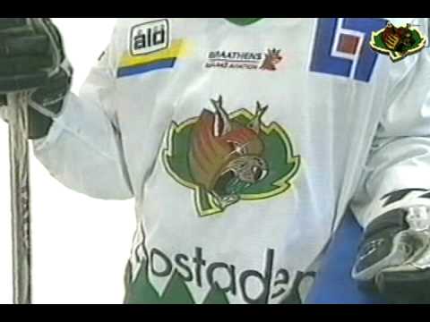
Björklöven Lynx
hqdefault.jpg


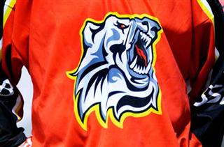
While the fanbases generally hated when their teams were adopting, or flirting with the idea of “NHL style logos”, some of them did last and became popular. I think that predating Frölunda’s in hindsight increasingly cringeworthy rebranding as the Indians, and Malmö becoming the Redhawks, the following Luleå bear logo was the standard until a couple of seasons ago when they went back to the original logo from the 70s as the main one. I still like it, I grew up with it and as a kid I was proud of my team having a really cool looking, “modern” logo. It’s also quite well thought out, in my opinion, with the “fire” actually symbolizing the Northern lights and the snowflakes putting an extra emphasis on just how freakishly far north we’re from. Alas, I do prefer us mainly using the old school logo nowadays, with the bear sometimes being used for Saturday games marketed to families and the like — I think it’s good when teams adhere to sort of “the tradition of European sports”, with history and legacy being favored over marketing ploys.
bb950927pk001-1-1580642531.jpg


Infamously, Luleå later on adopted an even more “NHL-like” bear logo for a season, maybe two, which has mockingly been dubbed “bjärven” (meaning a cross-breed between bear and wolverine, coined by a Swedish sitcom where “bjärven” was a feared, mythical creature) by fans. I’ve seen that some North American hockey fans rated the logo highly, when reviewing European hockey logos, it topped some list on I think maybe Bleacher Report. But it was ridiculed here, and it was embarrassing for us fans. I guess it’s not a bad logo per se — maybe — but loyal Swedish fans may feel like they’re being mocked when their teams try to lure them with some badass looking bearverine rather than with the on-ice product.
imagehandler-ashx.jpg

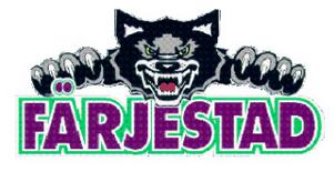
Got so caught up with talking about my own favorite team, I almost forgot this one:

Färjestad Wolves
j-IaNWxyFrB2LQYW8nhv2m7zLO4.jpeg


I wonder if more of these rebrandings would have caught on if only most of them weren’t so damned ugly?
 

Prsut18

Registered User
Jul 30, 2018
467
587
CZ
KHL Teams do it with jerseys too

Spartak Moscow - Detroit
SKA Petersburg - Rangers

Local league here where I live is full of copied NHL jerseys... just my team´s division has teams with Leafs, Habs, Blues and Devils jerseys with different logo, and one has Panthers old logo on different jersey
 
Last edited:

Robert Gordon Orr

Registered User
Dec 3, 2009
979
2,039
By the way, in Australia you have several teams that can be mentioned.
Here you have three teams just from Adelaide

71492831_1403436726499542_3295096066222850048_o.jpg

Adelaide Redwings (not Red Wings)

41215779_1914330408657350_3250360524386336768_o.jpg

Adelaide Blackhawks

2c47f5_6f44650cfcf64668b2bf45dcb7bfead6~mv2.webp

Outside of the NHL. Why not rip-off the logo of Jokerit Helsinki - Adelaide Jokers

I can come and think of more than a dozen other clubs right away that used jerseys that were very similar to what some of the NHL clubs had/have.
 
  • Like
Reactions: Yozhik v tumane

Ad

Upcoming events

Ad

Ad