grentthealien
Registered User
I always thought the modernized Stick and rink looked nice. It is a simple logo, but a lot of great sports logos are.
Last edited:
I always thought the modernized Stick and rink looked nice. It is a simple logo, but a lot of great sports logos are.

Agreed, this is the best Bruins jersey ever, they need to go back to it.Well, as a Jets fan I agree (well, specifically the "white" version). It would be redundant for me to post that jersey again, and although they aren't my favorite team, I select this jersey as Boston's best (and perhaps my favourite jersey of all time). The gold "B", socks, numbers and shoulders, along with the white outline on the shoulders that's ther perfect width and length. Yep, it's my favourite.

Their old greens are so much nicer than their black trim. Red, white, and black is such an uninteresting combination.I don't have as many choices for the Devils as our jerseys have been pretty consistent over the years. It's between the Reebok Away Jerseys from the our Cup era vs. the white, green, and reds of the 80's / early 90's. I'm not a fan of our current Addidas jerseys at all but the away jersey still looks good.
View attachment 174881
vs
View attachment 174883
Yes. I tried to post a photo of it but it wouldn’t allow me for some reason.Are you referring to Vancouver?


Yes. I tried to post a photo of it but it wouldn’t allow me for some reason.


Looks dirty.Neely/Bourque era black uniforms...possibly best in league history


Mine is definitely NOT this one...

The bear looks like he just got hit with a tranquilizer dart
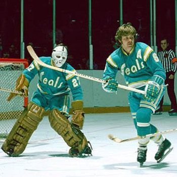
Although I have a soft spot for the green and gold, this one-year variation on the Seals original jersey is my favorite. This was worn in 69-70 only and it added white shoulder yokes with numbers which the original dark jerseys didn't have. Also wider white and blue stripes.

One thing I found baffling is that the Seals changed their colors to teal/white/yellow in 74-75, presumably to cut ties with the cursed Finley era, but why did they keep the same "Seals" wordmark across the front? Seems like they should have ditched that too and resurrected the original logo from the pre-Finley years.


Mine is definitely NOT this one...

The bear looks like he just got hit with a tranquilizer dart


Agreed, this is the best Bruins jersey ever, they need to go back to it.
Bring back the orange socks as well, not a fan of the all black look the Bruins currently sport.
I wholeheartedly concur.Bring back the orange socks as well, not a fan of the all black look the Bruins currently sport.
Bring back the orange socks as well, not a fan of the all black look the Bruins currently sport.
You’re not the only one who thinks this. They’ll ditch the black socks eventually.


To be perfectly honest, the bear on the shoulders kind of turned me off to this jersey. I know it’s a small thing. FOR THE MOST PART, the Bruins have always had great jerseys and this was no exception. It’s like picking your favorite child...Aside from the socks, would you like to see them bring back the yellow 'B' on the dark jerseys?


