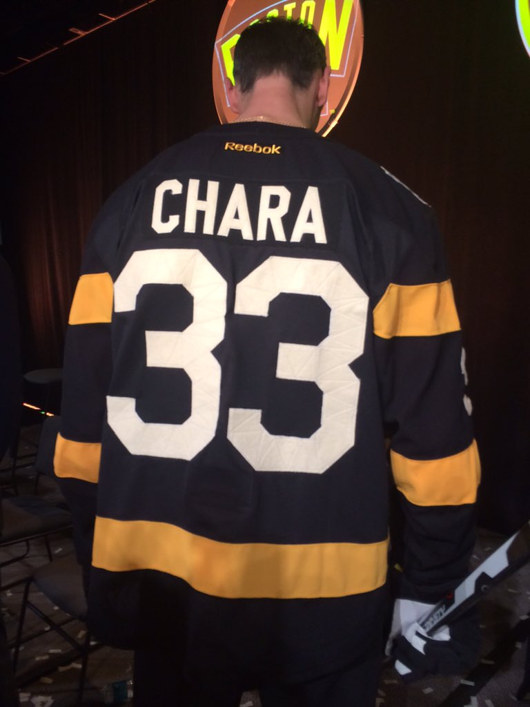
Winter Classic Jersey/Sweater unveiled

Fenway

HF Bookie and Bruins Historian
Sponsor
Sep 26, 2007
68,751
98,751
Cambridge, MA
CSGaBmXWIAAaepD.jpg:large


:amazed:

Awful- simply awful
 
Last edited:

Dellstrom

Pastrnasty
May 1, 2011
25,105
3,553
Boston
I was expecting them to be bad. Even then, I was expecting too much.

My God... that THING is awful. Looks like a bunch of firefighters decided to wear hockey jerseys on the scene.
 

Banded Peak

Registered User
Apr 15, 2015
600
690
I'll have to see it in real life to make a final judgment, but a little underwhelming.
 

bruins309

Krejci Fight Club
Sep 17, 2007
4,702
51
I'll have to see it in real life to make a final judgment, but a little underwhelming.

I'm at the event, and they do look better in person.

I'm in line to get one, maybe. Kinda sleazy that they display an authentic but sell the replica. I'm not sure what difference there will be. My guess is the fabric on the brown bear is def not the same
 

Shaun

Registered User
Oct 12, 2010
25,008
2,688
do you have to go to the pro shop to get the 25% off or can you pre order online somewhere?
 

goalieman40

Registered User
Feb 27, 2006
1,278
952
New Hampshire
Could it have been better? Yes. Is it horrible? No. Some pictures don't do it justice, but it looks good in the picture of Chara, Krejci and Rask. Full uniform will be alright. I don't see the vintage designed spiked b, so I'm guessing that'll be on the pants and/or helmets. They're emphasizing a blend of the current identity (colors) with the original jersey.
 

SoldiersOfFilth

Hamildone with Neely
Dec 28, 2013
992
573
Near Olympia
Pros:

I like the front patch

Cons:

No collar
No lacing
Why are the numbers on the elbow?
Striping gold doesn't match logo gold
In pictures, the number fabric just looks like cheap cut out felt. See below.
Numbers are funny looking

CSGeuw1UsAA1HQb.jpg:large
CSGjDiHUsAA2bUY.jpg:large
 

sarge88

HFBoards Sponsor
Sponsor
Jan 29, 2003
25,420
20,791
I hate brown on sports uniforms. Even the little bit that is on that jersey ruins it for me.

Real men wear black!
 

BMC

HFBoards Sponsor
Sponsor
Sep 26, 2003
69,718
59,567
The Quiet Corner
The brown (ick) is too dull and the gold is too bright. I don't like the #s down on the elbows either, they belong on the upper arms.

Only thing that works for me is the patch on the chest.
 

Artemis

Took the red pill
Dec 8, 2010
20,860
2
Mount Olympus
I like it, but I'm not a uniform fanatic. I believe the "different" elements are from some of the older jerseys.

Everyone has different taste. It's be a boring world if we didn't.
 

Ad

Upcoming events

Ad

Ad

-->