
It doesn't but teams will want the most exposure possible when unveiling a new product. The most visible aspect of the draft to unveil a jersey is the first round when it is televised."At the draft" doesn't necessarily mean "on the stage with Bettman making a draft selection."
Speculation: Winnipeg Jets to get 3rd Jersey next season - with a new logo
- Thread starter Jet
- Start date
You are using an out of date browser. It may not display this or other websites correctly.
You should upgrade or use an alternative browser.
You should upgrade or use an alternative browser.
The Jets don't need help selling jerseys so there's no point doing it at the draft for "extra exposure". They can hold a press conference downtown and everyone will hear about it. The fewer things that overlaps with, the better. I'd guess it'll be in mid-July.
None
Registered User
- Feb 22, 2012
- 11,606
- 17,094
then kindly detail what "at the draft" means to you and how you see this being released.
The draft might be the earliest the NHL is letting teams show their jersey. Teams don't have any reason to hold off on their jersey because revenue for jersey sales is divided league-wide. Given that other teams have already announced that they're revealing theirs at a specific point in time it should be easy enough to infer that there will likely be more at that point in time, even if they're unannounced.
Expect teasers again, just like the original Adidas reveal.
brendan smith
Registered User
- May 14, 2018
- 1,107
- 2,187
I SAW IT!
I like it a LOT more than I thought. The color isn't actually powder blue, it's a shade darker than the Avs' blue.
The wordmark and numbers etc are white with thick black bordering. It's very simple but has a lot of visual pop. It looks to have shoulder numbers, but no patches. This is the replica jersey though - the authentic may have the Jets primary logo or wordmark logo on the top of the shoulders.
I didn't think I would like a script logo but it manages to capture the entire Jets history, which is pretty neat.
I made a rendering but I am certainly no artist, graphic or otherwise. If I know you - feel free to PM me and I will share what I made
purdy44
Registered Loser
Aaaaand he delivers!I SAW IT!
I like it a LOT more than I thought. The color isn't actually powder blue, it's a shade darker than the Avs' blue.
The wordmark and numbers etc are white with thick black bordering. It's very simple but has a lot of visual pop. It looks to have shoulder numbers, but no patches. This is the replica jersey though - the authentic may have the Jets primary logo or wordmark logo on the top of the shoulders.
I didn't think I would like a script logo but it manages to capture the entire Jets history, which is pretty neat.
I made a rendering but I am certainly no artist, graphic or otherwise. If I know you - feel free to PM me and I will share what I made
What is the structure of the jersey like? I mean in terms of like striping down the arms and shoulders and stuff
Is it close to the Bombers home blue color ?I SAW IT!
I like it a LOT more than I thought. The color isn't actually powder blue, it's a shade darker than the Avs' blue.
The wordmark and numbers etc are white with thick black bordering. It's very simple but has a lot of visual pop. It looks to have shoulder numbers, but no patches. This is the replica jersey though - the authentic may have the Jets primary logo or wordmark logo on the top of the shoulders.
I didn't think I would like a script logo but it manages to capture the entire Jets history, which is pretty neat.
I made a rendering but I am certainly no artist, graphic or otherwise. If I know you - feel free to PM me and I will share what I made
Actually that's a pretty good comparison - not exactly the same but comparable.Is it close to the Bombers home blue color ?
Aaaaand he delivers!
What is the structure of the jersey like? I mean in terms of like striping down the arms and shoulders and stuff
White bands mid arm with thick border and white band along the bottom with the same border.
Guerzy
I'm a fricken baby
- Jan 16, 2005
- 39,854
- 3,121
White bands mid arm with thick border and white band along the bottom with the same border.
PM please!!
after seeing the lovely sketch of the jersey, the font is likely a take on this logo's font:
brendan smith
Registered User
- May 14, 2018
- 1,107
- 2,187
Hi Jet, any coloration of red in the design. With your description of light blue and white arm bands in mind, im worried it sounds like an alternative Maple Leafs Jersey. This my heart cannot take ")
Oh wow I really didn't notice that until you reposted. Nice catchafter seeing the lovely sketch of the jersey, the font is likely a take on this logo's font:
Hi Jet, any coloration of red in the design. With your description of light blue and white arm bands in mind, im worried it sounds like an alternative Maple Leafs Jersey. This my heart cannot take
No red at all. Just blue, white and black. I think red would have added some pop but it seems like they were looking to keep it really clean and simple.
PS for all who requested to see the sketch, I can't respond to everyone. Please know if I don't share with you I am not trying to offend. Thanks for understanding.
for good or for bad, that's very subtle. too subtle, IMO.Oh wow I really didn't notice that until you reposted. Nice catch
also, this should be our shoulder patch (in teal and white) for our regular jerseys, not that horrible JETS wording. this so classic and lovely.
as an aside, go look at the 1950s CFL logos. they're all so damn perfect as shoulder crests.
DowntownBooster
Registered User
for good or for bad, that's very subtle. too subtle, IMO.
also, this should be our shoulder patch (in teal and white) for our regular jerseys, not that horrible JETS wording. this so classic and lovely.
as an aside, go look at the 1950s CFL logos. they're all so damn perfect as shoulder crests.
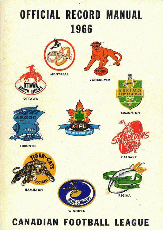
Thanks for providing the picture of the CFL logos HannuJ.
 I like how all the teams (with the exception of Hamilton) incorporated a football into their logo. The CFL logo looks quite alright as well.
Thanks for providing the picture of the CFL logos HannuJ.
I like how the Hamilton one is the only one that remotely resembles the teams' present logos.
m.
DowntownBooster
Registered User
I like how the Hamilton one is the only one that remotely resembles the teams' present logos.
m.
That's a good point Deuce. All the other team logos look so much different now than they did back then.
GaryPoppins
A broken clock is right twice in a day
- Sep 10, 2016
- 2,422
- 3,138
purdy44
Registered Loser
Jet mentioned earlier that there's a tiny plane in the lettering. Is that still the case? If so, where would it be
thegr8one66
Registered User
I thought he said through the "t" in "Jets".Jet mentioned earlier that there's a tiny plane in the lettering. Is that still the case? If so, where would it be
BobEssensa
Registered User
- Jun 16, 2011
- 506
- 169
Can someone who has gotten the sketch sent send it to me? I don't wanna overwhelm Jet
Me too, please. Also, FWIW, I think it's pretty safe to post a sketch of the jersey. No one's getting fired over that. Lol
I'd like to jump in on this train and possibly have this shared with me as well! Thanks!Me too, please. Also, FWIW, I think it's pretty safe to post a sketch of the jersey. No one's getting fired over that. Lol
People were fired over the last logo leak.Me too, please. Also, FWIW, I think it's pretty safe to post a sketch of the jersey. No one's getting fired over that. Lol
Ad
Latest posts
-

-
 GDT: Game Three: Boston Bruins At Toronto Maple Leafs (7:00 PM EST - SN, CBC)
- Latest: Jimmy Firecracker
-

-
 GDT: ECQF | GM3 | Boston Bruins @ Toronto Maple Leafs | ESPN
- Latest: MikeyMike01
Upcoming events
-
 Game 2 Vegas Golden Knights @ Dallas Stars - Vegas Golden Knights leads series 1-0Wagers: 12Staked: $10,874.00Event closes
- Updated:
-
Game 2 Los Angeles Kings @ Edmonton Oilers - Edmonton Oilers leads series 1-0Wagers: 19Staked: $45,615.00Event closes
- Updated:
-
-
-
