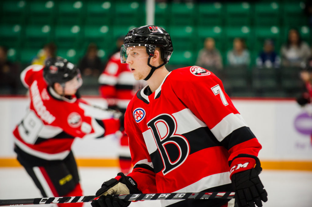
I get silver seven thing so I appreciate that's why they did it but I prefer the Belleville third because it's simpler and cleaner without the third stripe and different color logo.
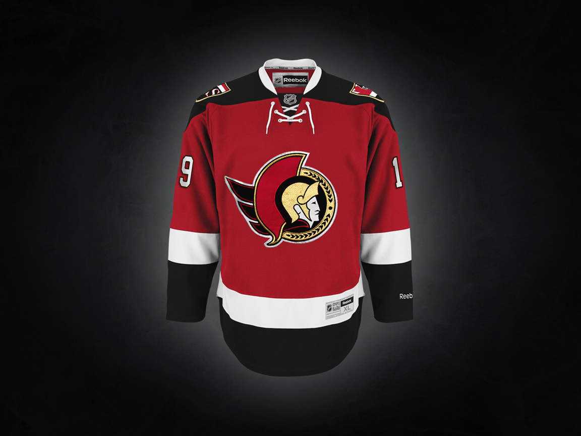
I was a big fan of the original Senators look during the expansion era and I think the brand would look a lot better going primarily with black, with red accent as opposed to a primarily red team with white and black. Saw this on Icethetics. Such a great, clean look. I really hope the Ottawa Senators go back to this look:
I was a big fan of the original Senators look during the expansion era and I think the brand would look a lot better going primarily with black, with red accent as opposed to a primarily red team with white and black. Saw this on Icethetics. Such a great, clean look. I really hope the Ottawa Senators go back to this look:
I was a big fan of the original Senators look during the expansion era and I think the brand would look a lot better going primarily with black, with red accent as opposed to a primarily red team with white and black. Saw this on Icethetics. Such a great, clean look. I really hope the Ottawa Senators go back to this look:
This site uses cookies to help personalise content, tailor your experience and to keep you logged in if you register.
By continuing to use this site, you are consenting to our use of cookies.


 Game 2 Washington Capitals @ New York Rangers - NYR leads series 1-0Wagers: 12Staked: $35,700.00Event closes