
Looking back at these I think my preference for the jersey is more nostalgia than anything else. The logo looks... special? Like it's more of an artsy-fartsy rendition of a shark. It's weird. I wish they would do something with the current practice-jersey-looking jerseys, but I don't think they should go back to these. Every now and again, sure. Not full time.
Time to Bring Back the Originals
- Thread starter WestCoast
- Start date
You are using an out of date browser. It may not display this or other websites correctly.
You should upgrade or use an alternative browser.
You should upgrade or use an alternative browser.
Pavelski2112
Bold as Boognish
Looking back at these I think my preference for the jersey is more nostalgia than anything else. The logo looks... special? Like it's more of an artsy-fartsy rendition of a shark. It's weird. I wish they would do something with the current practice-jersey-looking jerseys, but I don't think they should go back to these. Every now and again, sure. Not full time.
It's striking and simple. Looks great and pops against teal or white. The new one is just too busy for me, but I do like it - just not as much.
TealTown22
Registered User

weastern bias
worst team in the league
A shame if they're just warmups
But those 2007 era replica shoulder yokes are tragic, thanks, I hate it
sjsharks92
Registered User
sharski
Registered User
- Jun 4, 2012
- 5,613
- 4,571
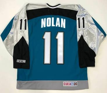
I'm probably in the minority but I never liked those lolYES! The old shark logo just looks moronic. I prefer the darker teal of one of the more recent jerseys too. Still I prefer the Nolan era Sharks jersey over any of them. To me that's the best Jersey they've had so far.

Too much bling
weastern bias
worst team in the league
I'm probably in the minority but I never liked those lol
Too much bling
The second gen jerseys are my least favorite specifically because of the grey stripes down the arms of the teal jerseys, they looked like practice jerseys
The white ones were pretty sleek though
Doctor Soraluce
Registered User
- Sep 28, 2017
- 7,051
- 4,459
I don't know how many practice jersey's you've seen but they don't look like that. The current ones more closely resemble practice jersey's than any of the others. Well, anyway, there's no accounting for taste.The second gen jerseys are my least favorite specifically because of the grey stripes down the arms of the teal jerseys, they looked like practice jerseys
The white ones were pretty sleek though

Last edited:
Frosty415
Registered User
I'm probably in the minority but I never liked those lol
Too much bling
love those, even after they got rid of the shiny
best jersey ainec
LeeIFBB
Crossing the Rubicon
AaronDellForPrez
RF Modulator
YES! The old shark logo just looks moronic.
Hmm. Hockey News ranked the original sharks jersey not only -not- moronic, but actually pretty good. And by pretty good, I mean "The #1, best hockey uniform of all NHL Teams OF ALL TIME" (no exaggeration)
Hockey News Ranks Sharks Jersey No. 1 of All-Time
So... you have to understand, when you say it looks moronic...


"Though the logo has been altered in recent years, the original shark crest was perfect. San Jose may not have popularized the use of a triangle as background, but the way the shark is springing out is fantastic. The teal blue is definitely bold, and San Jose owns that color (red, on the other hand, could make you think of Chicago, Montreal or Detroit). The secondary logo, a cutting fin on the shoulder, is also an amazing mark. This jersey could have been used for decades and no one would call it out for being dated. Simply put, it's flawless. The stripes aren't busy and, in an era where garishness took over, the Sharks kept it classy." - Hockey News, Oct 13 2015
Hmm. Hockey News ranked the original sharks jersey not only -not- moronic, but actually pretty good. And by pretty good, I mean "The #1, best hockey uniform of all NHL Teams OF ALL TIME" (no exaggeration)
Hockey News Ranks Sharks Jersey No. 1 of All-Time
So... you have to understand, when you say it looks moronic...
"Though the logo has been altered in recent years, the original shark crest was perfect. San Jose may not have popularized the use of a triangle as background, but the way the shark is springing out is fantastic. The teal blue is definitely bold, and San Jose owns that color (red, on the other hand, could make you think of Chicago, Montreal or Detroit). The secondary logo, a cutting fin on the shoulder, is also an amazing mark. This jersey could have been used for decades and no one would call it out for being dated. Simply put, it's flawless. The stripes aren't busy and, in an era where garishness took over, the Sharks kept it classy." - Hockey News, Oct 13 2015
Hockey news credibility gone.
The Ice Hockey Dude
Ack! Thbbft!
Hockey news credibility gone.
thats aweful! u used to get that publication as a kid.
thats aweful! u used to get that publication as a kid.
Nope didn't
The Ice Hockey Dude
Ack! Thbbft!
Nope didn't
sorry, I used to get that as a kid. This will show how old i am. This was before
the internet, social media, etc. All we had was TV, newspapers and magazines. LoL
sorry, I used to get that as a kid. This will show how old i am. This was before
the internet, social media, etc. All we had was TV, newspapers and magazines. LoL
Oh i know it was out when i was a kid, but me and my parents never wanted or needed it lol.
Doctor Soraluce
Registered User
- Sep 28, 2017
- 7,051
- 4,459
Hmm. Hockey News ranked the original sharks jersey not only -not- moronic, but actually pretty good. And by pretty good, I mean "The #1, best hockey uniform of all NHL Teams OF ALL TIME" (no exaggeration)
Hockey News Ranks Sharks Jersey No. 1 of All-Time
So... you have to understand, when you say it looks moronic...
"Though the logo has been altered in recent years, the original shark crest was perfect. San Jose may not have popularized the use of a triangle as background, but the way the shark is springing out is fantastic. The teal blue is definitely bold, and San Jose owns that color (red, on the other hand, could make you think of Chicago, Montreal or Detroit). The secondary logo, a cutting fin on the shoulder, is also an amazing mark. This jersey could have been used for decades and no one would call it out for being dated. Simply put, it's flawless. The stripes aren't busy and, in an era where garishness took over, the Sharks kept it classy." - Hockey News, Oct 13 2015
 Yeah ok buddy.
  Whoever wrote that for the Hockey News is a moron.
  Talk about discarding an opinion... Now I would agree about that jersey IF the new sharks crest didn't exist. But that new crest is one of the single greatest upgrades to a jersey ever. If a toddler was trying to draw the new crest you would likely end up with something that looks almost identical to the old crest. It looks stupid now. That old jersey with it's Boston Bruins styling is awesome though. Easily my 2nd favorite jersey. I would be fine with a return to it with the new crest.
AaronDellForPrez
RF Modulator
weastern bias
worst team in the league
Lol, I haven't watched that since it came out
Crazy that Hertl is the only player from that still on the team, even then new addition Brenden Dillon is gone

Ad
Upcoming events
-
 2024 SoFi NBA Play-In Tournament Sacramento Kings @ New Orleans PelicansWagers: 5Staked: $318.00Event closes
- Updated:
-
 Stanley Cup 2024 Stanley Cup Champion - ONLY BET ONE TEAMWagers: 11Staked: $10,925.00Event closes
- Updated:
-
-
-
Series Winner Boston Bruins vs Toronto Maple LeafsWagers: 8Staked: $3,310.00Event closes
- Updated: