The Inaugural Jersey Discussion Thread

Casper

30 goal grinder
Mar 23, 2010
1,558
3
MN
Good to know, but they still didn't explain the stupid red arrow at the neckline.

I like the jersey, hate that red arrow.

Agreed, even if the arrow was smaller if would look better. Just obnoxious based on that pic
 

Minnesota

L'Etoile du Nord
Sponsor
Aug 5, 2011
28,377
1,399
Not a fan of Vegas' first jerseys either.


There's like... Flames or leaves embroidered into the sleeve stripes? The hell? Trying to invoke a tacky Vegas hotel lobby methinks.

DCz57TCUQAIK6Dl.jpg:large
 

Minnesota

L'Etoile du Nord
Sponsor
Aug 5, 2011
28,377
1,399
Silver lining: Reds are gone. I'll take a bad green jersey over our old reds. :naughty:
 

plock

Sonic Reducer
Oct 5, 2013
1,256
0
Mill City
-Stripe all the way around.
-Stripe cream
-No red thing on the neck

Boom you've got a decent Jersey.

Just get rid of the stripe completely,even if it went all the way around it would still look ugly.
If you are going to do stripes just go all in like Barca...
Barcelona-15-16-Kits%2B%25281%2529.jpg
 

00xtremeninja

(╯°□°)╯︵ ┻━┻
Nashville has had the piano neck lining for a while now.

I like the new jersey overall. A modern take with some vintage thrown in. The red on the neck is whatever, the stripe not being all around is my biggest complaint. I like the numbers.

Nashville's got boring as all heck. Blues is clean and nice. But the winners of the jerseys are the Avs. Going back to the mountain horizon on the bottom is awesome.
 

vayeate

OZ-13MSX1
Jun 30, 2011
388
32
Anybody have the road versions of the jerseys?

*Crosses fingers for wheat colored road jerseys*
 

AKL

Danila Yurov Fan Club President
Sponsor
Dec 10, 2012
39,633
18,055
I actually really like the new jersey

Not to get confused with New Jersey's new jersey, that thing sucks
 

se7en

infamous...
Apr 14, 2010
1,155
30
Maui, HI
Just out of curiosity is there any league mandate or rule that says away jerseys must be a crisp/pure white or can they be wheat color? I can see the league considering wheat a primary color instead of a "white" and not allowing it as an away... I don't think I've ever heard Russo or anyone mention if we'd even be allowed to do wheat. Be cool if we could tho. Hella unique
 

se7en

infamous...
Apr 14, 2010
1,155
30
Maui, HI
With that said, I don't hate the new jersey but I'm disappointed with it... the middle stripe being on the front only & not the back just drives me nuts.. also I've never been a center strip fan. On an NHL level I think it only really works for the Canadians because it's iconic. (The Habs also had the common sense to have the stripe on the back too) and I know the Wild tried to press the vintage MN influence on the style for this as the justification for center strip but IMHO it just throws off the breakup of the jersey & makes it look unnatural..

The red neck arrow tab is really bad too. I really don't like the look of that collar line.. there's something off-putting with the way the the red upside down pentagon shape makes the natural V of the neck look upside down or like it goes the wrong direction..

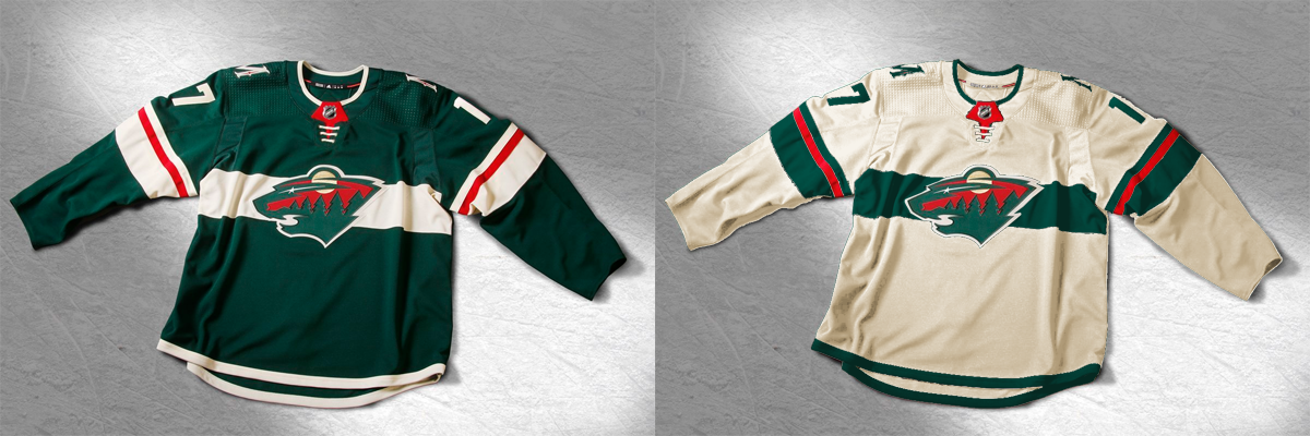
Lastly, maybe it's just the lighting or the pics but the material looks almost glossy & like really fine threading if that makes sense. almost more like a nylon or something. It doesn't seem to have any classic "sweater" material look to it at all, it looks more like the material bicycle racers wear.. then that horrible mesh on the shoulders like a kid in the 80s would wear tank tops of in neon.. I don't know, I just think it's tacky & trying too hard.. but what can I say, I appreciate classic, understated & iconic.. I love the Wild & support I them 100%, even from Maui I never miss a game but I don't know if I'll ever get over the full on cheesyness of our name & I just feel like we'll always just be a meh half-assed expansion team that came after an iconic team..

Rant over.. sorry it got so negative. I just struggle having any pride in being a Wild fan... I always say "Minnesota fan". I just hate our name & logo so much.. following up to the iconic North Stars name & logo & colors, I just think "Wild" is so cheesy... I hate explaining the name... Granted I live in a place with practically no interest in hockey so when people have no knowledge of us & I say "Wild" people seriously look at me like I'm a weirdo & question me on why anyone would ever name a team that word.. haha oh well


Side question- have we ever used the state of hockey logo as a shoulder patch? I think it'd be cool do have the M on one shoulder & the state of hockey Minnesota patch on the other
 

Wabit

Registered User
May 23, 2016
19,228
4,412
Looking closer at the jerseys most of them look like practice jerseys. No laces on the front really looks odd to me.

Not a fan of the wheat color, it just looks like a grungy to me. I have t-shirts and socks that have been through the wash without bleach and they have similar coloring.

I like the backs much better, nice and clean numbers on solid coloring. The stripe/piping would be fine on the bottom all the way around, not in the middle. It has a soccer jersey feel on the front, just not a fan of the style. Think I'll hold off buying a new one until I see the 3rd jersey (in a couple of years) or the away jersey.
 

Fighting Saint

Registered User
May 26, 2010
613
0
Minnesota
If they're going to keep the aways the same, why not just tweak the green 3rds (logo instead of script, no piping) and give us a great looking set of uniforms?

Meh
 

Fremitus Borealis

Flügelstürmer
Feb 4, 2007
9,262
13
The Slot
Anybody else get the impression there was a bare minimum of "hockey people" involved in any of this (the design process, the "reveal", etc.)? Seems like the kind of nonsense the league/teams threw a ton of money at some design/marketing "experts" to handle, and they largely dropped the ball because they don't care about it the way "hockey people" would. Hell, even just from a design standpoint.... obviously people are gonna complain no matter what, but I think there's a reason that "fan art" concepts of the new jerseys tend to be better than what was just revealed yesterday.
 

GORGO

Registered User
Dec 10, 2011
222
0
BABBITT, MN
You'll never be everything to everybody, but imo much better then the garbage they had before. Not sure how anyone could Not find this new jersey a Huge upgrade over what they had. They got my vote.
 

Ad

Upcoming events

Ad

Ad