Confirmed with Link: RIP Wordmark: Vancouver's uniforms have been modified for 2019-20 (leaked, then confirmed)

What do you think the Canucks should do with their jerseys?


  • Total voters
    113
Status
Not open for further replies.

clunk

Registered User
Dec 10, 2015
11,343
5,418
I'm gonna..
Maybe I’m in the minority but I love our logo. The orca breaking through the ice like the Orcas in our region break through the water just looks awesome and speaks to the beauty of the area. The connection with native art also ties to the area and C for Canucks tries to link it with the team name. just looks great.

I can give two ****s about the word mark. take it out leave it on, don’t care.

What I don’t like about our logo is how there’s no connection to what A Canuck is. That’s no fault of the logo, that’s the fault of whoever designed the team name with no attachment to anything recognizable in reality, and you’d have the same problem with any logo you try and design for that name. The name is also the reason our jersey keeps changing. You don’t have that problem if you’re the Sharks or the Jets because your name relates to something tangible.

Don’t get me wrong, I also love our team name for many reasons. Just makes it damn hard to market the team to new fans.

Question. Did they make the Orca bigger with the extra space now hat Vancouvers gone, or did they leave it the same size to make the transition to jersey ads seem more gradual?
In my opinion, a "Canuck" logo should be something unmistakably Canadian. Sure, you can point out that it has connection with the native art, but it's not really 'Canadian' culture. The stick and rink is great. Johnny Canuck is good but a little cartoonish. The skate logo, as flashy as it was, was still 'Canadian'.

Orcas you can find in literally every ocean and most seas. There's nothing Canadian about them.

They should just go back to the stick in rink and 'stick' with it permanently, perhaps changing other details on the jersey over time but keeping the logo the same.
 

The Vasili Jerry

Serenity now!
Jun 11, 2011
5,309
7,318
Orange County
In my opinion, a "Canuck" logo should be something unmistakably Canadian. Sure, you can point out that it has connection with the native art, but it's not really 'Canadian' culture. The stick and rink is great. Johnny Canuck is good but a little cartoonish. The skate logo, as flashy as it was, was still 'Canadian'.

Orcas you can find in literally every ocean and most seas. There's nothing Canadian about them.

They should just go back to the stick in rink and 'stick' with it permanently, perhaps changing other details on the jersey over time but keeping the logo the same.
A stick and rink is only Canadian?
 

vancityluongo

curse of the strombino
Sponsor
Jul 8, 2006
18,627
6,283
Edmonton
Another vote for go back to the stick n rink and never touch it again.

Lots of teams have had stints with alternate logos:

1118jays2.jpg

3329_edmonton_oilers-jersey-2002.png

28d3d741d2ecea2e07f97b9424a894c1.jpg


Only to go back to the originals or a direct variations of them.

We've been using a variation of the stick and rink logo for the last 10 years (40th anniversary jerseys). This "generation" of fans can recognize it.

Have an alternate with the Orca in blue trim. Green home stick n rink.
 

Interior Cascadian

Registered User
Apr 2, 2007
1,075
188
Olympia, WA
Maybe I’m in the minority but I love our logo. The orca breaking through the ice like the Orcas in our region break through the water just looks awesome and speaks to the beauty of the area. The connection with native art also ties to the area and C for Canucks tries to link it with the team name. just looks great.

I can give two ****s about the word mark. take it out leave it on, don’t care.

What I don’t like about our logo is how there’s no connection to what A Canuck is. That’s no fault of the logo, that’s the fault of whoever designed the team name with no attachment to anything recognizable in reality, and you’d have the same problem with any logo you try and design for that name. The name is also the reason our jersey keeps changing. You don’t have that problem if you’re the Sharks or the Jets because your name relates to something tangible.

Don’t get me wrong, I also love our team name for many reasons. Just makes it damn hard to market the team to new fans.

Question. Did they make the Orca bigger with the extra space now hat Vancouvers gone, or did they leave it the same size to make the transition to jersey ads seem more gradual?
I believe the logo is a little larger now, yes. I seem to recall it being reduced a bit to accommodate the word mark when they transitioned away from the navy/maroon/silver jerseys too.
 

TruKnyte

On the wagon
Jan 1, 2012
6,110
3,544
Vancouver, BC
When does the 50yr anniversary skate jersey come out?

They were selling them at games in Rogers during the season and might have them in the Canucks team store (although I think they only had Bure ones, I want to grab an Almo one myself). If I had to guess they'll probably go on sale online in September during pre-season, but I could be wrong.
 

MS

1%er
Mar 18, 2002
53,595
84,103
Vancouver, BC
The Orca is so bad, I actually avoid wearing it in public. I can wear Millionaires, stick in rink, or skate, but wearing the Orca is just embarrassing imo. It's childish and is unwearable on anything other than a jersey, imo. Even then, it's terrible.

Stick and rink never should of ended, like someone said earlier in this thread. It's simple, clean, and would have become a classic logo alongside the original 6 and a few others had the Canucks stuck with it, in my opinion. Like the Blues have kept the note, the Canucks should have kept the stick in rink.

Agreed 100%. The original 1970 jerseys are still - by far - the most aesthetically pleasing jerseys and the stick-in-rink is a simple, classic logo that looks good on hats and merchandise.

The orca is an ugly abomination. I basically own no orca-branded stuff and feel no connection to it whatsoever.

And the other thing about the orca beyond that it's ugly is where it came from. It's the corporate logo of John McCaw, Stan McCammon and the awful Orca Bay ownership group and basically symbolizes one of the darkest periods in franchise history in the 1990s. It's like having a piece of art hanging on your wall that you know was painted by a pedophile. Even if it looked good, the origins make it ... ick.
 
  • Like
Reactions: clunk

TruKnyte

On the wagon
Jan 1, 2012
6,110
3,544
Vancouver, BC
Agreed 100%. The original 1970 jerseys are still - by far - the most aesthetically pleasing jerseys and the stick-in-rink is a simple, classic logo that looks good on hats and merchandise.

The orca is an ugly abomination. I basically own no orca-branded stuff and feel no connection to it whatsoever.

And the other thing about the orca beyond that it's ugly is where it came from. It's the corporate logo of John McCaw, Stan McCammon and the awful Orca Bay ownership group and basically symbolizes one of the darkest periods in franchise history in the 1990s. It's like having a piece of art hanging on your wall that you know was painted by a pedophile. Even if it looked good, the origins make it ... ick.

I get you don't like the logo, but comparing it to cases of child abuse is a bit much imo.
 
  • Like
Reactions: Slads

MS

1%er
Mar 18, 2002
53,595
84,103
Vancouver, BC
I get you don't like the logo, but comparing it to cases of child abuse is a bit much imo.

Saying the origin of something can taint it and using that as an example isn't saying that they're on the same level. An analogy isn't a comparison. Although I guess using that as an example can be a trigger. What I was thinking of when using that analogy was how Michael Jackson songs are all kinda tainted now.
 

StreetHawk

Registered User
Sep 30, 2017
26,027
9,653
Another vote for go back to the stick n rink and never touch it again.

Lots of teams have had stints with alternate logos:

1118jays2.jpg

3329_edmonton_oilers-jersey-2002.png

28d3d741d2ecea2e07f97b9424a894c1.jpg


Only to go back to the originals or a direct variations of them.

We've been using a variation of the stick and rink logo for the last 10 years (40th anniversary jerseys). This "generation" of fans can recognize it.

Have an alternate with the Orca in blue trim. Green home stick n rink.
At least the Jays and Pens have always had a bird on the logo. No constant in the Canuck logos.

That oilers one that was never their primary logo. Just for a third jersey.
 
  • Like
Reactions: TruKnyte

sting101

Registered User
Feb 8, 2012
15,877
14,729
Add me to the list of owning nothing with Free Willy on it. And i love Orcas

I'm obviously advocating for the V from the Millionaires jerseys as our logo but the Stick in Rink is pretty solid and would more than satisfy my thirst to bury the Orca and it's completely unrelated symbol of a Canuck. Spaghetti skate and the whole black yellow era is a non starter for me also....even though they were kinda cool in their own way

Hated the Orca from the day it was unveiled with the crowd mocking it at the draft and the lovely subsequent years of ramming Messier and Keenan down our throats. For you kids imagine Aquilini unveling a salmon as the new logo and then hiring Claude Julien to strip Horvat of the C and sign 35yr old Brad Marchand to join the team and wear it.

20 yrs later......"i like the Salmon its just so west coast"
 

GetFocht

Indestructible
Jun 11, 2013
9,077
4,373
everyone loves nostalgic logos because they are a novelty, they aren't primary logos that should be used for every game.
 

thekernel

Registered User
Apr 11, 2011
6,235
3,474
People only like the "skate" (that I had no clue was a skate for years and years) for nostalgic reasons. It's not a very good logo.
I love the logo nostalgically, and I have to agree with you. The color scheme is heinous, and the design itself is incredibly dated and non-intuitive -- it also took me a long, long time to deduce it was a skate haha. I love it for what it represents to me though -- I grew up on Bure and Linden. I suspect it's the same for a lot of people; don't actually like the color or design, but love the '94 magic, and love the jersey for the bond it represents.

I like that they're going minimalist with the changes. Signify a new beginning, but without compromising the associations with the Sedin era. I wouldn't enjoy anything too radical, and I would only enjoy a reversion if we went stick-in-rink (since the color scheme is the same).
 

StreetHawk

Registered User
Sep 30, 2017
26,027
9,653
It as announced as a jersey change, not a logo change. Not sure why people are so upset. Like some don’t understand the difference between jersey and logo.
 

TruKnyte

On the wagon
Jan 1, 2012
6,110
3,544
Vancouver, BC
I love the logo nostalgically, and I have to agree with you. The color scheme is heinous, and the design itself is incredibly dated and non-intuitive -- it also took me a long, long time to deduce it was a skate haha. I love it for what it represents to me though -- I grew up on Bure and Linden. I suspect it's the same for a lot of people; don't actually like the color or design, but love the '94 magic, and love the jersey for the bond it represents.

I like that they're going minimalist with the changes. Signify a new beginning, but without compromising the associations with the Sedin era. I wouldn't enjoy anything too radical, and I would only enjoy a reversion if we went stick-in-rink (since the color scheme is the same).

Yea I'm pretty sure if I didn't become a fan during the 94 run the skate jersey would be lower down on my list of logo's/jerseys.
 

MS

1%er
Mar 18, 2002
53,595
84,103
Vancouver, BC
Add me to the list of owning nothing with Free Willy on it. And i love Orcas

I'm obviously advocating for the V from the Millionaires jerseys as our logo but the Stick in Rink is pretty solid and would more than satisfy my thirst to bury the Orca and it's completely unrelated symbol of a Canuck. Spaghetti skate and the whole black yellow era is a non starter for me also....even though they were kinda cool in their own way

Hated the Orca from the day it was unveiled with the crowd mocking it at the draft and the lovely subsequent years of ramming Messier and Keenan down our throats. For you kids imagine Aquilini unveling a salmon as the new logo and then hiring Claude Julien to strip Horvat of the C and sign 35yr old Brad Marchand to join the team and wear it.

20 yrs later......"i like the Salmon its just so west coast"

Exactly. It's a godawful logo created by godawful ownership representing a godawful era.

Literally the only reason it's still here is because fans under 25 are attached to it because we've kept it for so long. If the Sabres had kept the Buffaslug for the 20 years since it was first introduced, they'd now have the same problem - but they were smart enough to get rid of it fairly quickly.

I love the logo nostalgically, and I have to agree with you. The color scheme is heinous, and the design itself is incredibly dated and non-intuitive -- it also took me a long, long time to deduce it was a skate haha. I love it for what it represents to me though -- I grew up on Bure and Linden. I suspect it's the same for a lot of people; don't actually like the color or design, but love the '94 magic, and love the jersey for the bond it represents.

I like that they're going minimalist with the changes. Signify a new beginning, but without compromising the associations with the Sedin era. I wouldn't enjoy anything too radical, and I would only enjoy a reversion if we went stick-in-rink (since the color scheme is the same).

Yeah, I'm the same way. I have an extremely strong emotional attachment to the black/yellow jerseys and the skate logo and they'll always be my favourite uniforms. But I understand that they aren't really that great of a uniform or logo from a technical or aesthetic sense, and I understand why we wouldn't go back to them. That said, I want them very much to be our 3rd uniforms cracked out a few times a season.
 
  • Like
Reactions: 420Canuck

Josepho

i want the bartkowski thread back
Jan 1, 2015
14,789
8,302
British Columbia
i'm fine with the orca and all but i agree that the 90s is the worst thing that has ever happened to uniforms and logos in professional sports
 

TJ21

SURVIVED JIMBOCALYPSE - 12/5/2021
Oct 3, 2012
990
1,039
Vancouver
I guess I'm in the TINY minority of people that genuinely enjoys the current jerseys and logo. It's like some people have mentioned, I've only ever known the orca, and honestly, I've always really liked it. Im in my 20's so its not like I'm super young either. I feel like they hit the sweet spot when they went to the current color scheme, and now with the wordmark out, these are probably my favorite sets. Never been a huge fan of the stick in the rink at all. Would have absolutely loved a green trim on the orca, but cant complain, I very much enjoy them.
 

Canuckle1970

Registered User
Mar 24, 2010
6,965
6,010
I guess I'm in the TINY minority of people that genuinely enjoys the current jerseys and logo. It's like some people have mentioned, I've only ever known the orca, and honestly, I've always really liked it. Im in my 20's so its not like I'm super young either. I feel like they hit the sweet spot when they went to the current color scheme, and now with the wordmark out, these are probably my favorite sets. Never been a huge fan of the stick in the rink at all. Would have absolutely loved a green trim on the orca, but cant complain, I very much enjoy them.

You pretty much summed it up for me (except for being in my 20's - I wish). I've been around from the start, as my name implies, so I've seen 'em all.

The original "stick in rink" always looked Mickey Mouse to me. The 1978 black/yellow "V"s were a shock to the eyeballs when they arrived. After all the different designs and colors through the years, I'm now happy with this very latest jersey as we head into our 50th year. I love the original blue/green/white color scheme. I like the Orca logo without the wordmark, and I like the "stick in rink" shoulder patches - a nod to the original jersey.
 
  • Like
Reactions: Slads

Hemty

"Magni Consili Angelus"
Jan 14, 2015
943
687
Riga
soundcloud.com
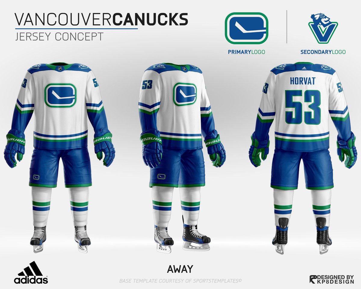
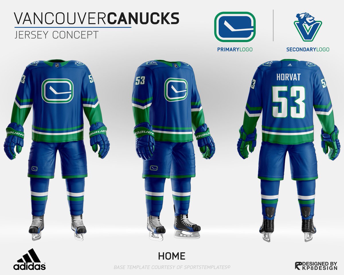
Yeah, that’s one of the best Canuck jersey mock-ups I’ve ever seen and those white uniforms in particular would be some of the nicest in the entire league.
Was about to say those white jerseys, Jesus ****** Christ are they smooth and clean. I feel like the home jerseys could use a little bit of polish. But like you said, overall these look amazing.
 
  • Like
Reactions: MS
Status
Not open for further replies.

Ad

Upcoming events

Ad

Ad