Confirmed with Link: RIP Wordmark: Vancouver's uniforms have been modified for 2019-20 (leaked, then confirmed)

What do you think the Canucks should do with their jerseys?


  • Total voters
    113
Status
Not open for further replies.

Pastor Of Muppetz

Registered User
Oct 1, 2017
26,130
15,985
I would much prefer the stick in rink but I like this change. It was a no brainer improvement that should have happened a lot sooner.
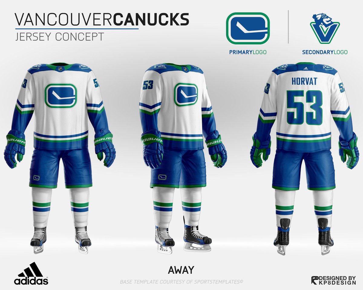
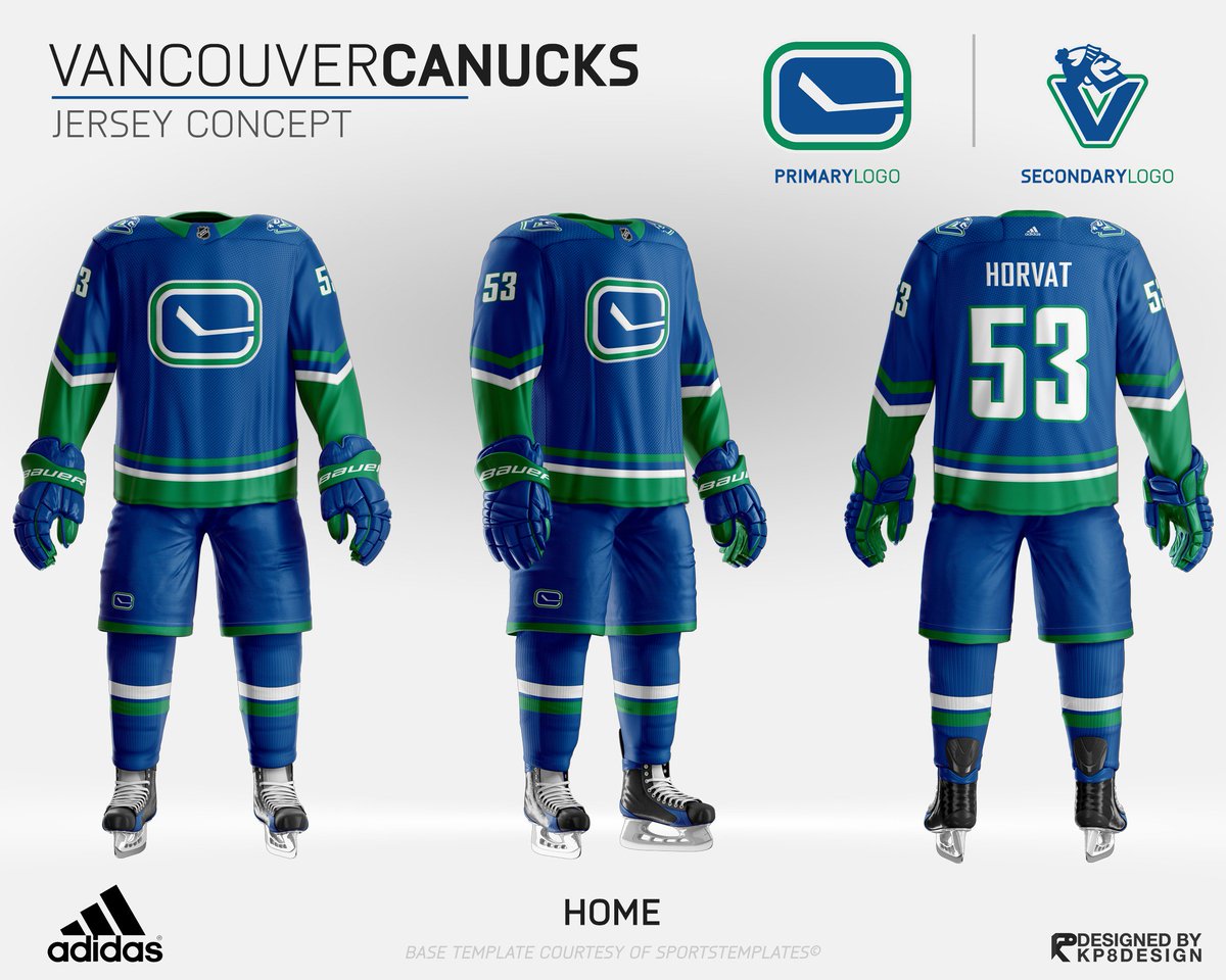
Looking at the mock ups..It looks like the designers got it right the first time (in 1970)..Its a little bit of a compromise having the Orca,but I can live with it.

The Orca is not that bad.. the Flames,Hurricanes and Ducks logos come to mind as being much worse.
 
  • Like
Reactions: mossey3535

BenningHurtsMySoul

Unfair Huggy Bear
Mar 18, 2008
25,138
10,535
Port Coquitlam, BC
I like the changes. Subtle, but noticeable at the same time. We’ve had enough drastic changes over time, let’s build an identity here.

Seattle is gonna probably do the exact same colour scheme but with green as the primary colour.
 

End on a Hinote

Registered Abuser
Aug 22, 2011
4,047
2,129
Northern British Columbia
Still a lousy jersey even without the wordmark.

Should have made the Reebok era stick in rink alternates their new regulars with a white version for the road.

The Canucks (still) have one of the worst regular tarps in the league, but had probably the best alternate with the Reebok stick in rink.

I obviously voted to go back to stick in rink. But I'm referring to the modernised ones, not the original 1970 version.
 

TruKnyte

On the wagon
Jan 1, 2012
6,110
3,544
Vancouver, BC
Skate jersey is still my favourite but I'm good with the small alteration. We've had enough jersey's and logos in our history, it's time to stick with one for more than a single generation.
 

lawrence

Registered User
May 19, 2012
15,971
6,755
Sigh! Why keep the fugly orca? Seriously, who ever design this logo deserved to be fired.

He was paid to design it once and that was it. If anything blame Francesco for designing something he personally likes over the interest in the entire fan base. Seattle is calling the fans to choose the name and probably to choose the jersey.

I full out want to see a new design for logo and jersey.
 
  • Like
Reactions: Vancouver_2010

StreetHawk

Registered User
Sep 30, 2017
26,023
9,649
He was paid to design it once and that was it. If anything blame Francesco for designing something he personally likes over the interest in the entire fan base. Seattle is calling the fans to choose the name and probably to choose the jersey.

I full out want to see a new design for logo and jersey.
Orca logo was during the McCaw years back in 1997.

LA kings also need to stick to a logo too. The yellow and purple crown to the Gretzky silver and black, then to the purple and black shield, then to the sharper silver crown, to what they have today of the black with the big LA on top with the crown on the bottom.

Stick and rink to skate to orca with always the Johnny Canuck around. Chance to go with an updated Johnny Canuck passed once the giants arrived.
 

The Drop

Rain Drop, Drop Top
Jul 12, 2015
14,873
4,060
Vancouver
I’m not even a huge fan of these but I like them better than what we’re getting. There’s actually green In the jerseys
DELd9xDUMAArtfb.jpg
DELd8guUMAA2tH2.jpg
 
Last edited:

me2

Go ahead foot
Jun 28, 2002
37,903
5,595
Make my day.
Chance to go with an updated Johnny Canuck passed once the giants arrived.

I know there was a BC team using the Johnny Canuck logo before it moved to the NHL. Can someone explain the actual Johnny Canuck connection to BC to me, the original Johnny Canuck character seems to be an Ontario invention (before BC joined Canada) and the WWII version also an Ontario invention. Wikipedia puts the word Canuck, a spelling of Kanuck, as French/Dutch Canadians from the 1830s. I'd have said that our version of the Johnny Canuck logo looks more French Canadian.
 
Last edited:

StreetHawk

Registered User
Sep 30, 2017
26,023
9,649
I’m not even a huge fan of these but I like them better than what we’re getting. There’s actually green In the jerseys
DELd9xDUMAArtfb.jpg
DELd8guUMAA2tH2.jpg
Logo would have been fine had they never changed it to the skate. If we had 50 years of this logo at least you can say it was original since it’s pretty simple.

But they don’t have the history since they went to the skate over 35 years ago.
 

LuckyDay

Registered User
Mar 25, 2011
1,781
1,173
The Uncanny Valley
I know there was a BC team using the Johnny Canuck logo before it moved to the NHL. Can someone explain the actual Johnny Canuck connection to BC to me, the original Johnny Canuck character seems to be an Ontario invention (before BC joined Canada) and the WWII version also an Ontario invention. Wikipedia puts the word Canuck, a spelling of Kanuck, as French/Dutch Canadians from the 1830s. I'd have said that our version of the Johnny Canuck logo looks more French Canadian.

The BC/Columbia River Region/Cascadia connection is interesting The prevailing theory among linguists is its a corruption of Kanaka, the Hawaiian word for Hawaiin. It became Kanuck/Canuck in Chinook Jargon (aka Chinook Wawa), the prevailing lingua franca of the region (i.e. Tillicum, Tyee, Tumwater, Gumshua, Klootch, Salt Chuck, Tumwater, Boston Bar, etc.)
As Hawaiins jumped ship to get a better life or pan for gold in the region non-Hawaiins started calling them Canucks. Eventually it became a term for French and other non-English by English or Chinook Jargon speakers. It never saw print in our region because it was racist and that's why you first see it back East as a term for Dutch (aka German) Americans probably trying to squat on the free land that was being given out. Somehow it became a name for all of us.

What's a yankee?
 
Last edited:

StreetHawk

Registered User
Sep 30, 2017
26,023
9,649
Yup. Better than an 800 million dollar sports empire
Canucks ownership isn't changing the logo. We've had massive changes to the logo since they joined the NHL. Used to have Johnny Canucks prior to the NHL. Then opted to go simple with the Stick and rink. Changed to the Skate, then to the Orca.

One thing for SJ to change the look or their Shark, or the Ducks going from the Disney look, to the work Ducks, and then to just the D with the web foot.

All of those logos are still the Shark or Duck. Kings have at least always had a crown in their 5 logos. Size may have been smaller with the Wayne Silver one, the Shield, and the Current one compared to the large rounded and sharp crown logos they also used.

Too much change from one thing to another for the Canucks. I think that's why they don't want to change the orca. I can understand that approach.

Best logo with what I have seen that is based on something that the Canucks have used is Johnny Canuck cut off at the waist against a thick V, similar to the one used as a shoulder batch with just Johnny's head.

That would have been the ideal choice back in 1997 or in 2006 when they went back to the original colors. But, too much time has passed now.
 

clunk

Registered User
Dec 10, 2015
11,343
5,418
I'm gonna..
The Orca is so bad, I actually avoid wearing it in public. I can wear Millionaires, stick in rink, or skate, but wearing the Orca is just embarrassing imo. It's childish and is unwearable on anything other than a jersey, imo. Even then, it's terrible.

Stick and rink never should of ended, like someone said earlier in this thread. It's simple, clean, and would have become a classic logo alongside the original 6 and a few others had the Canucks stuck with it, in my opinion. Like the Blues have kept the note, the Canucks should have kept the stick in rink.
 
  • Like
Reactions: MS

me2

Go ahead foot
Jun 28, 2002
37,903
5,595
Make my day.
LuckyDay said:
The BC/Columbia River Region/Cascadia connection is interesting The prevailing theory among linguists is its a corruption of Kanaka, the Hawaiian word for Hawaiin. It became Kanuck/Canuck in Chinook Jargon (aka Chinook Wawa), the prevailing lingua franca of the region (i.e. Tillicum, Tyee, Tumwater, Gumshua, Klootch, Salt Chuck, Tumwater, Boston Bar, etc.)
As Hawaiins jumped ship to get a better life or pan for gold in the region non-Hawaiins started calling them Canucks. Eventually it became a term for French and other non-English or Chinook Jargon speakers. It never saw print in our region because it was racist and that's why you first see it back East as a term for Dutch (aka German) Americans probably trying to squat on the free land that was being given out. Somehow it became a name for all of us.
I've always felt that explanation was as apocryphal as the rest.

Anyway we got beaten to Canucks name by at least one organisation
https://upload.wikimedia.org/wikipedia/en/1/13/Moose_jaw_canucks_1950-51.gif
 

PM

Glass not 1/2 full
Apr 8, 2014
9,869
1,664
The orca looks terrible on a hat so I hate it. My standards for logos are pretty low yet we can never seem to clear the bar other than the original 1970’s one. My motto is Looks Good On A Hat = Good Logo.

Our original 1970 jersey overall is beautiful in my opinion. The sleeves are my favourite part, not sure why we never go back to those.
 
  • Like
Reactions: MS and clunk

me2

Go ahead foot
Jun 28, 2002
37,903
5,595
Make my day.
lol.
View attachment 232067
these would be sick
not bad at all.

Skate jersey is still my favourite but I'm good with the small alteration. We've had enough jersey's and logos in our history, it's time to stick with one for more than a single generation.

IMHO The skate logo on it's own looks dated to 80s, it would have been a trendy design then ie lighting like stripping effect. The real strength is the colour scheme of black jersey that surrounded the logo, the logo itself turns into a random blob of colours that blends in and complements the jersey.
 
Last edited:

Paulinvancouver

Gas station in Carbondale did not have fresh yams!
Dec 19, 2015
4,001
1,024
Maybe I’m in the minority but I love our logo. The orca breaking through the ice like the Orcas in our region break through the water just looks awesome and speaks to the beauty of the area. The connection with native art also ties to the area and C for Canucks tries to link it with the team name. just looks great.

I can give two shits about the word mark. take it out leave it on, don’t care.

What I don’t like about our logo is how there’s no connection to what A Canuck is. That’s no fault of the logo, that’s the fault of whoever designed the team name with no attachment to anything recognizable in reality, and you’d have the same problem with any logo you try and design for that name. The name is also the reason our jersey keeps changing. You don’t have that problem if you’re the Sharks or the Jets because your name relates to something tangible.

Don’t get me wrong, I also love our team name for many reasons. Just makes it damn hard to market the team to new fans.

Question. Did they make the Orca bigger with the extra space now hat Vancouvers gone, or did they leave it the same size to make the transition to jersey ads seem more gradual?
 
Status
Not open for further replies.

Ad

Upcoming events

Ad

Ad